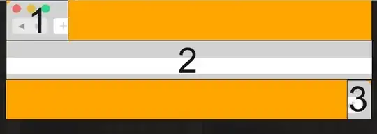
how can I make all divs get on the same line and fill div#2 the space between the left floated div#1 and right floated div#3?

Asked
Active
Viewed 4,691 times
1
user3519221
- 119
- 2
- 10
-
Please add your html and css code for this simple example – Huangism Mar 30 '15 at 12:50
3 Answers
4
Maybe flex will help you, here is an JSFiddle.
HTML
<div class="parent">
    <div class="div1"></div>
    <div class="div2"></div>
    <div class="div3"></div>
</div>
CSS
.parent {
    display: -webkit-flex;
    display: flex;
}
.div1 {
    width: 30px;
    height: 30px;
    background: #FFCC99;
}
.div3 {
    width: 30px;
    height: 30px;
    background: #FCF305;
}
.div2 {
    -webkit-flex: auto;
    flex: auto;
    height: 30px;
    background: #CCFFCC;
}
Miaonster
- 1,482
- 2
- 18
- 32
-
@user3519221: Just be careful with flexbox, as some consider it not to be production-ready yet [due to browser compatability](http://caniuse.com/#search=flexbox), amongst a few other reasons... – jbutler483 Mar 30 '15 at 13:21
1
You could use display: table for this kind of implementation (note this is not using tables for layout):
html,
body {
  margin: 0;
  padding: 0;
}
.wrap {
  display: table;
  width: 100vw;
}
.one {
  display: table-cell;
  height: 50px;
  width: 20%;
  background: red;
}
.two {
  display: table-cell;
  height: 50%;
  width: 60%;
  background: cornflowerblue;
}
.three {
  display: table-cell;
  background: lime;
  height: 50px;
}
<div class="wrap">
<div class="one"></div>
<div class="two"></div>
<div class="three"></div>
</div>Notice how I haven't set a width on the last element, yet it's filling the rest of the space available?
jbutler483
- 24,074
- 9
- 92
- 145
-
1Thanks, even a better solution while tables are supported by all browsers! – user3519221 Mar 31 '15 at 18:26
-
I also want to mention that if you set the width of the last element, and not the second element, that css decides that the second element will also fill the space between the two until it reaches the full width of the element displayed as a table (wrap). Gotta love tables! Note: It seems that you are required to specify the width of the first element in a non-percentile for this method to work! – Ethan Moore Jul 09 '20 at 17:33
-
@EthanMoore this isn't `
` - `display` is different to 'using tables for layout' – jbutler483 Jul 09 '20 at 17:35 -
@jbutler483 You're correct, but you're still using table logic when using `display: table`. Also: incredible response time for a question that was answered 5 years ago :P – Ethan Moore Jul 09 '20 at 17:37
-
1@EthanMoore True, [but there are differences nonetheless](https://stackoverflow.com/a/33100775/3436942) – jbutler483 Jul 09 '20 at 17:48
0
Here's a dummy implementation:
<div id="l"></div>

<div id="r"></div>

<div id="c"></div>

<style>
#l {
float: left;
width:30%;
}
#r {
float: right;
width: 30%;
}
#c {
margin: 0 auto;
width: 40%;
}
</style>
mehulmpt
- 15,861
- 12
- 48
- 88
-
But what if the first and last div need to have a width specified by pixels and not by percentage? – user3519221 Mar 30 '15 at 12:54
-
@user3519221 If the container width is set by you (like 1024px or 960px), then you can calculate it in a similar way (30% of container width to 2 divs and 40% of container width to 1 central div). If not, then you can use javascript to calculate the full screen width and apply same logic above. – mehulmpt Mar 30 '15 at 12:56