1

Example 1

I want to develop the above design with angled divs.

Example 2

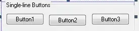
So far, I did as much as shown above.

Here is the code I've done so far:

.brd1, .brd3, .brd8{
    background-color: #4c4c4c;
}
.brd, .brd-nl{
    height: 60px;
}
.brd2, .brd4, .brd5, .brd7{
    background-color: #289de9;
}
.brd2{
    border-left: 5px solid #b31989;
    width: 94%;
    float: left;    
}
.brd2:before{
    border-bottom: 61px solid transparent;
    border-left: 45px solid #289de9;
    right: 7px;
    content: '';
    width: 0px;
    height: 0px;
    top: 0px;
    position: absolute;    
}
.brd3:after{
    border-top: 60px solid transparent;
    border-right: 45px solid #4c4c4c;
    left: -30px;
    content: '';
    width: 0px;
    height: 0px;
    top: 0px;
    position: absolute;     
}
.brd6{
    background-color: #3c6bb1;   
    width: 94%;  
}
.brd6:after{
    border-top: 60px solid transparent;
    border-left: 40px solid #3c6bb1;
    right: 12px;
    content: '';
    width: 0px;
    height: 0px;
    top: 0px;
    position: absolute;    
}
.brd7:before{
    border-bottom: 61px solid transparent;
    border-right: 45px solid #289de9;
    left: -30px;
    content: '';
    width: 0px;
    height: 0px;
    top: 0px;
    position: absolute; 
}
.brd7{
    border-right: 5px solid #b31989;;
}
<link href="https://maxcdn.bootstrapcdn.com/bootstrap/3.3.4/css/bootstrap.min.css" rel="stylesheet"/>
<div class="">
    <div class="">
        <div class="brd brd1 col-lg-1 col-md-1 col-sm-1"></div>
        <div class="brd col-lg-5 col-md-5 col-sm-5 col-xs-12">
             <h3 class="brd2"></h3>

        </div>
        <div class="brd col-lg-5 col-md-5 col-sm-5 col-xs-12">
             <h3 class="brd3">        
        </h3>

        </div>
        <div class="brd brd4 col-lg-1 col-md-1 col-sm-1"></div>
    </div>
    <div class="clear"></div>
    <div class="space-1"></div>
    <div class="">
        <div class="brd-nl brd5 col-lg-1 col-md-1 col-sm-1"></div>
        <div class="brd-nl col-lg-5 col-md-5 col-sm-5 col-xs-12">
             <h3 class="brd6"></h3>

        </div>
        <div class="brd-nl col-lg-5 col-md-5 col-sm-5 col-xs-12">
             <h3 class="brd7"></h3>

        </div>
        <div class="brd-nl brd8 col-lg-1 col-md-1 col-sm-1"></div>
    </div>
</div>

I need to add that angled border.

misterManSam
  • 24,303
  • 11
  • 69
  • 89
anu g prem
  • 545
  • 5
  • 15
  • 1
    Check http://stackoverflow.com/questions/23428286/create-border-arrow-with-css – ketan May 13 '15 at 07:25
  • I am no genius but isn't it possible with new css to set a background to like the 95% to the right in your div, leaving 5% for a different background color? Also you seem to have a picture of what it looks like, shouldnt you see if you can find the code? – kingkapd May 13 '15 at 07:26
  • This is what i was tallking about: https://developer.mozilla.org/en-US/docs/Web/Guide/CSS/Using_multiple_backgrounds – kingkapd May 13 '15 at 07:27

2 Answers2

4

This is my attempt (tested on Chrome 42.0.2311.135):

http://codepen.io/anon/pen/BNKzgG

The angled divs are made by 4 different linear-gradients and some widths are calculated through vw units. Red borders are realized both with colour steps inside the blue gradients or with a second gradient overlapped.

Also I simplified your markup as much as possible and you can add as many items as you want (try to uncomment the markup on codepen)

Markup

<ul>
  <li>Injection mould making</li>
  <li>Service and repair</li>
  <li>Jigs and fixtures</li>
  <li>Custom machining</li>
</ul>

CSS (relevant)

ul li { 
   float: left;
   width: 45%;
   position: relative;
   background-repeat: no-repeat !important;
   ...
}

/* linear gradients for angled effect and red lines */

ul li:nth-child(4n-3) {

    background: 
       /* vertical red line */
       linear-gradient(to right, 
          red 0px, 
          red 5px, 
          transparent 5px),

      linear-gradient(135deg, 
          #0b3a5e 0, 
          #0b3a5e calc(100% - 30px),    
          transparent calc(100% - 30px));
}

ul li:nth-child(4n-2) {

    background: 
       linear-gradient(135deg, 
          transparent 25px, 
          red 25px, 
          red 28px,
          #2f98e9 28px);
}

ul li:nth-child(4n-1) {

    background: 
      linear-gradient(45deg,  
         #276da2 0, 
         #276da2 calc(100% - 33px), 
         red calc(100% - 33px), 
         calc(100% - 30px), 
         transparent calc(100% - 30px));
}

ul li:nth-child(4n) {

    background: 
        /* vertical red line */
        linear-gradient(to left, 
          red 0px, 
          red 5px, 
          transparent 5px),

      linear-gradient(45deg, 
          transparent 25px, 
          #0b3a5e 25px);
}

...

/* blocks aside */

ul li:after, 
ul li:before {
   content: "";
   position: absolute;
   z-index -1;
   top: 0;  
   width: calc(5vw + 12px);
   height: 100%;
}

/* calculate correct position */

ul li:nth-child(2n):after { 
   right: calc(-5vw - 15px); 
}

ul li:nth-child(2n + 1):before { 
   left: calc(-5vw - 15px); 
}

/* colour assignment */

ul li:nth-child(4n-3):before, 
ul li:nth-child(4n):after  {
   background: #0b3a5e;   
}

ul li:nth-child(4n-2):after, 
ul li:nth-child(4n-1):before {
   background:  #2f98e9;   
}

Final result enter image description here

Note that for simplicity I've not specified any vendor prefix for calc and linear-gradient. Insert their prefixed version if you need to support specific older browsers.

Fabrizio Calderan
  • 120,726
  • 26
  • 164
  • 177
2

You can get those angled border with using plain css.

#upper{
  width: 100px;
height: 0px;
border-bottom: 24px solid #2f98e9;
border-left: 20px solid transparent;
  margin-top:50px;
  }
#lower{
  width: 100px;
height: 0px;
border-top: 24px solid #0b3a5e;
border-left: 20px solid transparent;
margin-top:5px;
}
#lupper{
  width: 100px;
height: 0px;
border-bottom: 24px solid #2f98e9;
border-right: 20px solid transparent;
  }
#llower{
  width: 100px;
height: 0px;
border-top: 24px solid #0b3a5e;
border-right: 20px solid transparent;
margin-top:5px;
}
<div id="lupper"></div>
<div id="llower"></div>
<div id="upper"></div>
<div id="lower"></div>

use them where ever you required to get the shape you mentioned in the image

Jayababu
  • 1,641
  • 1
  • 14
  • 30