We use Keen on a site to track view data. This works well but I’m having an issue with how some of the data is presented in the graphs (using v3.0.5 of the JS SDK). On the users dashboard we have a graph showing the last 4 months data (timeframe : this_4_months). I have a query though -
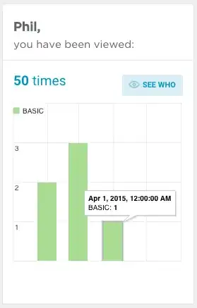
When the user hovers over one of the columns you see detail in a tooltip e.g. "April 1, 2015 12:00:00 AM" - is there any way to format this tooltip into something more user-friendly? e.g. "April 2015"
Keen.ready(function() {

        var query = new Keen.Query('count', {
            'eventCollection' : 'profile_views',
            'timeframe' : 'this_4_months',
            'interval' : 'monthly',
            'groupBy' : 'view.membership_type',
            'filters' : [
                {
                    'property_name' : 'view.user_id',
                    'operator' : 'eq',
                    'property_value' : String(user_id)
                }
            ]
        });

        client.draw(query, document.getElementById(element_id), {
            chartType: 'columnchart',
            width : graph_width,
            height : 250,
            colors : ['#abdd99', '#8dc7d9', '#eeeeee'],
            colorMapping : {
                'pro' : '#abdd99',
                'basic' : '#8dc7d9'
            },
            labelMapping: {
                "basic": "BASIC",
                "pro": "PRO"
            },
            title : '',
            chartOptions: {
                width : '100%',
                height : '100%',
                isStacked: true,
                fontName : 'Helvetica',
                fontSize : '11px',
                chartArea : {
                    left : '10px',
                    top : '0',
                    width : '90%',
                    height : '90%'
                },
                axisTitlesPosition : 'in',
                vAxis : {
                    viewWindowMode : 'pretty',
                    gridlines : { color : '#eeeeee' },
                    baselineColor : '#eeeeee',
                    textPosition : 'in'
                },
                hAxis : {
                    viewWindowMode : 'pretty',
                    gridlines : {
                        color : '#eeeeee'
                    },
                    baselineColor : '#eeeeee',
                    textPosition : 'none'
                },
                legend : {
                    position : 'in'
                },
                titlePosition : 'none'
            }
        });

    });
Here is a screenshot of how the tooltip appears :