2

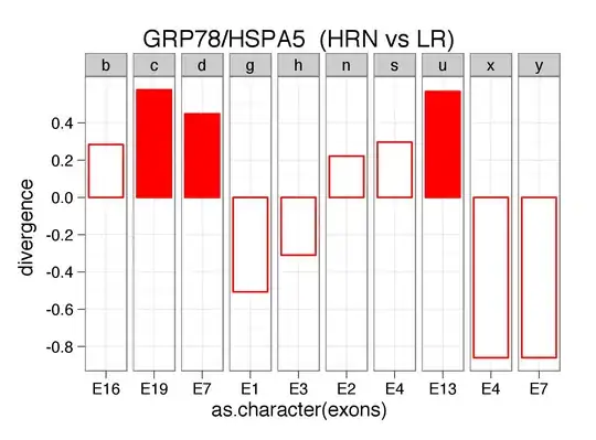
I'm superimposing two images in R. One image is a boxplot (using boxplot()), the other a scatterplot (using scatterplot()). I noticed a discrepancy in the scale along the x-axis. (A) is the boxplot scale. (B) is for the scatterplot.

enter image description here

What I've been trying to do is re-scale (B) to suit (A). I note there is a condition called xlim in scatterplot. Tried it, didn't work. I've also noted this example came up as I was typing out the question: Change Axis Label - R scatterplot.

Tried it, didn't work.

How can I modify the x-axis to change the scale from 1.0, 1.5, 2.0, 2.5, 3.0 to simply 1,2,3.

In Stata, I'm aware you can specify the x-axis range, and then indicate the step-ups between. For example, the range may be 0-100, and each measurable point would be set to 10. So you'd end up with 10, 20,....,100.

My R code, as it stands, looks something like this:

library(car)
boxplot(a,b,c) 
par(new=T)
scatterplot(x, y, smooth=TRUE, boxplots=FALSE) 

I've tried modifying scatterplot as such without any success:

scatterplot(x, y, smooth=TRUE, boxplots=FALSE, xlim=c(1,3))
Community
  • 1
  • 1
user2722253
  • 93
  • 1
  • 3
  • 8
  • 1
    Could you give a [reproducible example](http://stackoverflow.com/questions/5963269/how-to-make-a-great-r-reproducible-example/5963610#5963610)? – Jaap May 20 '15 at 07:22
  • Hi Jaap. Edited the question. Just trying to get rid of those nasty halves. – user2722253 May 20 '15 at 07:29
  • A `dput` of (a part of) your data would be nice. – Jaap May 20 '15 at 07:30
  • Won't be able to do that, unfortunately. Long story. But the data contains only 1s, 2s, and 3s, so I'm unsure why R is choosing to add the halves. But here's the Stata example I was referring to. xlabel(1920(20)1980). The (20) in the center suggests that each interval should be separated by 20. So you'd have 1920, 40, 60, 80. I'm looking for an R equivalent of that. – user2722253 May 20 '15 at 07:37
  • 2
    In that case you might want to change the viariable to a factor with `as.factor`. – Jaap May 20 '15 at 07:40
  • 2
    It may help to put your `xlim` flag in both boxplot and scatterplot. It is however difficult to test without data example. – Ruthger Righart May 20 '15 at 07:47
  • Jaap - Tried your suggestion. Returned an error. Tried Ruthger's suggestion. Worked. Many thanks, guys! – user2722253 May 20 '15 at 07:57

1 Answers1

4

As mentioned in comments use as.factor, then xaxis should align. Here is ggplot solution:

#dummy data
dat1 <- data.frame(group=as.factor(rep(1:3,4)),
                   var=c(runif(12)))
dat2 <- data.frame(x=as.factor(1:3),y=runif(3))


library(ggplot2)
library(grid)
library(gridExtra)

#plot points on top of boxplot
ggplot(dat1,aes(group,var)) +
  geom_boxplot() +
  geom_point(aes(x,y),dat2)

enter image description here

Plot as separate plots

gg_boxplot <- 
      ggplot(dat1,aes(group,var)) +
      geom_boxplot()

gg_point <- 
  ggplot(dat2,aes(x,y)) +
  geom_point()

grid.arrange(gg_boxplot,gg_point,
             ncol=1,
             main="Plotting is easier with ggplot")

enter image description here

EDIT Using xlim as suggested by @RuthgerRighart

#dummy data - no factors
dat1 <- data.frame(group=rep(1:3,4),
                   var=c(runif(12)))
dat2 <- data.frame(x=1:3,y=runif(3))

par(mfrow=c(2,1))
boxplot(var~group,dat1,xlim=c(1,3))
plot(dat2$x,dat2$y,xlim=c(1,3))

enter image description here

zx8754
  • 52,746
  • 12
  • 114
  • 209
  • True, but it doesn't give me /exactly/ what I'm after, which is why I resorted to superimposing boxplot and scatterplots. Ruthger's suggestion of simply using xlim variable in both boxplot and scatterplot fixed it. Thanks for the response. Much appreciated. – user2722253 May 20 '15 at 08:03
  • @user2722253 updated with `xlim` solution. To get "exactly what you are after" provide reproducible data and/or expected image of a plot. – zx8754 May 20 '15 at 08:16