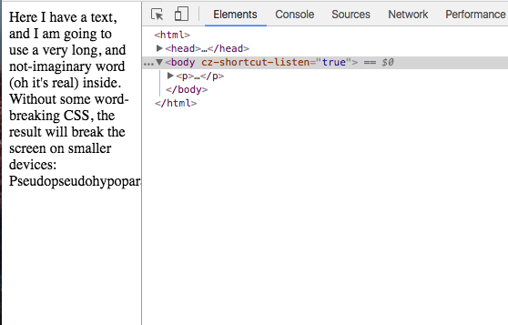
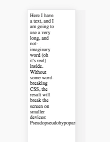
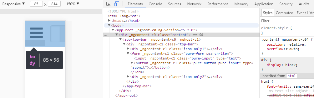
If I open my (GWT) page in a normal browser, everything works fine. The body takes the whole width and the content is nicely centered. But if I try this on a mobile phone, the body does not take the whole width and therefore the content is not centered.
I couldn't find out why it is being displayed like this. Also, adding 100% width to body and html tag does not solve the issue .
Is there a way to get this working nicely on a mobile device?
The page can be reached under: http://www.vegantastic.de/
