9

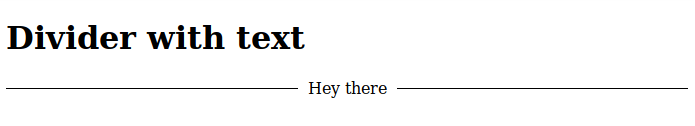
Using Angular Material, I'm trying to create a horizontal line with a word in the middle. Something pretty similar to the one displayed here.

I've tried this and it's close but I'd like the lines to be vertically aligned to the middle of the word or.

<div layout="row" layout-align="center start">
  <md-divider flex></md-divider>
  <div style="flex: 0 1 auto;">or</div>
  <md-divider flex></md-divider>
</div>

http://jsfiddle.net/devotis/a7m6xrwy/

I guess, I need styled <hr>'s left and right. How can I improve this code and remain within the ways of Angular Material?

Christiaan Westerbeek
  • 10,619
  • 13
  • 64
  • 89
  • 2
    Possible duplicate - http://stackoverflow.com/questions/23584120/line-separator-under-text-and-transparent-background – Paulie_D May 25 '15 at 20:26

4 Answers4

11

A nice way to do it is to use the layout="row" along with flex.

<span layout="row"><hr flex/>or<hr flex/></span>

JS fiddle applying this idea to the button text: http://jsfiddle.net/a7m6xrwy/1/

You can style the hr attribute with css. The md-divider directive isn't meant to be used this way, so there is no reason to try and force it. If you wish to use a directive to solve this issue, you will have to write your own md-divider directive which takes the display text as a parameter.

soote
  • 3,240
  • 1
  • 23
  • 34
10

Here is a solution using material's mat-divider:

<h1>Divider with text</h1>

<div class="container">
  <div class="line"><mat-divider></mat-divider></div>
  <div class="text mat-typography">Hey there</div>
  <div class="line"><mat-divider></mat-divider></div>
</div>
.container {
  width: 100%;
  display: flex;
  flex-direction: row;
  justify-content: center;
  align-items: center;
}

.line {
  flex: 1;
}

.text {
  padding-left: 10px;
  padding-right: 10px;
}

The result will look like this:

enter image description here

rkrishnan
  • 776
  • 1
  • 9
  • 21
6

For people using angular material 2 and flex-layout, here's my solution. Not entirely satisfactory, but it does the trick.

<div fxLayout="row" fxLayoutAlign="space-between center" fxLayoutGap="5px">
  <mat-divider fxFlex="1 0"></mat-divider>
  <div>or</div>
  <mat-divider fxFlex="1 0"></mat-divider>
</div>
David Bulté
  • 2,988
  • 3
  • 31
  • 43
0

This would work like a charm.

<mat-divider style="width: 40%; display: inline-block;"></mat-divider>
<span style="padding: 20px; font-weight: 500;">Or</span>
<mat-divider style="width: 40%; display: inline-block;"></mat-divider>

PS: You may extract the inline styles into meaningful CSS classes. Avoided it here for brevity.

Output:

Output