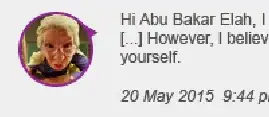
You could use a pseudo element in order to create your speech bubble triangle, as shown in the demo below.
This works by using a skew on a square, and position it absolutely within a relatively positioned container element.
Alternatively, this could be achieved with a single element if you were able to use the background-image instead of an image tag.
.circ {
  height: 100px;
  width: 100px;
  border-radius: 50%;
  bordeR: 5px solid tomato;
  position: relative;
}
.circ img {
  position: absolute;
  top: 0;
  left: 0;
  height: 100%;
  width: 100%;
  border-radius: 50%;
}
.circ:before{
  content:"";
  position:absolute;
  top:10%;
  right:0;
  height:20px;
  width:20px;
  background:tomato;
  transform:skewX(55deg) skewY(10deg);
  }
<div class="circ">
  <img src="https://i.stack.imgur.com/lCp2t.png" />
</div>
for more info in generating the triangle, you may find this quite a useful demonstration of how to achieve this triangle.
Background-image
By using a background-image instead, you can make this with only a single element.
.circ {
  position: relative;
  height: 100px;
  width: 100px;
  border-radius: 50%;
  border: 5px solid tomato;
  background:url(https://i.stack.imgur.com/lCp2t.png);
  background-size:100% 100%;
}
.circ:before{
  content:"";
  position:absolute;
  top:10%;
  right:0;
  height:20px;
  width:20px;
  background:tomato;
  transform:skewX(55deg) skewY(10deg);
  z-index:-1;
  }
<div class="circ"></div>


