3

I have something like

import matplotlib.pyplot as plt
import numpy as np

a=[0.05, 0.1, 0.2, 1, 2, 3]
plt.hist((a*2, a*3), bins=[0, 0.1, 1, 10])
plt.gca().set_xscale("symlog", linthreshx=0.1)
plt.show()

which gives me the following plot: log histogram

As one can see, the bar width is not equal. In the linear part (from 0 to 0.1), everything is find, but after this, the bar width is still in linear scale, while the axis is in logarithmic scale, giving me uneven widths for bars and spaces in between (the tick is not in the middle of the bars).

Is there any way to correct this?

Community
  • 1
  • 1
JonathanK
  • 827
  • 1
  • 6
  • 23

4 Answers4

2

Inspired by https://stackoverflow.com/a/30555229/635387 I came up with the following solution:

import matplotlib.pyplot as plt
import numpy as np

d=[0.05, 0.1, 0.2, 1, 2, 3]


def LogHistPlot(data, bins):
    totalWidth=0.8
    colors=("b", "r", "g")
    for i, d in enumerate(data):
        heights = np.histogram(d, bins)[0]
        width=1/len(data)*totalWidth
        left=np.array(range(len(heights))) + i*width

        plt.bar(left, heights, width, color=colors[i], label=i)
        plt.xticks(range(len(bins)), bins)
    plt.legend(loc='best')

LogHistPlot((d*2, d*3, d*4), [0, 0.1, 1, 10])

plt.show()

Which produces this plot: Correct logarithmic histogram with multiple datasets

The basic idea is to drop the plt.hist function, compute the histogram by numpy and plot it with plt.bar. Than, you can easily use a linear x-axis, which makes the bar width calculation trivial. Lastly, the ticks are replaced by the bin edges, resulting in the logarithmic scale. And you don't even have to deal with the symlog linear/logarithmic botchery anymore.

Community
  • 1
  • 1
JonathanK
  • 827
  • 1
  • 6
  • 23
  • Good idea; I didn't think of simply changing the tick labels to solve the problem. – Praveen Jun 01 '15 at 00:27
  • Thanks for the solution, it's amazing. One important detail: `plt.bar` requires the flag `align = 'edge` to work in the current version of Matplotlib. I just learned this the hard way hahaha. – C-3PO Oct 05 '21 at 15:23
1

You could use histtype='stepfilled' if you are okay with a plot where the data sets are plotted one behind the other. Of course, you'll need to carefully choose colors with alpha values, so that all your data can still be seen...

a = [0.05, 0.1, 0.2, 1, 2, 3] * 2
b = [0.05, 0.05, 0.05, 0.15, 0.15, 2]
colors = [(0.2, 0.2, 0.9, 0.5), (0.9, 0.2, 0.2, 0.5)]  # RGBA tuples
plt.hist((a, b), bins=[0, 0.1, 1, 10], histtype='stepfilled', color=colors)
plt.gca().set_xscale("symlog", linthreshx=0.1)
plt.show()

I've changed your data slightly for a better illustration. This gives me: Results

For some reason the overlap color seems to be going wrong (matplotlib 1.3.1 with Python 3.4.0; Is this a bug?), but it's one possible solution/alternative to your problem.

Praveen
  • 6,872
  • 3
  • 43
  • 62
  • This is certainly a good solution in some cases, especially if one dataset is strictly above the other. However I have often very similar values which are very hard to distinguish in such a plot. – JonathanK May 31 '15 at 11:04
1

Okay, I found out the real problem: when you create the histogram with those bin-edge settings, the histogram creates bars which have equal size, and equal outside-spacing on the non-log scale.

To demonstrate, here's a zoomed-in version of the plot in the question, but in non-log scale: hist-non-log

Notice how the first two bars are centered around (0 + 0.1) / 2 = 0.05, with a gap of 0.1 / 10 = 0.01 at the edges, while the next two bars are centered around (0.1 + 1.0) / 2 = 0.55, with a gap of 1.1 / 10 = 0.11 at either edge.

When converting things to log scale, bar widths and edge widths all go for a huge toss. This is compounded further by the fact that you have a linear scale from 0 to 0.1, after which things become log-scale.

I know no way of fixing this, other than to do everything manually. I've used the geometric means of the bin-edges in order to compute what the bar edges and bar widths should be. Note that this piece of code will work only for two datasets. If you have more datasets, you'll need to have some function that fills in the bin-edges with a geometric series appropriately.

import numpy as np
import matplotlib.pyplot as plt

def geometric_means(a):
    """Return pairwise geometric means of adjacent elements."""
    return np.sqrt(a[1:] * a[:-1])

a = [0.05, 0.1, 0.2, 1, 2, 3] * 2
b = [0.05, 0.1, 0.2, 1, 2, 3] * 3

# Find frequencies
bins = np.array([0, 0.1, 1, 10])
a_hist = np.histogram(a, bins=bins)[0]
b_hist = np.histogram(b, bins=bins)[0]

# Find log-scale mid-points for bar-edges
mid_vals = np.hstack((np.array([0.05,]), geometric_means(bins[1:])))

# Compute bar left-edges, and bar widths
a_x = np.empty(mid_vals.size * 2)
a_x = bins[:-1]
a_widths = mid_vals - bins[:-1]

b_x = np.empty(mid_vals.size * 2)
b_x = mid_vals
b_widths = bins[1:] - mid_vals

plt.bar(a_x, a_hist, width=a_widths, color='b')
plt.bar(b_x, b_hist, width=b_widths, color='g')

plt.gca().set_xscale("symlog", linthreshx=0.1)
plt.show()

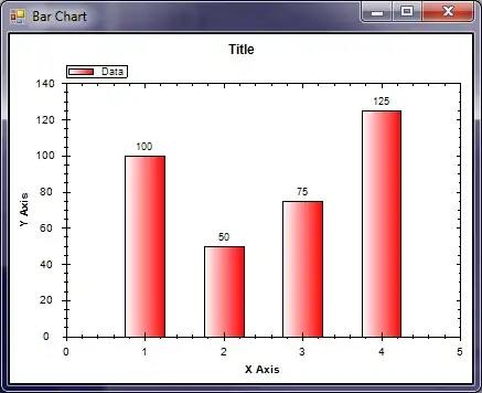
And the final result: final-result

Sorry, but the neat gaps between the bars get killed. Again, this can be fixed by doing the appropriate geometric interpolation, so that everything is linear on log-scale.

Praveen
  • 6,872
  • 3
  • 43
  • 62
  • Hm, this works, but is pretty complicated. However, I really liked the idea of using numpy.histogram and pyplot.bar instead just pyplot.hist. It inspired me for a somewhat simpler and more extensible solution: http://stackoverflow.com/a/30556906/635387 – JonathanK May 31 '15 at 11:51
0

Just in case someone stumbles upon this problem: This solution looks much more like the way it should be

plotting a histogram on a Log scale with Matplotlib

tmechsner
  • 31
  • 1
  • 5