8

I thought this would be simple but it's proving to be a bit of a headache. I'm trying to get a grid of images to re-center when the user resizes the browser and causes one (or more) of them to wrap onto the next line.

I've tried giving the grid-wrapper display:inline-block; and it's parent a value of text-align: center; but this doesn't re-center the elements when they wrap to a new line. Help appreciated.

For a visual of what I'm trying to achieve view picture here
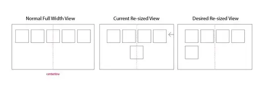
(source: ianclarke.ca)
.

HTML:

<div class="parent-wrapper">
    <div class="child-wrapper">
        <!-- Worpress loop to load many thumnails -->
        <?php if(have_posts()) : ?><?php while(have_posts()) : the_post(); ?>
        <div class="project-thumbnail">
        <?php the_post_thumbnail('thumbnail'); ?>
        </div>
        <?php endwhile; ?>
    </div>
</div>

CSS:

.parent-wrapper
{
width:100%;
text-align: center;
}

.child-wrapper
{
display:inline-block;
}

.project-thumbnail{
float:left;
border:2px solid black;
min-width: 269px;
max-width: 269px;
}
Glorfindel
  • 21,988
  • 13
  • 81
  • 109
Ian Clarke
  • 83
  • 5
  • Why not `width: 269px`? – Adam Jenkins Jun 09 '15 at 16:41
  • 1
    You will need to put `.child-wrapper` within the each loop to have it copied to each child. or give `display: inline-block;` to `.project-thumbnail` and ditch out `.child-wrapper` – Nico O Jun 09 '15 at 16:45
  • Your screenshot is not correct based on the code you have, the last item should be in the center or almost center. i.e. http://jsfiddle.net/6qp5g8yd/ – Stickers Jun 09 '15 at 16:51
  • @Adam - yes doh! @ Nico O - I think I tried that before but will try again. @ sdcr - the visual represents the ideal scenario, where wrapped thumbnails would still be left aligned. Perhaps I need to add another wrapper? – Ian Clarke Jun 09 '15 at 16:57
  • @ian-clarke - this is one of the best question description I have see in recent times. It has a Problem Statement + Description + Visuals + Code. Perfect composition of the problem and desired result. :) Cheers :) – Pralhad Narsinh Sonar Jun 09 '15 at 17:00
  • I think you just need to update the current resize view image, which isn't correct. But I understood what you want to have. Is jQuery being considered? – Stickers Jun 09 '15 at 17:00
  • After implementing @Nico's idea… we are getting there. All elements are now centering correctly – so if a single thumbnail is on the second row, it's positioned in the middle. My dream is to have it aligned to the left while the whole grid of images is centered. – Ian Clarke Jun 09 '15 at 17:05
  • Using JavaScript (most likely by sizing `.child-wrapper` on resize), and your current CSS that you have posted with your question, is the only solution to get that *orphaned* element positioned to the left. It can't be done with the current CSS spec any other way. – Adam Jenkins Jun 09 '15 at 17:06
  • @Adam that's what it looks like. TW posted a JS option that I'm trying out. – Ian Clarke Jun 09 '15 at 17:19

4 Answers4

1

I found a very similar question with two functional answers. One uses JS and the other uses placeholder elements. Neither are very pretty, but both appear to work around the inline-block whitespace wrap problem here.

Shrink-wrap and center a container for inline-block elements

Community
  • 1
  • 1
TW-
  • 33
  • 5
  • These are sounding like the only true way to achieve this :( I will try the JS way and let you know if I can get it to work. – Ian Clarke Jun 09 '15 at 17:16
1

This is the best solution I can think of with CSS only, the magic part is the @media queries. Obviously you'll have to do the math to fit your case.

JsFiddle Demo

body {
    margin: 0;
}
.parent-wrapper {
    margin: auto;
    width: 500px;
    padding: 5px 0;
    font-size: 0;
}
.child-wrapper {
    display: inline-block;
    width: 100px;
    font-size: 16px;
}
.child-wrapper img {
    max-width: 100%;
    height: auto;
    padding: 5px;
    vertical-align: top;
    box-sizing: border-box;
}
@media screen and (max-width: 499px) {
    .parent-wrapper { width: 400px; }
}
@media screen and (max-width: 399px) {
    .parent-wrapper { width: 300px; }
}
@media screen and (max-width: 299px) {
    .parent-wrapper { width: 200px; }
}
@media screen and (max-width: 199px) {
    .parent-wrapper { width: 100px; }
}
<div class="parent-wrapper">
    <div class="child-wrapper">
        <img src="//dummyimage.com/100" />
    </div>
    <div class="child-wrapper">
        <img src="//dummyimage.com/100" />
    </div>
    <div class="child-wrapper">
        <img src="//dummyimage.com/100" />
    </div>
    <div class="child-wrapper">
        <img src="//dummyimage.com/100" />
    </div>
    <div class="child-wrapper">
        <img src="//dummyimage.com/100" />
    </div>
    <div class="child-wrapper">
        <img src="//dummyimage.com/100" />
    </div>
</div>
Stickers
  • 75,527
  • 23
  • 147
  • 186
  • Thanks. I'm going to try it out now. I'll probably end up with a few breakpoints but it's a lot cleaner than invisible placeholders. – Ian Clarke Jun 09 '15 at 18:20
  • I went with this solution as I could automate it pretty quickly in SASS and it involved no extra elements. Thanks. – Ian Clarke Jun 09 '15 at 19:17
0

Have you tried:

.child-wrapper{margin:0 auto;}

So it stays centered? It usually works.

Corbac
  • 95
  • 2
  • 8
  • Thanks. I tried that, but no luck. The child-wrapper does "shrink to fit" the thumbnails, but once a thumbnail wraps to the next line the child div takes on the width of the parent div. – Ian Clarke Jun 09 '15 at 16:48
0

Please add float:left to class .project-thumbnail for the browser breakpoints specific to different browser / screen/device sizes.

.project-thumbnail{
    float:left;
    border:2px solid black;
    min-width: 269px;
    max-width: 269px;
}

Add margin: 0, auto; to following class.

.child-wrapper
{
    margin: 0, auto;
}

Going through the PHP code I understood that the DIV with the class name .project-thumbnail gets repeated through WHILE loop iterations.

Pralhad Narsinh Sonar
  • 1,406
  • 1
  • 14
  • 23
  • My apologies, project-thumbnail does have a float:left attribute, I was editing out unnecessary styles to keep the question clear and deleted that one by accident. I have a wireframe visual of the page at the top to give you a sense of what I'm trying to achieve. – Ian Clarke Jun 09 '15 at 16:52
  • Ok. Nice to see your concern of cleaning the code before you post it here. I appreciate it. :) . Have also included the `margin:0 auto;` to `.child-wrapper` class??? – Pralhad Narsinh Sonar Jun 09 '15 at 16:58
  • I tried that with no luck, right now what's (almost) working is the the old parent - text:aligned center and child - display:inline-block trick. However my thumbnails that wrap to a new line are center aligned. I'd like them to be left aligned. – Ian Clarke Jun 09 '15 at 17:11