Here is a screenshot of my dataset:

Here's what it's about: Imagine that you work in a delivery company and, for some reason, the package fails to be delivered to the client. The distribution of the number of packages returned changes according to the monetary value of the package, which is the first variable of the dataset (Levels). So, column B represents the distribution of all packages sold by the company last month, grouped by the value of the package. The last column, C, represents the distribution of packages that failed to be delivered because of some criteria (say, dangerous neighborhood) .
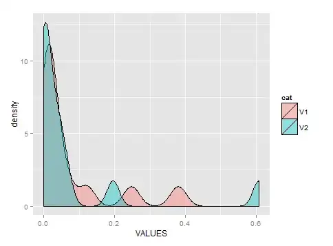
What I want to visually show is that this specific criteria is so important that it changes the distribution of the data. I used Excel to calculate those percentages from the raw data because I'm not allowed to install R at work.
I've done the following plot by doing some data wrangling, but I guess I could do better if I knew how:
Edit: I was told to post a dput version of the dataset:
structure(list(Levels = structure(c(6L, 11L, 12L, 13L, 1L, 2L,
3L, 4L, 5L, 7L, 8L, 9L, 10L), .Label = c("Less than $1000", "Less than $1200",
"Less than $1400", "Less than $1600", "Less than $1800", "Less than $200",
"Less than $2000", "Less than $2200", "Less than $2400", "Less than $2600",
"Less than $400", "Less than $600", "Less than $800"), class = "factor"),
    X.ofTotal = c(0.3802, 0.2475, 0.1218, 0.0664, 0.0409, 0.0247,
    0.0178, 0.016, 0.0099, 0.0109, 0.0061, 0.0063, 0.0063), X..ofTotalWithSomeCriteria = c(0.6087,
    0.1957, 0.0652, 0.0435, 0, 0.0217, 0, 0, 0.0435, 0.0217,
    0, 0, 0)), .Names = c("Levels", "X.ofTotal", "X..ofTotalWithSomeCriteria"
), class = "data.frame", row.names = c(NA, -13L))
>