0

Following the TutsPlus Power Up Your Portfolio With Bootstrap tutorial.

Trying to implement a 3 column portfolio with Bootstrap 3's col-sm-4 class , to get something like: enter image description here

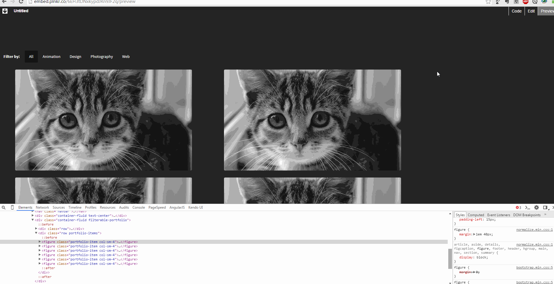
Instead, here is what I get: enter image description here

And here is what I get when I zoom out: enter image description here

HTML code:

<!doctype html>
<html class="no-js" lang="">
    <head>
        <meta charset="utf-8">
        <meta http-equiv="x-ua-compatible" content="ie=edge">
        <title></title>
        <meta name="description" content="">
        <meta name="viewport" content="width=device-width, initial-scale=1">

        <link rel="apple-touch-icon" href="apple-touch-icon.png">
        <!-- Place favicon.ico in the root directory -->
        <link rel="stylesheet" href="bower_components/bootstrap/dist/css/bootstrap.min.css">
        <link rel="stylesheet" href="css/normalize.css">
        <link rel="stylesheet" href="css/style.css">

        <script src="js/vendor/modernizr-2.8.3.min.js"></script>
    </head>
    <body>
        <!--[if lt IE 8]>
            <p class="browserupgrade">You are using an <strong>outdated</strong> browser. Please <a href="http://browsehappy.com/">upgrade your browser</a> to improve your experience.</p>
        <![endif]-->

        <!-- Add your site or application content here -->
<nav class="navbar">
  <div class="container-fluid">
    <!-- Brand and toggle get grouped for better mobile display -->
    <div class="navbar-header">
      <button type="button" class="navbar-toggle collapsed" data-toggle="collapse" data-target="#bs-example-navbar-collapse-1">
        <span class="sr-only">Toggle navigation</span>
        <span class="icon-bar"></span>
        <span class="icon-bar"></span>
        <span class="icon-bar"></span>
      </button>
      <a class="navbar-brand" href="#">Red Beluga</a>
    </div>

    <!-- Collect the nav links, forms, and other content for toggling -->
    <div class="collapse navbar-collapse" id="bs-example-navbar-collapse-1">
      <ul class="nav navbar-nav navbar-right">
        <li><a href="home.html">Home</a></li>
        <li><a href="blog.html">Blog</a></li>
        <li><a href="contact.html">Contact</a></li>
      </ul>
    </div><!-- /.navbar-collapse -->
  </div><!-- /.container-fluid -->
</nav>

<div class="container-fluid text-center">
  <div class="jumbotron">
    <div class="row">
        <div class="col-md-10 col-md-offset-1">
            <h1>Hello, welcome to Red Beluga's lab.</h1>
            <p class="lead">
                We build simple web apps.
            </p>
        </div>
    </div>
  </div>
</div>

<div class="container-fluid filterable-portfolio">
    <div class="row">
        <div class="col-md-12">
            <ul class="nav nav-pills">
              <li class="portfolio-title">Filter by:</li>
              <li role="presentation" class="active"><a href="#">All</a></li>
              <li role="presentation"><a href="#">Animation</a></li>
              <li role="presentation"><a href="#">Design</a></li>
              <li role="presentation"><a href="#">Photography</a></li>
              <li role="presentation"><a href="#">Web</a></li>
            </ul>
        </div>
    </div>

    <div class="row portfolio-items">
        <figure class="portfolio-item col-sm-4">
            <a href="#">
                <img src="http://placekitten.com/700/400" class="img-responsive">
            </a>
        </figure>
        <figure class="portfolio-item col-sm-4">
            <a href="#">
                <img src="http://placekitten.com/701/400" class="img-responsive">
            </a>
        </figure>
        <figure class="portfolio-item col-sm-4">
            <a href="#">
                <img src="http://placekitten.com/700/400" class="img-responsive">
            </a>
        </figure>
        <figure class="portfolio-item col-sm-4">
            <a href="#">
                <img src="http://placekitten.com/701/400" class="img-responsive">
            </a>
        </figure>

    </div>

</div>

        <script src="https://ajax.googleapis.com/ajax/libs/jquery/1.11.3/jquery.min.js"></script>
        <script>window.jQuery || document.write('<script src="js/vendor/jquery-1.11.3.min.js"><\/script>')</script>
        <script src="bower_components/bootstrap/dist/js/bootstrap.min.js"></script>
        <script src="js/plugins.js"></script>
        <script src="js/main.js"></script>

        <!-- Google Analytics: change UA-XXXXX-X to be your site's ID. -->
        <script>
            (function(b,o,i,l,e,r){b.GoogleAnalyticsObject=l;b[l]||(b[l]=
            function(){(b[l].q=b[l].q||[]).push(arguments)});b[l].l=+new Date;
            e=o.createElement(i);r=o.getElementsByTagName(i)[0];
            e.src='https://www.google-analytics.com/analytics.js';
            r.parentNode.insertBefore(e,r)}(window,document,'script','ga'));
            ga('create','UA-XXXXX-X','auto');ga('send','pageview');
        </script>
    </body>
</html>

CSS code:

@import 'main.css';
@import url(http://fonts.googleapis.com/css?family=Source+Sans+Pro:300,400,700);
@import url(http://fonts.googleapis.com/css?family=Abril+Fatface);

html{
    background: #222 url(../img/abstract-bg.svg) bottom right no-repeat;
    height: 100%;
    background-attachment: fixed;
    overflow-y: scroll;
}

body{
    background: none;
    line-height: 1.5;
    color: #F5F5F5;
    font-family: 'Source Sans Pro', sans-serif;
}

h1, h2, h3, h4, h5, h6 {
    font-family: 'Abril Fatface', cursive;
    margin-top: 0;
}

p {
    margin-bottom: 1rem;
}

.navbar-brand, .navbar-nav>li>a{
    color: #F5F5F5;
    font-weight: bold;
}

.navbar-brand:hover, .navbar-nav>li>a:hover{
    color: #F5F5F5;
    font-weight: bold;
    background: none;
}

.navbar-nav>li>a:after{
    content: '/';
    margin-left: 30px;
}

.navbar-nav>li:last-child>a:after{
    content: '';
}

.navbar-toggle{
    background: #111;
}

.navbar-toggle .icon-bar{
    background: #F5F5F5;
}

@media (max-width: 768px) {
    .navbar-nav>li>a:after{
    content: '';
}
    .navbar-nav>li>a{
        background: #111;
        border-radius: 4px;
        margin-bottom: 3px;
    }
}

.container .jumbotron, .container-fluid .jumbotron{
    padding-left: 0;
    padding-right: 0;
}

.jumbotron{
    background: none;
    margin-top: 75px;
    margin-bottom: 75px;
}

.jumbotron h1 {
    font-size: 120px;
}

.jumbotron .lead {
    font-size: 32px;
}

@media (max-width: 992px) {
    .jumbotron h1{
        font-size: 72px;
    }
}

@media (max-width: 768px) {
    .jumbotron h1{
        font-size: 40px;
    }
    .jumbotron .lead {
    font-size: 20px;
}
}

.portfolio-title{
    padding: 10px 15px 10px 0px;
    font-weight: bold;
}

.nav-pills>li.active>a, .nav-pills>li.active>a:focus, .nav-pills>li.active>a:hover {
  color: #F5F5F5;
  background: #111;
}

.nav-pills a {
    color: #F5F5F5;
    margin-bottom: 1rem;
}

.nav>li>a:focus, .nav>li>a:hover{
    background: none;
}

.portfolio-item {
    margin-bottom: 1rem;
}

.portfolio-item img{
    -webkit-filter: grayscale(100%);
    filter: grayscale(100%);
    border-radius: 4px;
}

.portfolio-item:hover img{
    -webkit-filter: grayscale(50%);
    filter: grayscale(50%);
}

.filterable-portfolio{
    margin-bottom: 3rem;
}

Any idea what I am doing wrong?

Thibaud Clement
  • 6,607
  • 10
  • 50
  • 103

5 Answers5

1

you need to wrap col-sm-4 in rows,

change this part and use rows every 3 col-sm-4 as wrappers;
the grid uses as 12th system column, check bootstrap grid

<div class="row portfolio-items">
        <figure class="portfolio-item col-sm-4">
            <a href="#">
                <img src="http://placekitten.com/700/400" class="img-responsive">
            </a>
        </figure>
        <figure class="portfolio-item col-sm-4">
            <a href="#">
                <img src="http://placekitten.com/701/400" class="img-responsive">
            </a>
        </figure>
        <figure class="portfolio-item col-sm-4">
            <a href="#">
                <img src="http://placekitten.com/700/400" class="img-responsive">
            </a>
        </figure>
        <figure class="portfolio-item col-sm-4">
            <a href="#">
                <img src="http://placekitten.com/701/400" class="img-responsive">
            </a>
        </figure>

    </div>

to:

<div class="row portfolio-items">
        <figure class="portfolio-item col-sm-4">
            <a href="#">
                <img src="http://placekitten.com/700/400" class="img-responsive">
            </a>
        </figure>
        <figure class="portfolio-item col-sm-4">
            <a href="#">
                <img src="http://placekitten.com/701/400" class="img-responsive">
            </a>
        </figure>
        <figure class="portfolio-item col-sm-4">
            <a href="#">
                <img src="http://placekitten.com/700/400" class="img-responsive">
            </a>
        </figure>
   </div><!-- closing first row -->
  <div class="row portfolio-items">
        <figure class="portfolio-item col-sm-4">
            <a href="#">
                <img src="http://placekitten.com/701/400" class="img-responsive">
            </a>
        </figure>
        <figure class="portfolio-item col-sm-4">
            <a href="#">
                <img src="http://placekitten.com/700/400" class="img-responsive">
            </a>
        </figure>
        <figure class="portfolio-item col-sm-4">
            <a href="#">
                <img src="http://placekitten.com/701/400" class="img-responsive">
            </a>
        </figure>
       </div><!-- closing sec row -->
    </div>
maioman
  • 18,154
  • 4
  • 36
  • 42
1

Your problem lies in the styling being applied to the figure tag element by the normalize.css (some additional margins in the variety of 1em for margin-top and 40px for margin-right, causing your content to be wider than Bootstrap's 33.3% width for the col-sm-4 divs). Either switch your figure elements to divs or provide a superseding value to the figure tags that eliminates the behavior applied by normalize. Here's what I mean:

demonstration of figure styles from normalize

[Edit] For a better view of the gif, check it out in a different tab. I captured it at a higher resolution than looks good here.

Here's the link to the plnkr I generated from the above code.

The reason AngularJR's answer works is because he didn't just use a CDN of Bootstrap, he also shuffled the order the CSS loads in, by placing Bootstrap's CSS after the normalize.css, making it inherit Bootstrap's last (and superseding). [/Edit]

Eric McCormick
  • 2,716
  • 2
  • 19
  • 37
  • Hi there Eric, I thought you had found the answer here. So I added a cdn to pull in normalize.css. But it had no impact. In my first post I only added a Bootstrap cdn, yes below the other css links. But none of the links another Bootstrap worked as they did not link any where. Take look at my edit at the second fiddle. It has the normalize below the Bootstrap. What's you thoughts.. issue with his custom css? – AngularJR Jun 15 '15 at 21:31
  • I would remove normalize entirely, as it's what's causing the issue. [Here's a link to an SO answer on the subject](http://stackoverflow.com/questions/18286189/should-i-use-normalize-css-in-my-bootstrap-project/18286291#18286291) (under Bootstrap 2.3, but still valid). The fact that it's being loaded from a CDN is immaterial; what matters is that your answer moved it above Bootstrap's CSS, making Bootstrap win out (in an unnecessary battle). – Eric McCormick Jun 15 '15 at 21:39
  • Hi, Yes, remove the normalize. Eric, none of the css links above the Bootstrap.css worked. As they could not have any path to link too. Try this in my first fiddle remove all the css link above the Bootstrap css. This is why I couldn't see what you found. There must be something else here. – AngularJR Jun 15 '15 at 21:50
  • The plnkr was to show how things were interacting, not replace the OP's code. – Eric McCormick Jun 15 '15 at 22:23
  • Thank you very much @EricMcCormick. Your gif is a really good way of illustrating what you mean. And you were right, as soon as I shuffled the order of the CSS loads, placing normalize.css AFTER bootstrap's css, it worked. – Thibaud Clement Jun 16 '15 at 01:10
  • @ThibaudClement I'm glad it helped. I would highlight that the need for normalize.css is probably negligible, and you could probably just do away with it (as Bootstrap has its own implementation). In any case, the "picture is worth a thousand words" adage is one I believe in ;-) – Eric McCormick Jun 16 '15 at 01:37
0

you need to set your col-sm-4 div's into another col-md-12 div otherwise it will be setting 33.3% of your total page width and make everything look goofy.

Adam Buchanan Smith
  • 9,422
  • 5
  • 19
  • 39
  • Thanks @Adam Buchanan Smith. I agree, this would be the correct way of doing it, but I did not understand why it was working in the tutorial, and not on my computer. Just an issue of CSS loads order apparently. Anyway, thanks. – Thibaud Clement Jun 16 '15 at 01:11
0

The markup for a 3 column layout is:

<div class="row>
    <div class="col-md-4">...cat1...</div>
    <div class="col-md-4">...cat2...</div>
    <div class="col-md-4">...cat3...</div>
</div>
<div class="row>
    <div class="col-md-4">...professor puddinpop...</div>
    <div class="col-md-4">...colonel snazzypants...</div>
    <div class="col-md-4">...the good king snugglewumps...</div>
</div>
<div class="row">
    ...
</div>

This will ensure you have 3 columns before stacking when the screen becomes small enough.

See the bootstrap docs on grids for more info.

  • 1
    You don't need the
    – Brian Ogden Jun 15 '15 at 20:59
  • Thanks Lewis & Brian. As mentioned above to Adam, I agree, this would be the correct way of doing it, but I did not understand why it was working in the tutorial, and not on my computer. Just an issue of CSS loads order apparently. Anyway, thanks. – Thibaud Clement Jun 16 '15 at 01:13
0

Thibaud Clement, It looks like you may have a issue coming from your custom css.
When I added a cdn Bootstrap css to your code it works fine.

Take a look here at the Fiddle.

 <link rel="apple-touch-icon" href="apple-touch-icon.png">
        <!-- Place favicon.ico in the root directory -->
        <link rel="stylesheet" href="bower_components/bootstrap/dist/css/bootstrap.min.css">
        <link rel="stylesheet" href="css/normalize.css">
        <link rel="stylesheet" href="css/style.css">
<!-- Bootstrap core CSS -->
    <link rel="stylesheet" href="https://maxcdn.bootstrapcdn.com/bootstrap/3.3.4/css/bootstrap.min.css">

Added to this
It looked like your issue may have come from the normalize.cssgoing by another post. Which I thought was onto the right track here. I added a cdn for normalize.cssbut your code still works fine.
As you will see in this updated Fiddle.

AngularJR
  • 2,752
  • 2
  • 16
  • 19
  • It's not his custom CSS, but rather the normalize.css which after your change to load it before Bootstrap's (coincidentally from CDN) is now overridden. – Eric McCormick Jun 15 '15 at 21:31