1

Using C# and .Net 4 (I've also tried 4.5.1) I want to draw various areas on a chart representing different timespans, some short, some long. For very short timespans (less than a pixel?) some (but not all) disappear. Different ones disappear as the chart is resized slightly as shown below.
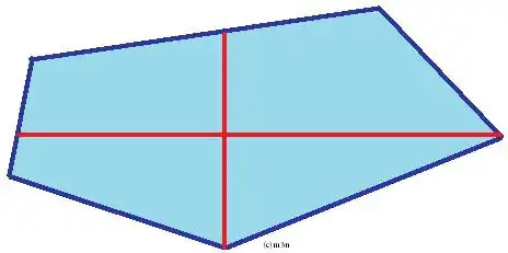
All lines shown Just one shown A couple shown

I can't see any pattern to predict the ones that aren't drawn - see code fragment below...

using System;
using System.Windows.Forms;
using System.Windows.Forms.DataVisualization.Charting;

namespace ChartTest
{
    public partial class Form1 : Form
    {
        public Form1( )
        {
            InitializeComponent( );

            var series = new Series( )
            {
                ChartType = SeriesChartType.Area,
                MarkerStyle = MarkerStyle.None,
                XValueType = ChartValueType.DateTime,
                YAxisType = AxisType.Primary,
            };

            AddLine( DateTime.Parse( "17/6/2015" ), series );
            AddLine( DateTime.Parse( "18/6/2015" ), series );
            AddLine( DateTime.Parse( "19/6/2015" ), series );
            AddLine( DateTime.Parse( "20/6/2015" ), series );
            AddLine( DateTime.Parse( "21/6/2015" ), series );

            chart1.Series.Add( series );
        }

        private static void AddLine( DateTime dateTime, Series series )
        {
            var endTime = dateTime.AddMinutes( 2 );
            series.Points.AddXY( dateTime, 0 );
            series.Points.AddXY( dateTime, 1 );
            series.Points.AddXY( endTime, 1 );
            series.Points.AddXY( endTime, 0 );
        }
    }
}

Anyone know how to avoid this without making the areas arbitrarily wide? Anyone know if I could use the Paint or PrePaint events to adjust the drawing?

Thanks in advance.

erac
  • 155
  • 7
  • The way you add the datapoint in your code means that there could be 24*30=720 2 minute areas per day and another 24*30=720 0 minute areas, alternating between your series color and the background. To display them you need at least 1440 pixels per interval or a chart width of 5760 pixels for the data in your example. That can't work. One day in your chart has, say, around 100 pixels! – TaW Jun 17 '15 at 17:10
  • Thanks for the comment. True, but not what will happen with real data. In practice the two minute periods are likely to be an hour apart with other areas of may be 10 minute or up to 6 hour duration. My question is what can I do to avoid some (but usually not all) of these slim 2 minute areas from not being displayed. – erac Jun 17 '15 at 18:17
  • With the above calculation in mind: where __could__ they display? with a width of ca 100/720 = 0.15 pixels that just can't happen. No way really around that. one may think about manual anti-aliased single pixel 'areas' with some special color but they would only make sense if you accept that they will __steal__ their space from some other datapoints.. So I suggest giving up an that and instead give the user the option to zoom in.. – TaW Jun 17 '15 at 18:34

0 Answers0