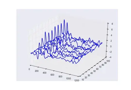
I have implement solution from Matplotlib plot pulse propagation in 3d into my needs and as a result of this operation I get plot as shown below:
However, in the question linked above stack-user was refering to the plot looking like this:

How can I color lines on my plot so higher values will be closed to red, and lower values to blue?
Here is my code with some random data:
import numpy as np
import matplotlib.pyplot as plt
from mpl_toolkits.mplot3d import Axes3D


def draw_3d_plot(x_scale, y_scale, data):
    sx = x_scale.size
    sy = y_scale.size

    x_scale = np.tile(x_scale, (sy, 1))
    y_scale = np.tile(y_scale, (sx, 1)).T

    fig = plt.figure()
    ax = fig.add_subplot(1, 1, 1, projection='3d')
    surf = ax.plot_wireframe(x_scale, y_scale, data, cstride=1000)

draw_3d_plot(np.arange(1000), np.linspace(1, 3, 3), np.random.rand(3, 1000))
plt.show()