8

I've designed a 3-bar icon using pure SVG code in HTML. I'm using CSS3 transforms to rotate the top & bottom bars into an X shape. The problem is that they rotate around their own center, but I need them rotating around the icon's center. To get around this I've adjusted their X/Y coordinates.

This causes a LOT of buggy issues with Internet Explorer, Firefox, & Safari. Chrome seems to be alright but obviously I'd like to code this the "right" way so it'll work in all browsers.

Here's my live CodePen

HTML

<svg id="burgericon" xmlns="http://www.w3.org/2000/svg" width="90" height="80">
  <g class="icon">
    <rect class="frstbar" x="10" y="10" width="70" height="12" rx="7" ry="7" fill="#414141"/>
    <rect class="scndbar" x="10" y="35" width="70" height="12" rx="7" ry="7" fill="#414141"/>
    <rect class="thrdbar" x="10" y="60" width="70" height="12" rx="7" ry="7" fill="#414141"/>
  </g>
</svg>

CSS

.hamburger { display:block; text-align:center; }
svg { cursor:pointer; }

.frstbar, .scndbar, .thrdbar {
  -webkit-transition: all 0.35s linear;
  -moz-transition: all 0.35s linear;
    -o-transition: all 0.35s linear;
    transition: all 0.35s linear;
}
#burgericon.open .frstbar {
  -webkit-transform: rotate(45deg);
  -ms-transform: rotate(45deg);
  transform: rotate(45deg);
}
#burgericon.open .thrdbar {
  -webkit-transform: rotate(-45deg);
  -ms-transform: rotate(-45deg);
  transform: rotate(-45deg);
}
#burgericon.open .scndbar { width: 0; opacity: 0; }

JS

$('#burgericon').on('click', function(e) {

  if($(this).attr('class') != "open") {
      $(this).attr('class','open');
      $('.frstbar').attr('x','25').attr('y','-5');
      $('.thrdbar').attr('x','-35').attr('y','55');
    } 
  else {
    $(this).attr('class','default');
    $('.frstbar').attr('x','10').attr('y','10');
      $('.thrdbar').attr('x','10').attr('y','60');
    }
});

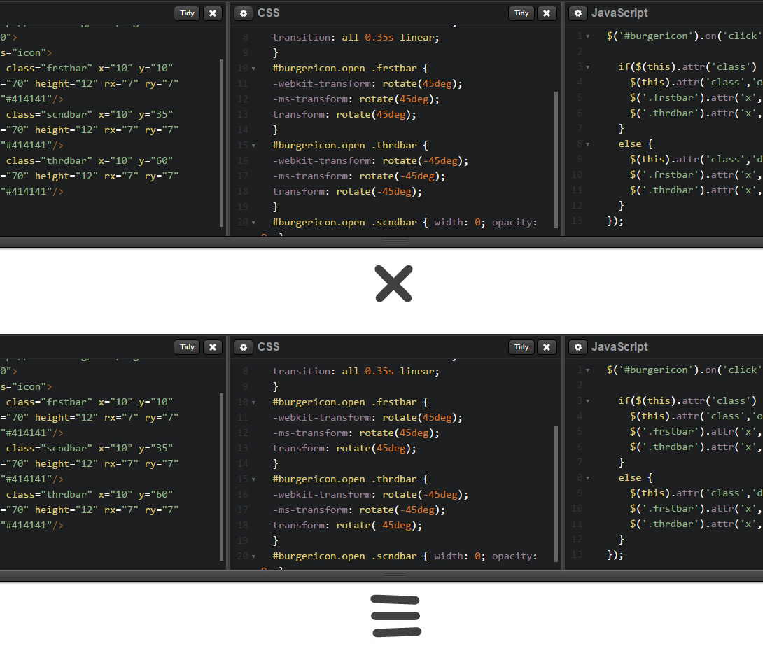
I also think changing the X/Y coords is causing a blurry effect. I've added a screenshot below. First you'll see the completed X icon and then you'll see how it looks when animated back to default.

The bars aren't perfectly straight but instead they look crooked for some reason.

Screenshot here

I'm still new to SVG manipulation so I'm not sure how to properly rotate <rect> elements with CSS3/JS. Any help or tips in the right direction would be more than appreciated.

web-tiki
  • 99,765
  • 32
  • 217
  • 249
Thomas Lancy
  • 83
  • 1
  • 5
  • codepen probably isn't the best demo site for errors due to its auto-save feature. Would it be possible to post your markup here as well (for future readers?) – jbutler483 Jun 19 '15 at 15:50
  • 1
    It's strange ... even in Chrome, if I try it several times, some will fail ... – vals Jun 19 '15 at 15:57
  • I don't think the **linear** `transition-timing-function` gives the transition time to finish properly. Switching to the default **ease** seems to fix it in my limited testing. – andyb Jun 19 '15 at 16:04
  • 1
    @jbutler483 Sure! Just added all the code so it's visible from this post without CodePen. – Thomas Lancy Jun 19 '15 at 16:26

2 Answers2

8

You can remove the JS positioning by using the CSS transform-origin property. You can set it on the left of the first and second bars with transform-origin: 0 50%;.

This way they will cross each other when they are rotated :

document.getElementById('burgericon').addEventListener('click', function (e) {
    this.classList.toggle('open');
});
.hamburger {
  display: block;
  text-align: center;
}
svg {
  cursor: pointer;
}
.frstbar,.scndbar,.thrdbar {
  transition: all 0.35s linear;
  transform: rotate(0deg);
  transform-origin: 0% 50%;
}
#burgericon.open .frstbar {
  transform: rotate(45deg);
}
#burgericon.open .thrdbar {
  transform: rotate(-45deg);
}
#burgericon.open .scndbar {
  width: 0;
  opacity: 0;
}
<nav class="hamburger">
  <svg id="burgericon" xmlns="http://www.w3.org/2000/svg" width="90" height="80">
    <g class="icon">
      <rect class="frstbar" x="10" y="10" width="70" height="12" rx="7" ry="7" fill="#414141" />
      <rect class="scndbar" x="10" y="35" width="70" height="12" rx="7" ry="7" fill="#414141" />
      <rect class="thrdbar" x="10" y="60" width="70" height="12" rx="7" ry="7" fill="#414141" />
    </g>
  </svg>
</nav>
<div>
</div>

Credits to David Thomas for the JS

Note that the transform-origin property needs the same vendor prefixes as the transform property. I have omited them for both in the above snippet

Community
  • 1
  • 1
web-tiki
  • 99,765
  • 32
  • 217
  • 249
  • Nice and simple jquery solution :P – Persijn Jun 19 '15 at 16:11
  • 1
    It's also just as simple (if not more so) with plain JavaScript: [JS Fiddle demo](http://jsfiddle.net/davidThomas/gog3e1ae/). – David Thomas Jun 19 '15 at 16:24
  • This does seem cleaner but do you know why it won't work in IE? I'm testing on the latest IE11 both codes from web-tiki and @DavidThomas but IE seems troublesome. I know that's a pesky one and I'd be okay to forego support in IE, but it also seems buggy in FireFox too. [jsFiddle](http://jsfiddle.net/9xjkejbo/) – Thomas Lancy Jun 19 '15 at 16:31
  • @DavidThomas definetly simpler in plain JS – web-tiki Jun 19 '15 at 16:35
  • @ThomasLancy FF doesn't support the transform-origin property for svg elements. There is a workaround here http://stackoverflow.com/questions/15139090/setting-transform-origin-on-svg-group-not-working-in-firefox – web-tiki Jun 19 '15 at 16:47
  • 2
    @web-tiki It does support transform-origin on svg elements as long as you avoid percentages. – Robert Longson Jun 19 '15 at 17:35
  • @RobertLongson thanks it does seem to work in FF using pixels. Doesn't seem to fit perfectly but it looks much better. I've [updated the fiddle](http://jsfiddle.net/9xjkejbo/1/) with FF support - probably the best I can do with current browser standards. – Thomas Lancy Jun 20 '15 at 14:36
  • Percentage support is coming. It's implemented but hidden behind a disabled pref, we're unhiding/enabling it soon. Not sure yet which version will get it first though. – Robert Longson Jun 20 '15 at 14:38
5

CSS

Using css transform: rotate() I rotated the elements so they form the X
Using css opacity and transitions; made the object gradually go transparent.

.icon {
  stroke: none;
  fill: #777;
}
.icon .frstbar {
  transform-origin: 10% 50%;
  transition: transform 1s;
}
.icon:hover .frstbar {
  transform: rotate(45deg);
}
.icon .thrdbar {
  transform-origin: 10% 50%;
  transition: transform 1s;
}
.icon:hover .thrdbar {
  transform: rotate(-45deg);
}
.scndbar {
  opacity: 1;
  transition: opacity 1s;
}
.icon:hover .scndbar {
  opacity: 0;
}
<svg id="burgericon" xmlns="http://www.w3.org/2000/svg" width="90" height="90" viewBox="0 0 100 100">
  <g class="icon">
    <rect class="frstbar" x="10" y="10" width="90" height="12" rx="7" ry="7" />
    <rect class="scndbar" x="10" y="35" width="90" height="12" rx="7" ry="7" />
    <rect class="thrdbar" x="10" y="60" width="90" height="12" rx="7" ry="7" />
  </g>
</svg>
Persijn
  • 14,624
  • 3
  • 43
  • 72
  • Thanks! I can see why you removed JS to simplify. But I notice this solution also gets wonky in Firefox - any idea why? Even just modern up-to-date browser support seems to be impossible. Here's a [Firefox screenshot](http://i.imgur.com/E6TycUs.jpg) from your demo along with a [jsFiddle demo](http://jsfiddle.net/f88jvro5/) – Thomas Lancy Jun 19 '15 at 16:37
  • Hey Persijn i guesss you should add hover styles to svg instead of the group, as when you hover between the strokes, the hover wont fire! – Max Payne Jun 21 '15 at 11:40
  • @TimKrul naaaaa i kinda like it this way :D – Persijn Jun 21 '15 at 22:35