15

How might we achieve the following layout:

enter image description here

With the following conditions:

  1. The tiles of each row should be equal in height to the highest element in the row

  2. The last tile in the row should be flush with the parent container (no gap)

  3. The tiles can be different width ratios (3 times one-third or one-third + two-thirds, etc)

  4. The ordering of the tiles is unknown

  5. No grid framework

  6. Modern browsers only

And the following markup:

<div class="tile-wrapper">
  <div class="tile-container">
    <div class="tile third">1/3</div>
    <div class="tile third">1/3</div>
    <div class="tile third">1/3</div>
    <div class="tile two-thirds">2/3</div>
    <div class="tile third">1/3</div>
    <div class="tile sixth">1/6</div>
    <div class="tile sixth">1/6</div>
    <div class="tile third">1/3</div>
    <div class="tile sixth">1/6</div>
    <div class="tile sixth">1/6</div>
  </div>
</div>
Michael Benjamin
  • 346,931
  • 104
  • 581
  • 701
monners
  • 5,174
  • 2
  • 28
  • 47

4 Answers4

10

This is an increasingly common layout that can be relatively easily achieved using flexbox and some clever container markup.

A common problem with tiled layouts is maintaining consistent spacing and alignment between tiles of differing sizes across multiple rows. Assuming we would like a 30px margin separating all tiles, we could simply set margin-right: 30px on all tiles and then use an nth-of-type selector to remove the margin-right of the last tile in the row.

However, this isn't possible when the relative sizes and order of the tiles is unknown. For example, a two-thirds tile next to a one-third tile won't conform to the same nth-of-type selector rule required to remove the margin of the last tile as a row consisting of three one-third tiles.

A clever way around this is to instead absord the right-most tile's margin into the width of the parent container. We can do with by setting the outer-most div's width to the desired width (in this case 90%) with overflow: hidden, and then set the inner-container's width to be 100% plus the width of the tile margin; width: calc(100% + 30px). This way, no matter what tile is in the right-most position of the row, the tile will sit flush with the edge of its container.

To ensure that the tiles then always fit as desired, we set their flex-basis to be the proportion of the row width we'd like them to occupy minus the tile margin; .third { flex: 0 0 calc(33.33% - 30px); /* for a 1/3 tile */}
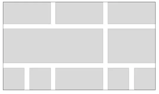
Like so:

* {
  box-sizing: border-box;
}
.tile-wrapper {
  display: block;
  position: relative;
  width: 90%;
  margin: 0 auto;
  overflow: hidden;
}
.tile-container {
  display: flex;
  position: relative;
  width: calc(100% + 30px);
  flex-wrap: wrap;
}
.tile {
  display: inline-block;
  margin-right: 30px;
  margin-bottom: 30px;
  min-height: 200px;
  line-height: 199px;
  text-align: center;
  border: 1px solid black;
}
.two-thirds {
  flex: 0 0 calc(66.66% - 30px);
}
.third {
  flex: 0 0 calc(33.33% - 30px);
}
.sixth {
  flex: 0 0 calc(16.66% - 30px);
}
<div class="tile-wrapper">
  <div class="tile-container">
    <div class="tile third">1/3</div>
    <div class="tile third">1/3</div>
    <div class="tile third">1/3</div>
    <div class="tile two-thirds">2/3</div>
    <div class="tile third">1/3</div>
    <div class="tile sixth">1/6</div>
    <div class="tile sixth">1/6</div>
    <div class="tile third">1/3</div>
    <div class="tile sixth">1/6</div>
    <div class="tile sixth">1/6</div>
  </div>
</div>

Here's a Fiddle

NOTE: This will only work in modern browsers (Chrome, Safari, FF, IE11+). There's also a known bug in IE11 that requires you to use the long-hand flex-basis style attribute in order to set it to a calc() value.

Gleb Kemarsky
  • 10,160
  • 7
  • 43
  • 68
monners
  • 5,174
  • 2
  • 28
  • 47
6

From the question:

  1. No grid framework

This question was posted in 2015, when CSS Grid Layout had weak browser support.

Since 2017, all major browsers support Grid Layout.

So, assuming that this requirement was posted for purposes of browser compatibility, I will look past it and provide an optimal (grid-based) solution easily supported by today's browsers.

body {
  margin: 0;
}

.tile-wrapper {}

.tile-container {
  display: grid;
  grid-template-rows: auto auto auto;
  grid-template-columns: repeat(6, 1fr);
  grid-gap: 30px;
}

.sixth {
  grid-column: span 1;
}

.third {
  grid-column: span 2;
}

.two-thirds {
  grid-column: span 4;
}

/* demo only */
.tile {
  display: flex;
  justify-content: center;
  align-items: center;
  background-color: lightgray;
  border: 1px solid gray;
}
<div class="tile-wrapper">
  <div class="tile-container">
    <div class="tile third">1/3</div>
    <div class="tile third">1/3<br>
    text<br>text<br>text</div>
    <div class="tile third">1/3</div>
    <div class="tile two-thirds">2/3</div>
    <div class="tile third">1/3<br>
    text<br>text<br>text<br>
    text<br>text<br>text<br>
    text<br>text<br>text</div>
    <div class="tile sixth">1/6<br>
    text<br>text<br>text<br>
    text<br>text</div>
    <div class="tile sixth">1/6</div>
    <div class="tile third">1/3</div>
    <div class="tile sixth">1/6</div>
    <div class="tile sixth">1/6</div>
  </div>
</div>

From the question:

With the following conditions:

  1. The tiles of each row should be equal in height to the highest element in the row. CHECK

  2. The last tile in the row should be flush with the parent container (no gap). CHECK

  3. The tiles can be different width ratios (3 times one-third or one-third + two-thirds, etc). CHECK

  4. The ordering of the tiles is unknown. OK

  5. No grid framework. N/A (see note above)

  6. Modern browsers only. CHECK

Michael Benjamin
  • 346,931
  • 104
  • 581
  • 701
2

You can try this:

  • Set flex-basis: 0 and the desired flex-grow factor to each item.
  • Force line breaks placing pseudo-elements at the right places.
  • Set some margin to all flex items.
  • Set a negative margin of the same amount to the flex wrapper.

.tile-wrapper {
  border: 1px solid #000;
}
.tile-container {
  display: flex; /* Magic begins */
  flex-wrap: wrap; /* Multiline */
  margin: -5px; /* Neutralize margins at the edges */
}
.tile {
  min-height: 50px; /* Just an example */
  margin: 5px;
  border: 1px solid #979797;
  background: #d8d8d8;
}
.sixth{ flex: 1; } /* 1/6 * 6 */
.third{ flex: 2; } /* 1/3 * 6 */
.two-thirds{ flex: 4; } /* 2/3 * 6 */
.tile-container::before, .tile-container::after {
  content: ''; /* Enable the pseudo-element */
  order: 1; /* Place it at the appropiate place */
  width: 100%; /* Force line break */
}
.tile-container > :nth-child(n+4) { order: 1; }
.tile-container > :nth-child(n+6) { order: 2; }
<div class="tile-wrapper">
  <div class="tile-container">
    <div class="tile third">1/3</div>
    <div class="tile third">1/3</div>
    <div class="tile third">1/3</div>
    <div class="tile two-thirds">2/3</div>
    <div class="tile third">1/3</div>
    <div class="tile sixth">1/6</div>
    <div class="tile sixth">1/6</div>
    <div class="tile third">1/3</div>
    <div class="tile sixth">1/6</div>
    <div class="tile sixth">1/6</div>
  </div>
</div>
Oriol
  • 274,082
  • 63
  • 437
  • 513
  • Can you elaborate on what you mean by 'force line breaks placing pseudo-elements at the right places'? – monners Sep 05 '15 at 10:50
1

You can achieve the desired effect by playing with the container and tiles margins, taking into account when sizing the tiles. Here is a working CSS. I've added some colours and text to better see the sizes and expand behaviour.

Basically, we set a half-size negative margin for the container on x axis and a full-size negative margin for the top (it might as well be the bottom, it doesn't really matter). Each tile has half-sized margins on each side, so we don't need to know which one is the first and which one is the last (all are the same). Between them, we will have the full-size margin.

This approach has the great benefit to be responsive-ready, working out of the box for different media queries for the width of tile sizes. Also, it allows you to expose a full no-margin viewing experience.

* { box-sizing: border-box; margin:0;padding:0; text-align: center; }

.tile-wrapper {
  border:1px solid black;
  overflow:hidden;
}

.tile-container {
  display: flex;
  flex-direction: row;
  flex-wrap: wrap;
  margin-left: -15px;
  margin-right: -15px;
  margin-top: -30px;
}

.tile-container .tile {
  background-color: gray;
  color: black;
  margin-left: 15px;
  margin-right: 15px;
  margin-top: 30px;
  padding: 0;
}

.tile.third {
  flex: 0 0 calc(33.33333% - 30px);
}

.tile.two-thirds {
  flex: 0 0 calc(66.6666666% - 30px);
}

.tile.sixth {
  flex: 0 0 calc(16.66666667% - 30px);
}
<div class="tile-wrapper">
  <div class="tile-container">
    <div class="tile third">1/3<br />Lorem ipsum dolor sit amet consectetur adipisicing elit</div>
    <div class="tile third">1/3</div>
    <div class="tile third">1/3</div>
    <div class="tile two-thirds">2/3</div>
    <div class="tile third">1/3<br />Lorem ipsum dolor sit amet consectetur adipisicing elit</div>
    <div class="tile sixth">1/6</div>
    <div class="tile sixth">1/6<br />Lorem ipsum dolor sit amet consectetur adipisicing elit</div>
    <div class="tile third">1/3</div>
    <div class="tile sixth">1/6</div>
    <div class="tile sixth">1/6</div>
  </div>
</div>

Note: If the wrapper is not the single, direct child of the body, or the surrounding elements can account for a -15px (in the example) margin, you can safely remove the overflow rule.

Alex
  • 810
  • 9
  • 16