2

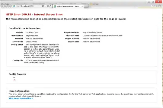
I'm building a website layout and I'm trying to have a list of images with descriptions centered next to them, but I can't figure out how to get the paragraphs to move next to the images without the entire layout messing up. I've messed around with the float, clear, and display settings with no avail. I added a picture of my desired result

enter image description here enter image description here

my HTML for this section looks like this currently:

 <section>
    <ul id="gallery">
        <li>
            <a href="GPA_Calc_Screen.png">
                <img src="GPA_Calc_Screen.png" alt""> <!--Relative img path -->
            </a>
        </li>
        <li>
            <p >
                    This is a custom GPA Calculator, and what I like to think is the first real app that I made. Going to Georgia Tech, and college in general, this is a vital asset. Although at GT we don't operate on the plus/minus system, I added a setting in which you can edit that if you want.
            </p>

        </li>

        <li>
                <a href="Avengers_App_Screen.png">
                    <img src="Avengers_App_Screen.png" alt"">
                </a>
        </li>
        <li>
                <p>
                    Okay, who doesn't like The Avenegrs movie series? Huh? Well, yeah I guess you're right, but it doesn't matter because I love it! I made this app to
                    test out layout design, android intents, and a few other features. It's also
                    a great way to kill 4 minutes.
                </p>
        </li>

    </ul>
  </section>

and my CSS that goes with it looks like this currently:

#gallery {
    margin: 0;
    padding: 0;
    list-style: none; /*Removes bullet points*/
}

#gallery li {

    width: 45%;
    margin: 2.5%;
    background-color: #b3dbeb
    color: #1d95c5;
}


.descriptions {
    display: block;
}

.descriptions a {
    float: left;
}
Joseph hooper
  • 967
  • 4
  • 16
  • 35
  • sorry, i dont quite get what you meant. is it something like [this](https://jsfiddle.net/zfav3wm3/) ? – Andrew Jul 01 '15 at 05:12

2 Answers2

3

For each p tag just add a clearfix class and import bootstrap or any other framework with clearfix support or do as below

.p:before,
.p:after {
  content:"";
  display:table;
}
.p:after {
  clear:both;
}
.p {
  zoom:1; /* For IE 6/7 (trigger hasLayout) */
}
  • http://stackoverflow.com/questions/211383/which-method-of-clearfix-is-best?lq=1 refer this to get better idea of floats and clearfix –  Jul 01 '15 at 05:05
  • Thanks for your support –  Jul 01 '15 at 05:16
  • I thought it did but no luck. I posted an image of what my page ends up looking like – Joseph hooper Jul 01 '15 at 05:20
  • It is easy to organise such sort of problems –  Jul 01 '15 at 05:22
  • I know about the bootstrap grid system but I'm trying to solve the problem without it if possible. Let me define the widths and see if that solves it. – Joseph hooper Jul 01 '15 at 05:23
  • Just clearfix the second list item ,it will solve your problem –  Jul 01 '15 at 05:25
  • it clears the image from the right of the paragraph, but there's still an image under the paragraph instead of the first image, should I just edit the top and bottom padding for the paragraph items? – Joseph hooper Jul 01 '15 at 05:32
  • Yeah I'm just adjusting the padding/width/height numbers but it worked – Joseph hooper Jul 01 '15 at 05:37
0

Try flex box on the parent of your two elements:

display: flex;

Or try float right on paragraph:

.description p {float:right}

Make sure to define widths first.

Hezerac
  • 334
  • 1
  • 5
  • 20