8

I'm trying to plot with ggplot2 the track of a bird around the antarctic. So far I got a map projected in polar coordinates, I also managed to plot the track points correctly and I almost link them correctly BUT... As the track crosses the international DATE & TIME line , ggplot2 is not able to correctly link the 2 points in either sides of the line.So I'm looking for a way to force ggplot to link the points in continuous manner.

Here's my dataset:

Data =>
ID  Date      Time   A1   Lat.    Long.
10 12.9.2008 22:00   1  21.14092 70.98817 
10 12.9.2008 22:20   1  21.13031 70.97592 
10 12.9.2008 22:40   2  21.13522 70.97853 
10 12.9.2008 23:00   1  21.13731 70.97817
10 12.9.2008 23:20   3  21.14197 70.97981
10 12.9.2008 23:40   1  21.14156 70.98158
10 12.9.2008 23:40   1  21.14156 70.98158
10 13.9.2008 00:00   2  21.14150 70.98478
10 13.9.2008 00:20   3  21.14117 70.98803
10 13.9.2008 00:40   1  21.14117 70.98803
10 13.9.2008 01:00   2  21.14117 70.98803

....

ID is the bird's ID.

UPDATE using Nick K code

Here's my original graph without using the time dimension and line

south_map <- map_data("world") %>% group_by(group) 
set.seed(123)

track_df2 <- new_df2

long_diff <- diff(new_df2$Long)
long_diff[long_diff < -180] <- long_diff[long_diff < -180] + 360
long_diff[long_diff > 180] <- long_diff[long_diff > 180] - 360
track_df2$Longitude <- cumsum(c(new_df2$Long[1], long_diff))

ggplot(track_df2, aes(x = track_df2$Long, y = track_df2$Lat)) +
geom_polygon(aes(group = a3_id), data = south_map, colour = "grey", fill = "gainsboro") +
geom_point(aes(colour = factor(a3_id)), size = 2)

A1 defines what the bird is currently doing.

enter image description here

Jonnus
  • 2,988
  • 2
  • 24
  • 33
ayush
  • 343
  • 3
  • 20
  • 1
    Just connect the points based on sorted time? – Vlo Jul 01 '15 at 17:34
  • 1
    agree with @Vlo, I think you have to just convert the times. neat problem – Liz Young Jul 01 '15 at 17:37
  • 1
    @VIo I didn't get you. Can you give me some example or explain me? – ayush Jul 01 '15 at 17:43
  • @ayush I made a mistake in suggesting that, my apology. Your problem seems similar to (identical?) http://stackoverflow.com/questions/25157221/ggplot2-how-to-link-correctly-track-points-around-polar-projection-map is this a homework? I would suggest maybe email ggplot package maintainer – Liz Young Jul 01 '15 at 17:52
  • @TanDollars No, its not a homework. I have a similar dataset and trying to do kindda similar stuff. That 1st image was taken as an example from that ques only but the second graph is from my original dataset and for that I have used the said command. – ayush Jul 01 '15 at 17:59
  • my primary recommendation is to email the package maintainer, but maybe you can 'trick' the desired output by reversing your data? That seems suboptimal, though – Liz Young Jul 01 '15 at 18:04
  • @TanDollars Thanks for the suggestion. – ayush Jul 01 '15 at 18:09
  • 3
    I would **not** recommend emailing the package maintainer, SO is a good forum for this type of question but the ggplot Google group is another option. What you can do to get an answer is to make a small, reproducible example. You share one data set but don't provide code to graph it, then you show code a graphs for a different data set. Let's see data and graph code *for that data*, and share the data using `dput()` for reproducibility. – Gregor Thomas Jul 01 '15 at 21:20
  • @Frank I hope this helps now? code for producing the graph is given at the bottom of the question – ayush Jul 05 '15 at 06:09
  • Your graph code doesn't match the data shared, and the data isn't shared with `dput(data)`. We don't need all your data, just enough to illustrate your problem which probably means going at least one full circle around the pole. – Gregor Thomas Jul 05 '15 at 06:30
  • @Gregor Is it sufficient now? – ayush Jul 05 '15 at 06:41
  • 1
    @ayush, you still have not shared the data using `dput`. Please refer to [this question and its answers](https://stackoverflow.com/questions/5963269/how-to-make-a-great-r-reproducible-example) – akhmed Jul 05 '15 at 20:02
  • @ayush you can test yourself if it's sufficient: start a brand new R session, and run your code. Does it work? The answer is no, because you use some data frame called `new_df2` that you never define. Now try the same for Nick's answer: works just fine! – Gregor Thomas Jul 06 '15 at 15:47

1 Answers1

14

You don't seem to actually use the time in your plot, but the issue is the longitudes wrapping around -180/180. This can be solved using coord_map rather than coord_polar and ensuring that the longitudes don't wrap around.

Load packages and generate sample data

library("ggplot2")
library("dplyr")
south_map <- map_data("world") %>% group_by(group) %>% filter(min(lat) <= -20)

set.seed(123)
track <- data.frame(long = cumsum(c(210,
                                    unlist(lapply(c(1, -1), function(x) {
                                      rnorm(50, x * 4, 4)
                                      })))) %% 360 - 180,
                    lat = cumsum(c(-50, rnorm(100, 0.4, 2))),
                    A1 = sample(1:3, 101, replace = TRUE))

Ensure that coordinates don't wrap around:

track_new <- track
long_diff <- diff(track$long)
long_diff[long_diff < -180] <- long_diff[long_diff < -180] + 360
long_diff[long_diff > 180] <- long_diff[long_diff > 180] - 360
track_new$long <- cumsum(c(track$long[1], long_diff))

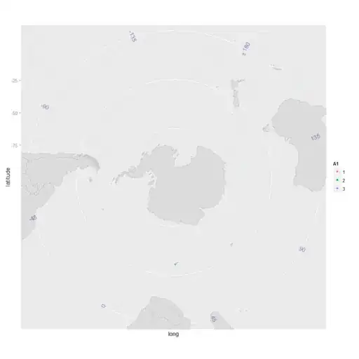
Plot using aziequidistant projection. Note that this assumes the North Pole in the centre, so the latitudes are flipped and then corrected with the scale.

ggplot(track_new, aes(x = long, y = -lat)) +
  geom_polygon(aes(group = group), data = south_map, colour = "grey", fill = "gainsboro") +
  coord_map("azequidistant") +
  geom_point(aes(colour = factor(A1)), size = 2) +
  geom_path(colour = "grey", size = 1) +
  scale_x_continuous(breaks = NULL) +
  scale_y_continuous("latitude", breaks = 25 * 0:3, labels = -25 * 0:3)

Final plot:

Bird plot

Just for interest, I thought it would be fun to produce an animation of this image. Here's the code to do it:

track_new$alpha <- 1
# Setup longitude labels

long_labels <- data.frame(long = 45 * -3:4, lat = -22.5)
long_labels$label <- long_labels$long
long_labels$label[8] <- "\U00B1 180"
long_labels$angle <- long_labels$long + 67.5 + 180 * (long_labels$long >= 45)

# Set up the basic plot
p <- ggplot(track_new, aes(x = long, y = -lat)) +
  geom_polygon(aes(group = group), data = south_map, colour = "grey", fill = "gainsboro") +
  coord_map("azequidistant", ylim = c(20, 90)) +
  geom_point(aes(colour = A1, alpha = alpha), size = 2) +
  geom_path(aes(alpha = alpha), colour = "grey", size = 1) +
  scale_x_continuous(breaks = NULL) +
  scale_y_continuous("latitude", breaks = 22.5 * 0:3, labels = -22.5 * 0:3) +
  scale_alpha_identity(guide = "none") +
  geom_text(aes(label = label, angle = angle),
            data = long_labels, colour = "dark blue", alpha = 0.5, size = 4)

# Produce the animation
p$data$alpha <- 0
for(i in 1:(nrow(track_new) + 10)) {
  p$data$alpha <- pmax(p$data$alpha - 0.1, 0)
  if (i <= nrow(track_new)) {
    p$data$alpha[i] <- 1
  }
  png(file.path("BirdPlots", sprintf("BirdPlot%03d.png", i)), width = 1024, height = 1024, res = 100)
  print(p)
  dev.off()
  if (!(i %% 5)) cat(i, "\n")
}

# This needs ImageMagick in the system path. For non-Windows systems, you
# might be better using system rather than shell
shell(paste("convert", file.path("BirdPlots", "BirdPlot*.png"),
  file.path("BirdPlots", "BirdPlotAnimation.gif")))

And here's the result:

Animation of bird

EDIT Corrected version of ayush's code

track_df2 <- new_df2

long_diff <- diff(new_df2$Longitude)
long_diff[long_diff < -180] <- long_diff[long_diff < -180] + 360
long_diff[long_diff > 180] <- long_diff[long_diff > 180] - 360
track_df2$Longitude <- cumsum(c(new_df2$Longitude[1], long_diff))

track_df2$a3_id <- factor(track_df2$a3_id)

ggplot(track_df2, aes(x = Longitude, y = -Latitude)) +
  coord_map("azequidistant", ylim = c(20, 90)) +
  geom_point(aes(colour = a3_id, alpha = alpha), size = 2) +
  geom_path(aes(alpha = alpha), colour = "grey", size = 1) +
  scale_x_continuous(breaks = NULL) +
  scale_y_continuous(breaks = 22.5 * 0:3, labels = -22.5 * 0:3) +
  scale_alpha_identity(guide = "none")
Community
  • 1
  • 1
Nick Kennedy
  • 12,510
  • 2
  • 30
  • 52
  • I've added an animated version which produces a series of PNGs and converts them to an animated GIF. – Nick Kennedy Jul 05 '15 at 21:44
  • Its a nice solution. But the said problem is about adding the date & time feature. Yes, I didn't use the D & T in my plot because I can't find sol for this. Can you add Time as 3rd Dimension then plot the result? What the problem I am facing it is after 23:59:59 hrs time is reset to 00:00:00. Hence it's making layers. I want to preserve this 2D plot in 3D. Can you solve this problem? – ayush Jul 05 '15 at 21:45
  • @ayush I'm not quite sure what you mean. Do you want a 3d scatter plot effectively, with time represented as the height? Or something else? What have you tried so far? It's also worth noting that your original data was all between 70.9 and 71 degrees longitude, so the polar projection you've got looks way off. – Nick Kennedy Jul 05 '15 at 21:47
  • @ayush You also wouldn't cross the dateline with those coordinates (and probably not even a timezone boundary). If it's just a time issue, surely you'd want the time dimension to be based on a fixed timezone - it doesn't really make sense to use local time. – Nick Kennedy Jul 05 '15 at 22:03
  • Yes, as you stated in your 1st line. I don't want it to be in Scatterplot. I want similar to polar coordinates to project Lat - Long - Time.. But the problem is as I said Its forming layes as the time is moving and its not giving me any good results out of it. Can you help me in this, I am still new in R.....? I have tried looking Dygraphs but its not very helpful also its not ploting as the map/polar coordinates does – ayush Jul 05 '15 at 22:10
  • I still don't get how you want the third dimension plotted. The options in general are to use a 3d representation (e.g. rgl), something like a colour gradient (as seen in a heat map) or animation (like my second example). What do you want to achieve? Note that you can still use polar coordinates for a 3d scatter plot - you just need to transform them to cartesian coordinates first using `cos` and `sin`. – Nick Kennedy Jul 05 '15 at 22:14
  • What I want to measure via the plot is that I want to see at what time what's my lat-long is? Also I want to analyze the path of the bird in the same graph (As you have done). Can you help with this part? Your animation plot is way more helpful to me. Thank you very much. – ayush Jul 05 '15 at 22:19
  • @ayush so do you want the time printed on the graph as a label? Or a 3d graph? For the former it would be straightforward to use `geom_text` to print times. For the latter, as suggested above `plot3d`. Another option would be to create an animation that was effectively in sped-up realtime and being able to step through it. – Nick Kennedy Jul 05 '15 at 22:23
  • What your last sugession is what I needed and is very effective too. I can't use geom_text because my dataset is too large and dense(in thousands). so I don't see It as a very good idea when I visualize my plot. (But yeah! its what is solving the problem) plot3d/scatterplot isn't giving me good analysis. It is forming layers at time axis when I am using scatterplot3D which I don't want. – ayush Jul 05 '15 at 22:30
  • @ayush that would suggest that your map data frame doesn't have a column called 'long'. Are you using a map? If so, what are the columns called? – Nick Kennedy Jul 06 '15 at 01:05
  • Aesthetics must either be length one, or the same length as the dataProblems:Data_new$Longitude, Data_new$Latitude This is the errror its showing – ayush Jul 06 '15 at 01:59
  • @ayush can you edit your question to add the code you're currently trying to use? Please keep the question the same, but add a new bit at the bottom. – Nick Kennedy Jul 06 '15 at 06:41
  • I have updated the ques. I have tried to do this with your code – ayush Jul 06 '15 at 07:10
  • @ayush thanks. I've edited your code and appended to my answer. Note that the geom_polygon was for the map. The coord_map corrects the projection. Your issue with your aesthetics is that they should just be the column names not the columns from the data. – Nick Kennedy Jul 06 '15 at 07:25
  • what's the alpha here? I am getting a straight line(Y-Axis) in the plot nothing else – ayush Jul 06 '15 at 08:44
  • 2
    The alpha is transparency. If it's set to zero, nothing will be drawn. The idea is then to use the loop I posted above to set the alpha for each point in turn and produce an image. These images can then be converted into an animation (with ImageMagick) or a movie (with ffmpeg). If you want to see all of the points, just set `p$data$alpha <- 1`. – Nick Kennedy Jul 06 '15 at 08:46
  • @NickKennedy okie.Done – ayush Jul 06 '15 at 16:24