1

Is there ANY ways possible to manipulate, maybe even override the way the candlestick charts are colored?

What I'm trying to do, should look like this: MSChart edited result

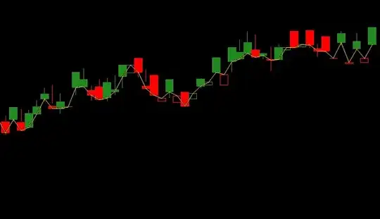
What happens here, is that the candles are filled with its color when the "Open" prices are higher than "Close" prices, and black when it's the other way around.

But this isn't possible in MS Chart? I was thinking about creating another candlestick series on top of the other, and get filled boxes from that, but it wouldn't work, since MS Chart automatically uses the "PriceDown/Up" colors. ...See my answer below.

Here's the code I use and which doesn't work the way I would like to:

DataPointCollection dpcCandle = Series[Candle].Points;
DataPointCollection dpcPrice = Series[Price].Points;

int candleCount = dpcCandle.Count;

dpcCandle.AddXY(time, high);
dpcCandle[candleCount].YValues[1] = low;
dpcCandle[candleCount].YValues[2] = open;
dpcCandle[candleCount].YValues[3] = close;

if( candleCount > 1 )
{
    Color col;
    float oldClose = (float)dpcCandle[candleCount-1].YValues[3];
    float oldOpen = (float)dpcCandle[candleCount-1].YValues[2];

    dpcCandle[candleCount].BorderWidth = 1;

    // Determine color
    if( oldClose <= close) // Price up!
        col = Color.ForestGreen;
    else // Price down...
        col = Color.Red;

    // Determine fill
    if( open < close )
    {
        dpcCandle[candleCount].Color = Color.Black;
        dpcCandle[candleCount].BorderColor = col;
    }
    else
    {
        dpcCandle[candleCount].Color = col;
        dpcCandle[candleCount].BorderColor = col;
    }

    if( oldOpen.Equals(close) )
    {
        dpcCandle[candleCount].Color = dpcCandle[candleCount-1].Color;
        dpcCandle[candleCount].BorderColor = dpcCandle[candleCount-1].BorderColor;
    }
}

Well, it works, but the result looks like this: MSChart original result

...with these settings:

Series[Candle]["PriceUpColor"] = "Black";
Series[Candle]["PriceDownColor"] = "Black";

And when I change those to these:

Series[Candle]["PriceUpColor"] = "ForestGreen";
Series[Candle]["PriceDownColor"] = "Red";

...I get this ugly mess for a result: enter image description here

Thanks in advance.

misthema
  • 173
  • 1
  • 11
  • Setting `PriceUpColor` and `PriceDownColor` is necessary and correct. Why do you set any other colors?? All candle coloring should happen automatically! To set the color of the lines simply set the color of the series it self! – TaW Jul 05 '15 at 12:45
  • Yes, you're right. But the automatic coloring just works differently than what I'm looking for. – misthema Jul 05 '15 at 12:57
  • See my answer for further control of the bar colors! – TaW Jul 05 '15 at 12:58

2 Answers2

1

Ok, so I was able to do workaround which includes a total of three two Candlestick Serieses... It's kinda ugly, but it does what I wanted.

The setup:

// ****************************
// Candlestick setup
Series[Candle].ChartType = SeriesChartType.Candlestick;
Series[Candle]["OpenCloseStyle"] = "Triangle";
Series[Candle]["ShowOpenClose"] = "Both";
Series[Candle]["PriceUpColor"] = "Black";
Series[Candle]["PriceDownColor"] = "Black";
Series[Candle]["PointWidth"] = "0.75";

Series[CandleGreen].ChartType = SeriesChartType.Candlestick;
Series[CandleGreen]["OpenCloseStyle"] = "Triangle";
Series[CandleGreen]["ShowOpenClose"] = "Both";
Series[CandleGreen]["PriceUpColor"] = "ForestGreen";
Series[CandleGreen]["PriceDownColor"] = "Red";
Series[CandleGreen]["PointWidth"] = "0.75";
Series[CandleGreen].BorderColor = Color.Transparent;

// ^^^^^^^^^^^^^^^^^^^^^^^^^^^^

Then I did this:

DataPointCollection dpcCandle = Series[Candle].Points;
DataPointCollection dpcCandleG = Series[CandleGreen].Points;
DataPointCollection dpcPrice = Series[Price].Points;

// Point count
int candleCount = dpcCandle.Count;

// Add the new point
dpcCandle.AddXY(time, high);
dpcCandle[candleCount].YValues[1] = low;
dpcCandle[candleCount].YValues[2] = open;
dpcCandle[candleCount].YValues[3] = close;

// Add the hacks...
int g = dpcCandleG.AddXY(dpcCandle[candleCount].XValue, 0);
        dpcCandleG[g].YValues[1] = 0;
        dpcCandleG[g].YValues[2] = 0;
        dpcCandleG[g].YValues[3] = 0;

if( candleCount > 1 )
{
    float oldClose = (float)dpcCandle[candleCount-1].YValues[3];
    float oldOpen = (float)dpcCandle[candleCount-1].YValues[2];

    dpcCandle[candleCount].BorderWidth = 1;

    // Determine color
    if( oldClose <= close) // Price up!
    {
        dpcCandle[candleCount].Color = Color.ForestGreen;
        dpcCandle[candleCount].BorderColor = Color.ForestGreen;
    }
    else // Price down...
    {
        dpcCandle[candleCount].Color = Color.Red;
        dpcCandle[candleCount].BorderColor = Color.Red;
    }

    // Determine fill
    if( open > close )
    {
        if( dpcCandle[candleCount].Color == Color.Red )
        {
            dpcCandleG[g].YValues[2] = open;
            dpcCandleG[g].YValues[3] = close;
        }
        else if( dpcCandle[candleCount].Color == Color.ForestGreen )
        {
            dpcCandleG[g].YValues[2] = close;
            dpcCandleG[g].YValues[3] = open;
        }
    }

    if( oldOpen.Equals(close) )
    {
        dpcCandle[candleCount].Color = dpcCandle[candleCount-1].Color;
        dpcCandle[candleCount].BorderColor = dpcCandle[candleCount-1].BorderColor;
    }
}

Result: enter image description here

misthema
  • 173
  • 1
  • 11
0

Setting PriceUpColor and PriceDownColor is necessary and correct. Why do you set any other colors?? All candle coloring should happen automatically!

If you want to style the vertical bar in a Series "price" of a Chart chart1 you can do it by setting the DataPoint.Color like this:

chart1.Series["price"].BorderWidth = 4;
foreach(DataPoint dp in chart1.Series["price"].Points)
{
    dp.Color =  (dp.YValues[2] > dp.YValues[3]) ? Color.CadetBlue : Color.Pink;
}

I took the code and the data from this post by zeFrenchy. Here is the result:

I added the loop after adding the data. But you can do it while adding points as well..

enter image description here

Community
  • 1
  • 1
TaW
  • 53,122
  • 8
  • 69
  • 111
  • I understand what you mean, but that isn't what I'm looking for. Here is a screenshot of what I want: http://puu.sh/iNTIj/1fc0dafe6b.png - The point is, that I want the candle be filled when OpenPrice > ClosePrice, and have only borders when it has values OpenPrice < ClosePrice. :-) – misthema Jul 05 '15 at 13:15
  • Well you can the any color to "Transparent" or to the Chart's Backcolor and set the individual DataPoints' BorderColors but their width and color will be equal to the Bars' widths and colors... – TaW Jul 05 '15 at 13:36
  • I was able to do a workaround with 3 Candlestick Series's.... This is how it looks now: http://puu.sh/iNUTz/74d63441d6.png - Will post my answer soon. – misthema Jul 05 '15 at 13:42
  • 1
    Haha, adding more series was my next suggestion, but SO was down for an while.. If you are happy with it, yes do post the answer. (I hare it, but that means nothing ;-) – TaW Jul 05 '15 at 14:34