I'm trying to build a simple image grid in CSS that shows images in 4 columns with no gaps under them and dynamic floating positions.
CSS:
.img-grid .img-grid-item-holder {
    display: inline-block;
    text-align: left;
    width: 25%;
    overflow: hidden;
    padding: 0px;
    margin: 0px;
}

.img-grid img {
    width: 100% !important;
    height: auto !important;
}
HTML:
<div class="img-grid">
    <div class="img-grid-item-holder">
        <img src="http://www.lorempixel.com/400/800/cats" />
    </div>
    <div class="img-grid-item-holder">
        <img src="http://www.lorempixel.com/350/750/cats" />
    </div>
    <div class="img-grid-item-holder">
        <img src="http://www.lorempixel.com/500/600/cats" />
    </div>
    <div class="img-grid-item-holder">
        <img src="http://www.lorempixel.com/410/430/cats" />
    </div>
    <div class="img-grid-item-holder">
        <img src="http://www.lorempixel.com/320/650/cats" />
    </div>
    <div class="img-grid-item-holder">
        <img src="http://www.lorempixel.com/350/750/cats" />
    </div>
    <div class="img-grid-item-holder">
        <img src="http://www.lorempixel.com/500/600/cats" />
    </div>
</div>
Here is a JSfiddle showing the HTML and CSS I currently have. You can see there are spaces between the bottom right images.
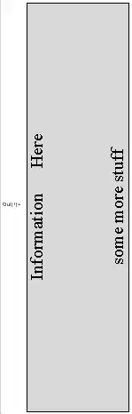
I need it to look like this (or similar), and to allow the elements to sit neatly close to each other when I append new elements to img-grid div, while making sure the old elements keep their positions.

I tried to do this using CSS3 columns, but they don't play well with dynamically appending elements to the img-grid div making the old images change positions.
Thanks in advance.