7

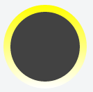
I have an background image in shape of a circle. Have given it a yellow border. I would like to change the border to a gradient from yellow to white. I have seen many examples with square borders but none applied to circles. Here's my code:

.Profileimage{
  background-image: url("images/profilePic.jpg");
  background-repeat: no-repeat;
  background-size: cover;
  overflow:hidden;
  -webkit-border-radius:50px;
  -moz-border-radius:50px;
  border-radius:50%;
  width:100px;
  height:100px;
  border: 5px solid rgb(252,238,33); 
}
<div class="Profileimage"></div>

Thanks!!

Woodrow Barlow
  • 8,477
  • 3
  • 48
  • 86
L N
  • 77
  • 1
  • 1
  • 4
  • 1
    this would use the `border-image` property, which can't be combined with `border-radius`. the answers to [this question](http://stackoverflow.com/questions/5706963/possible-to-use-border-radius-together-with-a-border-image-which-has-a-gradient) go in depth about why that is, and also suggest a technique you could use to spoof the effect. – Woodrow Barlow Jul 13 '15 at 16:52

3 Answers3

17

This Is Your Answer:

#cont{
  background: -webkit-linear-gradient(left top, crimson 0%, #f90 100%);
  width: 300px;
  height: 300px;
  border-radius: 1000px;
  padding: 10px;
}

#box{
  background: black;
  width: 300px;
  height: 300px;
  border-radius: 1000px;
}
<div id="cont">
  <div id="box"></div>
</div>
hmak.me
  • 3,770
  • 1
  • 20
  • 33
5

Maybe something like this?

.Profileimage{
  position: relative;
  background: linear-gradient(rgb(252,238,33), rgb(255,255,255));
  -webkit-border-radius:50px;
  -moz-border-radius:50px;
  border-radius:50%;
  width:100px;
  height:100px;
}
.Profileimage:after{
  position: absolute;
  display: block;
  top: 5px;
  left: 5px;
  width: 90px;
  height: 90px;
  content: "";
  background-color: #fff;
  background-image: url("images/profilePic.jpg");
  background-repeat: no-repeat;
  background-size: cover;
  border-radius: 50%;
  overflow: hidden;
}

Not sure if that's what you're looking for, but you can just set the background to the gradient, and then position an element over the top (here I'm using the 'after' pseudo selector)

Fiddle: http://jsfiddle.net/6ue88pu6/1/

Hiram Hibbard
  • 537
  • 2
  • 10
3

I see that this question is already old, but i just had the same problem and i could fix it. The trick is to wrap your div into another div.

.gradient-wrapper { padding: 10px; border-radius: 50%; display: inline-block;
  background: yellow; // As fallback for browsers which do not support gradient
  background: -webkit-linear-gradient(yellow, white); 
  background: -o-linear-gradient(yellow, white); 
  background: -moz-linear-gradient(yellow, white); 
  background: linear-gradient(yellow, white); 
}

#maincircle { width: 100px; height: 100px; background: #424242; border-radius: 50%; }
<div class="gradient-wrapper">
  <div id="maincircle">
    &nbsp;
  </div>
</div>

Result:

Result of Code Snippet

Hope this helped!

Luca Tescari
  • 162
  • 1
  • 12