I have a little problem with a ggplot barchart.
I wanted to make a barchart with ggplot2 in order to compare my Svolumes for my 4 stocks on a period of few months.
I have two problems:
The first one is that my y axis is wrong. My graph/data seems correct but the y axis don't "follow" as I thought it will contain another scale... I would to have to "total" number of my dataset svolumes, I think here it is writing my svolumes values. I don't know how to explain but I would like the scale corresponding to all of my data on the graph like 10,20,etc until my highest sum of svolumes.
There is my code:
Date=c(rep(data$date))
Subject=c(rep(data$subject))
Svolume=c(data$svolume)
Data=data.frame(Date,Subject,Svolume)

Data=ddply(Data, .(Date),transform,pos=cumsum(as.numeric(Svolume))-(0.5*(as.numeric(Svolume))))

ggplot(Data, aes(x=Date, y=Svolume))+
  geom_bar(aes(fill=Subject),stat="identity")+
  geom_text(aes(label=Svolume,y=pos),size=3)
and there is my plot:

I helped with the question here
Finally, How could I make the same plot for each months please? I don't know how to get the values per month in order to have a more readable barchart as we can't read anything here...
If you have other ideas for me I would be very glad to take any ideas and advices! Maybe the same with a line chart would be more readable...? Or maybe the same barchart for each stocks ? (I don't know how to get the values per stock either...)
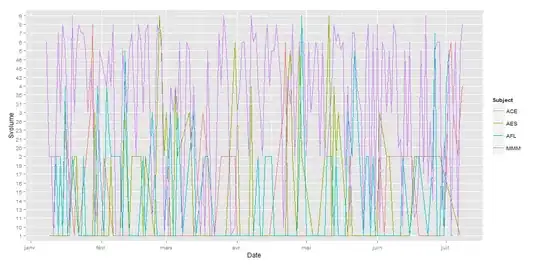
I just found how to do it with lines.... but once again my y axis is wrong, and it's not very readable....
Thanks for your help !! :)