This is the code that I have in my page
 <fieldset style="width: 60%; border: 1px solid #BBB; margin-left: auto; margin-right: auto; border-radius: 10px; text-align: center;">

   <div style="width: 95%; margin: 5px; padding: 6px; margin-left: auto; margin-right: auto; overflow-x: scroll; text-align: center;">
    <canvas id="graph" width="1645" height="300"></canvas>
   </div>

  </fieldset>
As you can see I have a canvas inside a div, which has set the overflow-x: scroll property.
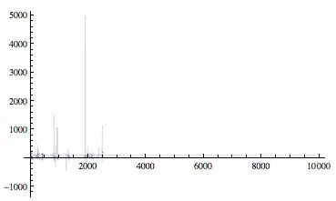
This is the result that I have which is what I am not looking for. As you can see the fieldset (which is width: 60%;) covers the entire screen width and over. The div is scrolling only a little part of the canvas.
This should be the result that I'd like to see:
Here I set the canvas width to 750 just to show what I want to have.
In conclusion, I want to have the fieldset with a width: 60% and a div that scrolls the overflow-x of the canvas. How could I do it?