36

Does anybody have any experience with different fonts for OCR? I am generating an ID then trying to scan it with tesseract. At the moment I am just T&E'n different fonts, but this seems pretty inefficient. I've tried the OCR* family of fonts, and various others such as Arial and Georgia. The tesseract tends to get confused with the OCR* fonts.

Is there any font specifically designed for tesseract, or any system font which works well with it?

Chris Lloyd
  • 12,100
  • 7
  • 36
  • 32

9 Answers9

20

After trying a lot of different fonts and OCR engines I tend to get the best results using Consolas. It is a monospaced typeface like OCR-A, but easier to read for humans. Consolas is included in several Microsoft products.

There is also an open source font Inconsolata, which is influenced by Consolas. Inconsolata is a good replacement for Consolas, especially considering the licensing details.

In my tests, the numbers and spaces in the Calibri font were not always recognized properly. OCR-A gave lots of reading errors. I did not give MIRC a try, since it is not easily readable for most humans.

Note: tesseract requires a lot of testing and fine-tuning before being reliable. In our case we switched to a commercially licensed OCR engine (ABBYY), especially since reliability was very important and we needed to support multiple (European) languages.

Update: 2017 Jan 31 - Changed 'based on Consolas' to 'influenced by Consolas' due to potential copyright issues.
Gawin
  • 994
  • 10
  • 12
  • how did Abbyy compare with previous iterations using tesseract? I'm considering the pros and cons of switching to commercial – Don Cheadle Jan 02 '15 at 22:17
  • In 2011 ABBYY worked 99% of the time. But it wouldn't surprise me if there are more attractive alternatives available now. – Gawin Aug 28 '16 at 10:06
  • 2
    Inconsolata is certainly not based on Consolas. If it were, then it would be a derivative work of Consolas and could not be released under a free license. The wikipedia page uses the word "influenced" which is a much better attribute in this case. Just pointing this out because understanding copyright is hard and it's useful to not use the wrong terms and create even more confusion. – josch Jan 29 '17 at 19:01
  • @josch In 2011, at the time of writing, the Wikipedia article said 'inspired' (see wikipedia history log) and an interview mentioned 'based'. But I understand that for copyright purposes 'influenced' might be more suitable, I'll update the answer. – Gawin Jan 31 '17 at 22:16
19

Okay, a search on google comes up with this, a specific OCR font: OCR Font

Looks like it's a standard adopted in 1973.

Paul Sonier
  • 38,903
  • 3
  • 77
  • 117
  • 1
    Link is dead. Are you refering to [OCR-A](https://en.wikipedia.org/wiki/OCR-A#Additional_characters)? – Arete May 31 '21 at 12:57
5

I find that Calibri works the best for me. We use OCR software daily in an automated system and after testing dozens of fonts (including some OCR specific ones) that Calibri is consistently the best.

Good luck.

  • 3
    The [Wikipedia page for Calibri](https://en.wikipedia.org/wiki/Calibri) notes that in Calibri lowercase L (l) and uppercase I are "effectively indistinguishable", which is a problem if you are doing OCR on non-prose text such as computer code, base64 printouts, etc. – Law29 Nov 28 '17 at 11:25
5

I'd probably use the same font that banks use for the routing numbers at the bottom of checks:

http://morovia.com/font/micr.asp

It was specifically designed to be unambiguously machine-readable.

benjismith
  • 16,559
  • 9
  • 57
  • 80
3

It really depends on the OCR engine considered.

For gocr, FreeMono is the best, see gocr documentation.

For tesseract, DejaVu-Serif works well, see https://superuser.com/a/1543382/280936

For abbyocr, verdana is good, see this comparison

See also this wrap-up: https://www.monperrus.net/martin/perfect-ocr-digital-data

Martin Monperrus
  • 1,845
  • 2
  • 19
  • 28
2

I had always success by simply using times new roman..

David
  • 141
  • 2
  • 2
    Yes, Roman font should yield good results. Make sure the image is grayscale or bitonal at between 200 and 300dpi. But you would probably be better off training the engine for a limited domain (alphabet/words) for this type of use-case. – sventechie Dec 04 '09 at 19:13
1

I've been doing extensive testing in this recently in an ECM called Laserfiche, which uses Nuance OmniPage, and I've found that monospace fonts perform poorly compared to dynamically spaced fonts. Those old OCR fonts don't perform as well as more 'normal' looking fonts. Especially for strings of numbers at smaller font sizes like point 12.

It's strange that someone else is having success with Calibri. It performed very poorly in my tests, routinely getting similar looking letters and numbers confused for each other. The best fonts (among those that come on a Windows computer with Office installed) were Consolas, Verdana, and Book Antiqua. All dynamic serif fonts where letters and numbers looked distinct. Consolas was the champion.

Glen Murie
  • 11
  • 1
0

Currently using Monospace. Tried very many fonts, but this is the most accurate one for me.

Sam
  • 900
  • 10
  • 18
0

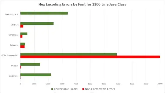
I recently ran an experiment to look at different OCR (using Adobe Acrobat Pro) fonts to help us Airgap code, which OCR is notoriously bad at handling. I found that you can just about guarantee 100% success if the code/text is converted to Hex, and if Book Antiqua with a size 14 font (full results are below) is used. There are errors of course (e.g. "S" -, "5"), but they can be corrected completely, and easily, utilizing a script. Once the script is run, convert back to ASCII. Of course you could go even further and print the bitstream of a file if you are willing to take the paper hit. A font comparison chart is below.

enter image description here

ShaneK
  • 193
  • 9