Stack Overflow seems to be full of similar questions but I haven't found a satisfying answer for my use case. Basically, I need a responsive, full screen background image for the top part of my front page. Means, narrowing the viewport leads to cropping, not stretching; the image should be centered. I'd like to avoid JS for this.
Aaron created a fiddle that almost looks like what I'm searching for. Two problems:
- Strange behaviour when narrowing viewport (below 500px width)
position: fixed;
I was able to reproduce the solution of Bryce Hanscomb and Gabriela Gabriel for a container (see my fiddle):

But I failed to extend this to full screen. This is my code (see fiddle):
HTML:
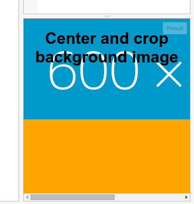
<div id="background">
    <img src="//dummyimage.com/600x200/0099cc/fff.png" />
</div>
CSS:
div#background {
  background-color: orange;
  min-height: 100%;
  min-width: 100%;
  overflow: hidden;
  position: absolute;
  top: 0;
  z-index: -1;
}
img {
  left: 50%;
  position: relative;
  transform: translate(-50%, 0);
  min-height: 100%;
  min-width: 100%;
}
Problem #1: The image doesn't take up the full height of its parent div (with min-height set to 100%).

Problem #2 + #3: In a narrow viewport, the image is cut off on the right (not centered), and a horizontal scrollbar is shown.
As a side note, can somebody tell me where those 4 pixels come from?