I have a div element that must have a background image that is fixed so when you scroll the content rolls over it. My issue is that I have to set a height for that specific div element in order to see it. That is because there isn't any content in that div.
CSS
#top-banner{
    background-image: url(../img/grey.jpg);
    background-attachment:fixed;
    height:700px;
    background-repeat: no-repeat;
    background-size: 100% auto;
}
HTML
<div class="container-fluid">
    <div class="row" >
        <div class="col-sm-12" id="top-banner"></div>
    </div>
    <div class="row">
        <div class="col-sm-12 text-center" >
            <h1 class="band-name">Lorem Ipsum</h1>
        </div>
    </div>
</div>
This gives me what I want for larger screens:
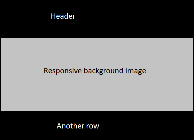
But as you shrink the browser, like you are on a phone or tablet, the height for that div pushes all the content down making it look unappealing:

Is there a way to not give it a specific height so the content is not pushed down on smaller screen but still have the fixed background image?
EDIT Here is a fiddle to check out. http://jsfiddle.net/0xbfhwnt/
I reiterate: It looks fine at first but when you make the browser smaller the image shrinks like it is supposed to but the height of the div stays keeping the content below the image instead of flush with the background image div.