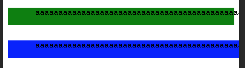
It seems that pre tag behaves differently if placed inside block layout and flex layout item:
  <div>
    <pre style="background-color: green;">
      aaaaaaaaaaaaaaaaaaaaaaaaaaaaaaaaaaaaaaaaaaaaaaaaaaaaaaaaaaaaaaaaaaaaaaaaaaaaaaaaaaaaaaaaaaaaaaaaaaaaaaaaaaaaaaaaaaaaaaaaaaaaaaaaaaaaaaaaaaaaaaaaaaaaaaaaaaaaaaaaaaaaaaaaaaaaaaaaaaaaaaaaaaaaaaaaaaaaaaaaaaaaaaaaaaaaaaaaaaaaaaaaaaaaaaaaaaaaaaaaaaaa
    </pre>
  </div>
  <div style="display: flex;">
    <pre style="background-color: blue;">
      aaaaaaaaaaaaaaaaaaaaaaaaaaaaaaaaaaaaaaaaaaaaaaaaaaaaaaaaaaaaaaaaaaaaaaaaaaaaaaaaaaaaaaaaaaaaaaaaaaaaaaaaaaaaaaaaaaaaaaaaaaaaaaaaaaaaaaaaaaaaaaaaaaaaaaaaaaaaaaaaaaaaaaaaaaaaaaaaaaaaaaaaaaaaaaaaaaaaaaaaaaaaaaaaaaaaaaaaaaaaaaaaaaaaaaaaaaaaaaaaaaaa
    </pre>
  </div>
First pre (marked with green background) is correctly sized by parent div's width (page width). But second pre that is placed inside flex container seems to have maximum width and spawns beyond page width. This happens only if pre have long words. Any ways I can correctly limit second pre's width without hacks like explicitly specifying it or cutting out exceeding text via overflow: hidden? I have tried white-space: pre-wrap; but it doesn't make any difference :(