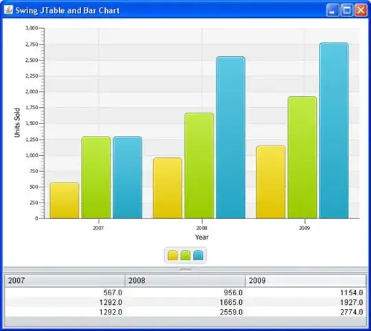
I'd like to create a graph that looks like this, but uses my own data for the min/max of the grey fit line

Here is a simple plot.
df <- data.frame(x1 = c(0,1,2,3,4),
                 y1 = c(2,3,4,5,6),
                 x2 = c(0,1,2,3,4),
                 y2 = c(3,4,6,7,8),
                 x3 = c(0,1,2,3,4),
                 y3 = c(0,0,1,2.5,2))

g <- ggplot(data=df) +
  geom_line(aes(x1,y1,color="red")) +
  geom_line(aes(x2,y2)) +
  geom_line(aes(x3,y3))
I want a transparent grey fill area like in the example to be behind the red line and between the 2 black lines. How do I accomplish this?


