I'm looking for a way to set the height of my div searchResults to 100% when I resize down to col-xs-12. When the searchFilter div shrinks down to col-xs-12 I hide it and its height is set to 20%. The div below it searchResults has a height of 80%, and when I resize down to col-xs-12 I want to change it's height to 100%.
I tried this in my css but it didn't work.
.searchResults .col-xs-12 {
    height: 100%;
}
I also tried
.searchResults > .col-xs-12 {
    height: 100%;
}
Here is my html and css
.searchFilter {
height: 20%;
}
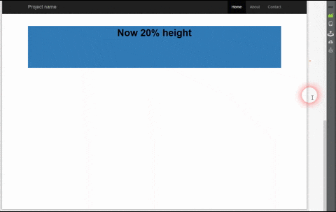
.searchResults {
height: 80%;
}
.searchResults .col-xs-12 {
height: 100%;
}<div class="container-fluid">
<div class="row">
<div class="col-lg-5 col-md-5 col-sm-5 hidden-xs">
@*Sidebar*@
<div id="googleResultMap"></div>
</div>
<div class="col-lg-7 col-md-7 col-sm-7 col-xs-12">
@*Body content*@
<div class="searchFilter col-lg-12 col-md-12 col-sm-12 hidden-xs">
hi
</div>
<div class="searchResults col-lg-12 col-xs-12 col-sm-12">
@*some content here left out*@
</div>
</div>
</div>
</div>