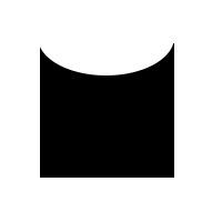
I want to create this shape using css or any other possible option. Is it possible? Is there any inside negative border for such a shape?
Thanks
I want to create this shape using css or any other possible option. Is it possible? Is there any inside negative border for such a shape?
Thanks
something like this?
.shape{
  display:inline-block;
  position:relative;
  background-color:black;
  width:60px;
  height:60px;
  padding-top:20px;
  overflow:hidden;
}
.shape:before{
  position:absolute;
  top:-20px;
  left:0;
  width:100%;
  height:40px;
  border-radius:50%;
  content:"";
  background-color:white;
}
<div class="shape">
</div>
Please Try this one
.flag {
  width: 110px;
  height: 56px;
  padding-top: 25px;
  position: relative;
  background: red;
  color: white;
  font-size: 11px;
  letter-spacing: 0.2em;
  text-align: center;
  text-transform: uppercase;
}
.flag:after {
  content: "";
  position: absolute;
  left: 0;
  top: 0;
  width: 0;
  height: 0;
  border-top: 13px solid #eee;
  border-left: 55px solid transparent;
  border-right: 55px solid transparent;
}
you could to do selector :before and add border-radius to pseudo element.
a hacky way and probable wont do you any good but here we go:
<style>


.test {background: #000;
            width:100px;
            height:100px;
            color:#fff;
            padding:40px;

        }
    .test:before {
        position: absolute;
        left:0;
        top:-10px;
        width:200px;
        height:40px;
        border-radius: 50%;
        content:'';
        background-color: #fff;
    }
</style>


<div class="test">

        this is a rtest content
    </div>
or you could use a svg background :)