I want to display the following table:
+----+------+-------------+---------+
| id | name | description | actions |
+----+------+-------------+---------+
| .. |  ..  |     ..      |   ..    |
I want that
- the first column (id) has the minutest width possible (white-space:nowrap)
- the other columns (name, description) should break the words when necessary (word-wrap: break-word)
- the last column has also the minutest width possible (white-space:nowrap)
What I have:
<table class="table_standard" style="word-wrap:break-word; table-layout: fixed;">
But with this code all columns have the same width.
How can I solve this problems?
@thomasfuchs
This is how it looks with a 1920x1080 monitor:

This is how it looks with a lower screen width:
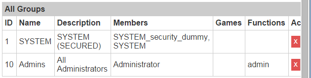
And this is how it looks with an extreme low resolution:

As you can see, I want that the browser breaks the words if the resolution is too low but it just doesn't display the complete table.
This is my current code:
<style>
    col.id          { width: 1%; }
    col.name        { width: 20%; }
    col.description     { width: 30%; }
    col.users     { width: 30%; }
    col.games     { width: 9%; }
    col.functions     { width: 9%; }
    col.actions     { width: 1%; }
    table td:nth-child(2) { word-wrap: break-word; }
    table td:nth-child(3) { word-wrap: break-word; }
    table td:nth-child(4) { word-wrap: break-word; }
</style>
<table class="table_standard" style="word-wrap: break-word">
    <colgroup>
        <col class="id">
        <col class="name">
        <col class="description">
        <col class="users">
        <col class="games">
        <col class="functions">
        <col class="actions">
    </colgroup>
    <tr>
        <th class="th_titlebar" colspan="7">Alle Gruppen</th>
    </tr>
    <tr>
        <th class="th_subtitle">ID</th>
        <th class="th_subtitle">Name</th>
        <th class="th_subtitle">Description</th>
        <th class="th_subtitle">Members</th>
        <th class="th_subtitle">Games</th>
        <th class="th_subtitle">Functions</th>
        <th class="th_subtitle">Actions</th>
    </tr>
    //loop with data from the db
</table>