25

I have a div with a 1px border and I'm trying to create a 3px border in another color to that div. I'm using this code:

box {
  border: 1px solid #ddd;
  border-top: 3px solid #3F9BD0;
}

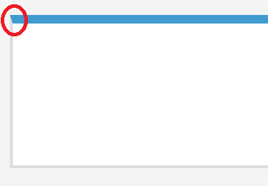
but at the corners the border is not good, see image:
bad border

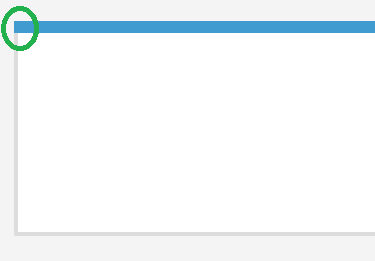
How can I make this border look good, like this:
desired border with right-angled corners

fiddle: https://jsfiddle.net/15tory3z/

Ilmari Karonen
  • 49,047
  • 9
  • 93
  • 153
AlbaStar
  • 469
  • 5
  • 12

7 Answers7

17

Instead of border-top, try using the :after pseudo-element to recreate the effect you want.

.box {
  width: 200px;
  height: 100px;
  border: 1px solid #ddd;
  position: relative;
}
.box:after {
  position: absolute;
  content: "";
  width: 100%;
  height: 5px;
  top: -5px;
  background: dodgerblue;
  padding: 1px;
  left: -1px;
}
<div class="box"></div>

Choice 2:

Use linear-gradient().

.box {
  width: 200px;
  height: 100px;
  border: 1px solid #ddd;
  background: -webkit-linear-gradient(top, dodgerblue 5%, #fff 5%);
  background: -moz-linear-gradient(top, dodgerblue 5%, #fff 5%);
  background: -o-linear-gradient(top, dodgerblue 5%, #fff 5%);
  background: -ms-linear-gradient(top, dodgerblue 5%, #fff 5%);
  background: linear-gradient(top, dodgerblue 5%, #fff 5%);
}
<div class="box"></div>
approxiblue
  • 6,982
  • 16
  • 51
  • 59
Akshay
  • 14,138
  • 5
  • 46
  • 70
15

You could draw these with inset shadows and padding :

div {
  padding:12px 5px 5px;
  width: 40%;
  height: 200px;
  box-shadow: inset 0 10px #3F9BD0, inset 4px 0 gray, inset -4px 0 gray, inset 0 -4px  gray
}
<div></div>

or just an outset top shadow

div {
 
  width: 40%;
  height: 200px;
  border:2px solid gray;
  border-top:none;
  box-shadow:  0 -10px #3F9BD0;
  margin-top:12px;
}
<div></div>

else, background gradient could be used and even animated 2 examples : http://codepen.io/gc-nomade/pen/IGliC or http://codepen.io/gc-nomade/pen/pKwby

G-Cyrillus
  • 101,410
  • 14
  • 105
  • 129
7

This also puts a line on top:

.box1 {
  border: 10px solid #ddd;
  border-top: 0;
  box-shadow: 0 -30px 0 #3F9BD0;
  float: left;
  width: 300px;
  height: 300px;
}
<div class="box1"></div>
Madalina Taina
  • 1,968
  • 20
  • 26
3

Use css :after pseudo-class, docs

.box_big {
  border: 10px solid #ddd;
  position:relative;
  z-index: 1;
}
.box_big:after{
    height: 10px;
    position: absolute;
    top:-10px; left:-10px; right:-10px;
    content: " ";
    z-index: 2;
    background: red;
}
.box {
  border: 1px solid #ddd;
  position:relative;
  z-index: 1;
}
.box:after{
    height: 3px;
    position: absolute;
    top:-3px; left:-1px; right:-1px;
    content: " ";
    z-index: 2;
    background: red;
}
<div class="box_big">
    big box
</div>
<hr />
<div class="box">
    your box
</div>
Medet Tleukabiluly
  • 11,662
  • 3
  • 34
  • 69
1

Welcome to the css borders. The only way to properly do that is using :after or :before pseudoelements.

Fiddle

.box {
    border: 1px solid #ddd;
    position: relative;
}
.box:after {
    position: absolute;
    display: block;
    content:'';
    /* Positioning */
    top: 0;
    width: 100%;
    height: 3px;
    left: 0;
    right: 0;
    /* Color */
    background-color: #3F9BD0;
}
knitevision
  • 3,023
  • 6
  • 29
  • 44
1

Try this:

.box {
  outline: 2px solid #ddd;
  margin-top: -2px;
  border-top: 10px solid #3F9BD0;
  min-width:100px;
  min-height:100px;
  float:left;
}
<div class="box"></div>
Madalina Taina
  • 1,968
  • 20
  • 26
1

The question is a bit old but I thought I'd make a suggestion that worked for me in a similar situation.

I just set border-width: 0; and that took away the mitered ends and made them nice and square for a button that I had a bottom-border applied.

Rockin4Life33
  • 2,240
  • 1
  • 31
  • 29