1

I have a div container with display: inline-block; with a background color.

Inside this div, I add more rectangle divs side by side with float:left.

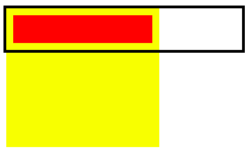
When there is not enough space for all the divs on one line, the next one is added under the others, leaving an empty space on the right side of the page. The empty space left over has the color of the background of my container but I want it to be white.

enter image description here

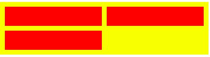
The image on the left is what it currently looks like. The image on the right is what it should look like; the parents background should shrink wrap around its children:

enter image description here

Here is a jsfiddle of the below:

.bigDiv {
  background-color: #aaa;
  display: inline-block;
}
.item {
  height: 50px;
  width: 150px;
  background-color: #000;
  float: left;
  margin: 10px;
}
<div class="bigDiv">
  <div class="item"></div>
  <div class="item"></div>
  <div class="item"></div>
  <div class="item"></div>
  <div class="item"></div>
  <div class="item"></div>
</div>
misterManSam
  • 24,303
  • 11
  • 69
  • 89
IggY
  • 3,005
  • 4
  • 29
  • 54
  • Do you want four in a row? – Praveen Kumar Purushothaman Sep 03 '15 at 16:08
  • so you want to stretch the last div in the line to fill the space till the end of the line? and what did you try? – smnbbrv Sep 03 '15 at 16:08
  • Just use percentages and put them together? – Kadeem L Sep 03 '15 at 16:08
  • Can you post some CSS and HTML? Are these things variable or fixed width? – ryachza Sep 03 '15 at 16:09
  • @smnbbrv No, I want the width of the grey part to stop at the 3rd div, not to fill the empty width on the right – IggY Sep 03 '15 at 16:12
  • This isn't possible with CSS. The "extra" space is just that...space, not an element and so it can't be styled or selected. This behaviour is standard for all box models as far as I know, – Paulie_D Sep 03 '15 at 16:16
  • @Paulie_D Can't I force my grey div to fit the width of its content ? – IggY Sep 03 '15 at 16:18
  • @IggY Nope...the box-model / block formatting just doesn't work that way. You're trying the ultimate "shrink-wrap" and AFAIK...it's not possible. Love to find out I'm wrong though. – Paulie_D Sep 03 '15 at 16:19
  • 1
    There is an existing duplicate question somewhere on SO which was given a javascript solution. Only way this is possible. I remember it from a year or so ago. – misterManSam Sep 03 '15 at 16:37
  • @IggY - I made a few edits to the question, there is nothing wrong with it and I'm trying to make it clearer :) – misterManSam Sep 03 '15 at 17:19
  • @misterManSam Possibly - http://stackoverflow.com/questions/8684793/shrink-wrap-and-center-a-container-for-inline-block-elements – Paulie_D Sep 03 '15 at 17:47

2 Answers2

2

Creating "pseudo-backgrounds"

I have just come up with a somewhat... creative solution:

  • The parent is not given a background, only padding and overflow: hidden

  • Each child div is given a ::before pseudo element that will create a "pseudo-background" (z-index: -1 moves it behind the divs background)

  • The pseudo-background is positioned with top, left and right with negative values that drag them into the divs padding.

  • The height: 1000% can be any absurd number, as long as it is tall enough to cover every row of divs. The excess is cleanly cut off with overflow: hidden on the parent div

This is what each div looks like, the black border is the edge of the parent which is where the yellow "pseudo-background" is cut off:

Screenshot 1

it becomes this:

Screenshot 2

Note: This is a purely visual thought experiment, which may be useful in some cases. The div is still taking up the same width, it just has no background color.

Example

Resize it, see how the "pseudo-background" works at all widths.

.wrapper {
  overflow: hidden;
  padding: 10px 0 0 10px;
  width: 70%;
}
.wrapper > div {
  height: 40px;
  background: #F00;
  margin: 0 10px 10px 0;
  width: 200px;
  float: left;
  position: relative;
}
.wrapper > div::before {
  content: '';
  position: absolute;
  background: rgba(255, 255, 0, 1);
  left: -10px;
  right: -10px;
  top: -10px;
  z-index: -1;
  height: 1000%;
}
<div class="wrapper">
  <div></div>
  <div></div>
  <div></div>
  <div></div>
  <div></div>
  <div></div>
  <div></div>

</div>
Community
  • 1
  • 1
misterManSam
  • 24,303
  • 11
  • 69
  • 89
  • 1
    Obviously this is a visual solution only as the actual container will still have the *extra* width. Interesting though. – Paulie_D Sep 03 '15 at 17:41
  • Exactly what I wanted. I don't want to use the extra width so it's perfect for me ! Thank's. If someone could provide me a link explaining why it is so complicated to do that I'd love it ! – IggY Sep 04 '15 at 07:08
1

This is a perfect use-case of <table> or better, FlexBox:

Preview:

Snippet:

.flex-container {
  margin: 10px;
  display: -ms-flexbox;
  display: -webkit-flex;
  display: flex;
  -webkit-flex-direction: row;
  -ms-flex-direction: row;
  flex-direction: row;
  -webkit-flex-wrap: wrap;
  -ms-flex-wrap: wrap;
  flex-wrap: wrap;
  -webkit-justify-content: flex-start;
  -ms-flex-pack: start;
  justify-content: flex-start;
  -webkit-align-content: stretch;
  -ms-flex-line-pack: stretch;
  align-content: stretch;
  border: 1px solid #999;
}

.flex-item {
  -webkit-order: 1;
  -ms-flex-order: 1;
  order: 1;
  -webkit-flex: 1 1 auto;
  -ms-flex: 1 1 auto;
  flex: 1 1 auto;
  -webkit-align-self: auto;
  -ms-flex-item-align: auto;
  align-self: auto;
  border: 1px solid #99f;
  margin: 5px;
  min-width: 30%;
}
<div class="flex-container">
  <div class="flex-item">Hello</div>
  <div class="flex-item">Hello</div>
  <div class="flex-item">Hello</div>
  <div class="flex-item">Hello</div>
</div>

<div class="flex-container">
  <div class="flex-item">Hello</div>
  <div class="flex-item">Hello</div>
  <div class="flex-item">Hello</div>
</div>

<div class="flex-container">
  <div class="flex-item">Hello</div>
  <div class="flex-item">Hello</div>
</div>

Same CSS, infinite entries.

Praveen Kumar Purushothaman
  • 164,888
  • 24
  • 203
  • 252
  • Not in this case I don't think...that's not what he's after,...at least as far as he knows. – Paulie_D Sep 03 '15 at 16:14
  • @Paulie_D Check out my updated snippet. Just updated. – Praveen Kumar Purushothaman Sep 03 '15 at 16:14
  • I think you misunderstood my problem. I don't want all the divs to fit in one line, I'm fine with the way they are positioned. What I want is the enclosing div with background color to not fill all the width of the page but stop at the 3rd div of the first line, to not have a grey margin on the right as shown on the screenshot – IggY Sep 03 '15 at 16:15
  • But you're not addressing his color issue. He's happy with the wrapping...is the color underneath he wants to affect. I agree flexbox might be more appropriate for what he *needs* but that's not what he's asking for, – Paulie_D Sep 03 '15 at 16:15
  • @Paulie_D Now I understood. Please have a look at the updated fiddle. Thanks for the clarification. – Praveen Kumar Purushothaman Sep 03 '15 at 16:24
  • Something like this? Or am I totally missing the mark? https://jsfiddle.net/swx2cux7/1/ – Kadeem L Sep 03 '15 at 16:29
  • Nope...unfortunately, you're still stretching elements not shrinkwrapping the container. As I said in the comments. this isn't possible AFAIK. Perfect shrinkwrapping of floats & inline blocks isn't possible and flexbox doesn't change that....at least AFAIK – Paulie_D Sep 03 '15 at 16:29
  • @IggY Try giving a `float: left` to the parent `
    `?
    – Praveen Kumar Purushothaman Sep 03 '15 at 16:31
  • 1
    @PraveenKumar I made a fiddle and added a screenshot to explain better what I did and what I want – IggY Sep 03 '15 at 16:33
  • 2
    There is an existing duplicate question somewhere on SO which was given a javascript solution. Only way this is possible. I remember it from a year or so ago. – misterManSam Sep 03 '15 at 16:36
  • Yeah...I'm sure this is s dupe too. I'd love to get to grips with why the *extra* space is there. It's something to do with `line-box` or something like that. – Paulie_D Sep 03 '15 at 17:42