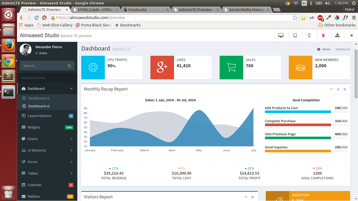
I'm using https://almsaeedstudio.com/preview theme which gives some brilliant boxes layout and social widget boxes layout which I want to use in my project.
Refer to simple box screenshot
and social widget box
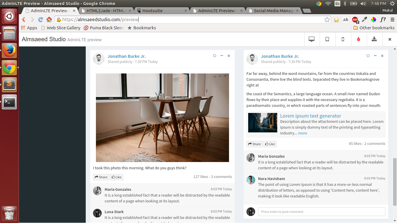 .
.
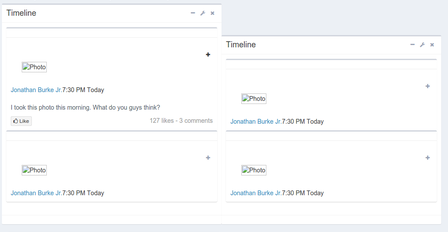
I'm trying to arrange multiple simple boxes horizontally where each of the simple box can contain multiple social widget boxes.
Refer to this screenshot for more clarity:
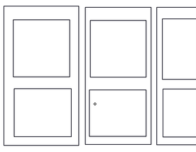 .
.
I tried playing with the exiting simple boxes and social widget boxes code and come up with this snippet.
I have created this plunker, somehow css is not getting loaded properly.
<!DOCTYPE html>
<html>

  <head>
    <link rel="stylesheet" href="style.css">
    <script src="script.js"></script>
  </head>

  <body>
    <div class="row">
  <div class="col-md-12">
    <div style="overflow:auto;">
      <div class="" style="width:2050px;">
        <div class="box" style="display:inline-block;width:1000px;">
          <div class="box-header with-border">
            <h3 class="box-title">Monthly Recap Report</h3>
            <div class="box-tools pull-right">
              <button class="btn btn-box-tool" data-widget="collapse"><i class="fa fa-minus"></i>
              </button>
              <div class="btn-group">
                <button class="btn btn-box-tool dropdown-toggle" data-toggle="dropdown"><i class="fa fa-wrench"></i>
                </button>
                <ul class="dropdown-menu" role="menu">
                  <li><a href="#">Action</a>
                  </li>
                  <li><a href="#">Another action</a>
                  </li>
                  <li><a href="#">Something else here</a>
                  </li>
                  <li class="divider"></li>
                  <li><a href="#">Separated link</a>
                  </li>
                </ul>
              </div>
              <button class="btn btn-box-tool" data-widget="remove"><i class="fa fa-times"></i>
              </button>
            </div>
          </div>
          <!-- /.box-header -->
          <div class="box-body" style="display: block;">
            <div class="">


              <div class="box box-widget collapsed-box">
                <hr>
                <div class="box-header with-border">
                  <div class="user-block">
                    <img src="../dist/img/photo2.png" alt="Photo" class="img-responsive pad"><span class="username"><a href="#">Jonathan Burke Jr.</a></span><span class="description">7:30 PM Today</span>
                  </div>
                  <!-- /.user-block-->
                  <div class="box-tools">
                    <button data-widget="collapse" class="btn btn-box-tool"><i class="fa fa-plus"></i>
                    </button>
                  </div>
                  <!-- /.box-tools-->
                </div>
                <!-- /.box-header-->
                <div class="box-body" style="display: block;">
                  <p>I took this photo this morning. What do you guys think?</p>
                  <button class="btn btn-default btn-xs"><i class="fa fa-thumbs-o-up"></i> Like</button><span class="pull-right text-muted">127 likes - 3 comments</span>
                </div>
                <!-- /.box-body-->
                <div class="box-footer box-comments" style="display: block;">
                  <div class="box-comment">
                    <!-- User image-->
                    <img src="../dist/img/photo2.png" alt="Photo" class="img-responsive pad">
                    <div class="comment-text"><span class="username">Maria Gonzales<span class="text-muted pull-right">8:03 PM Today</span></span>
                      <!-- /.username-->It is a long established fact that a reader will be distracted by the readable content of a page when looking at its layout.
                    </div>
                    <!-- /.comment-text-->
                  </div>
                  <!-- /.box-comment-->
                  <div class="box-comment">
                    <!-- User image-->
                    <img class="img-responsive img-circle img-sm" src="../dist/img/user4-128x128.jpg" alt="alt text">
                    <div class="comment-text"><span class="username">Luna Stark<span class="text-muted pull-right">8:03 PM Today</span></span>
                      <!-- /.username-->It is a long established fact that a reader will be distracted by the readable content of a page when looking at its layout.
                    </div>
                    <!-- /.comment-text-->
                  </div>
                  <!-- /.box-comment-->
                </div>
                <!-- /.box-footer-->
                <div class="box-footer" style="display: block;">
                  <form>
                    <img class="img-responsive img-circle img-sm" src="../dist/img/user4-128x128.jpg" alt="alt text">
                    <div class="img-push">
                      <input type="text" placeholder="Press enter to post comment" class="form-control input-sm">
                    </div>
                  </form>
                </div>
                <!-- /.box-footer-->
              </div>
              <div class="box box-widget collapsed-box">
                <hr>
                <div class="box-header with-border">
                  <div class="user-block">
                    <img src="../dist/img/photo2.png" alt="Photo" class="img-responsive pad"><span class="username"><a href="#">Jonathan Burke Jr.</a></span><span class="description">7:30 PM Today</span>
                  </div>
                  <!-- /.user-block-->
                  <div class="box-tools">
                    <button data-widget="collapse" class="btn btn-box-tool"><i class="fa fa-plus"></i>
                    </button>
                  </div>
                  <!-- /.box-tools-->
                </div>
                <!-- /.box-header-->
                <div class="box-body" style="display: block;">
                  <p>I took this photo this morning. What do you guys think?</p>
                  <button class="btn btn-default btn-xs"><i class="fa fa-thumbs-o-up"></i> Like</button><span class="pull-right text-muted">127 likes - 3 comments</span>
                </div>
                <!-- /.box-body-->
                <div class="box-footer box-comments" style="display: block;">
                  <div class="box-comment">
                    <!-- User image-->
                    <img src="../dist/img/photo2.png" alt="Photo" class="img-responsive pad">
                    <div class="comment-text"><span class="username">Maria Gonzales<span class="text-muted pull-right">8:03 PM Today</span></span>
                      <!-- /.username-->It is a long established fact that a reader will be distracted by the readable content of a page when looking at its layout.
                    </div>
                    <!-- /.comment-text-->
                  </div>
                  <!-- /.box-comment-->
                  <div class="box-comment">
                    <!-- User image-->
                    <img class="img-responsive img-circle img-sm" src="../dist/img/user4-128x128.jpg" alt="alt text">
                    <div class="comment-text"><span class="username">Luna Stark<span class="text-muted pull-right">8:03 PM Today</span></span>
                      <!-- /.username-->It is a long established fact that a reader will be distracted by the readable content of a page when looking at its layout.
                    </div>
                    <!-- /.comment-text-->
                  </div>
                  <!-- /.box-comment-->
                </div>
                <!-- /.box-footer-->
                <div class="box-footer" style="display: block;">
                  <form>
                    <img src="../dist/img/photo2.png" alt="Photo" class="img-responsive pad">
                    <div class="img-push">
                      <input type="text" placeholder="Press enter to post comment" class="form-control input-sm">
                    </div>
                  </form>
                </div>
                <!-- /.box-footer-->
              </div>


            </div>
            <!-- /.row -->
          </div>
          <!-- ./box-body -->
          <div class="box-footer" style="display: block;">
            <!-- /.row -->
          </div>
          <!-- /.box-footer -->
        </div>
        <!-- /.box -->

        <div class="box" style="display:inline-block;width:1000px;">
          <div class="box-header with-border">
            <h3 class="box-title">Monthly Recap Report</h3>
            <div class="box-tools pull-right">
              <button class="btn btn-box-tool" data-widget="collapse"><i class="fa fa-minus"></i>
              </button>
              <div class="btn-group">
                <button class="btn btn-box-tool dropdown-toggle" data-toggle="dropdown"><i class="fa fa-wrench"></i>
                </button>
                <ul class="dropdown-menu" role="menu">
                  <li><a href="#">Action</a>
                  </li>
                  <li><a href="#">Another action</a>
                  </li>
                  <li><a href="#">Something else here</a>
                  </li>
                  <li class="divider"></li>
                  <li><a href="#">Separated link</a>
                  </li>
                </ul>
              </div>
              <button class="btn btn-box-tool" data-widget="remove"><i class="fa fa-times"></i>
              </button>
            </div>
          </div>
          <!-- /.box-header -->
          <div class="box-body" style="display: block;">
            <div class="">


              <div class="box box-widget collapsed-box">
                <hr>
                <div class="box-header with-border">
                  <div class="user-block">
                    <img src="../dist/img/photo2.png" alt="Photo" class="img-responsive pad"><span class="username"><a href="#">Jonathan Burke Jr.</a></span><span class="description">7:30 PM Today</span>
                  </div>
                  <!-- /.user-block-->
                  <div class="box-tools">
                    <button data-widget="collapse" class="btn btn-box-tool"><i class="fa fa-plus"></i>
                    </button>
                  </div>
                  <!-- /.box-tools-->
                </div>
                <!-- /.box-header-->
                <div class="box-body" style="display: block;">
                  <p>I took this photo this morning. What do you guys think?</p>
                  <button class="btn btn-default btn-xs"><i class="fa fa-thumbs-o-up"></i> Like</button><span class="pull-right text-muted">127 likes - 3 comments</span>
                </div>
                <!-- /.box-body-->
                <div class="box-footer box-comments" style="display: block;">
                  <div class="box-comment">
                    <!-- User image-->
                    <img class="img-responsive img-circle img-sm" src="../dist/img/user4-128x128.jpg" alt="alt text">
                    <div class="comment-text"><span class="username">Maria Gonzales<span class="text-muted pull-right">8:03 PM Today</span></span>
                      <!-- /.username-->It is a long established fact that a reader will be distracted by the readable content of a page when looking at its layout.
                    </div>
                    <!-- /.comment-text-->
                  </div>
                  <!-- /.box-comment-->
                  <div class="box-comment">
                    <!-- User image-->
                    <img src="../dist/img/user4-128x128.jpg" alt="user image" class="img-circle img-sm">
                    <div class="comment-text"><span class="username">Luna Stark<span class="text-muted pull-right">8:03 PM Today</span></span>
                      <!-- /.username-->It is a long established fact that a reader will be distracted by the readable content of a page when looking at its layout.
                    </div>
                    <!-- /.comment-text-->
                  </div>
                  <!-- /.box-comment-->
                </div>
                <!-- /.box-footer-->
                <div class="box-footer" style="display: block;">
                  <form>
                    <img class="img-responsive img-circle img-sm" src="../dist/img/user4-128x128.jpg" alt="alt text">
                    <div class="img-push">
                      <input type="text" placeholder="Press enter to post comment" class="form-control input-sm">
                    </div>
                  </form>
                </div>
                <!-- /.box-footer-->
              </div>
              <div class="box box-widget collapsed-box">
                <hr>
                <div class="box-header with-border">
                  <div class="user-block">
                    <img src="../dist/img/photo2.png" alt="Photo" class="img-responsive pad"><span class="username"><a href="#">Jonathan Burke Jr.</a></span><span class="description">7:30 PM Today</span>
                  </div>
                  <!-- /.user-block-->
                  <div class="box-tools">
                    <button data-widget="collapse" class="btn btn-box-tool"><i class="fa fa-plus"></i>
                    </button>
                  </div>
                  <!-- /.box-tools-->
                </div>
                <!-- /.box-header-->
                <div class="box-body" style="display: block;">
                  <p>I took this photo this morning. What do you guys think?</p>
                  <button class="btn btn-default btn-xs"><i class="fa fa-thumbs-o-up"></i> Like</button><span class="pull-right text-muted">127 likes - 3 comments</span>
                </div>
                <!-- /.box-body-->
                <div class="box-footer box-comments" style="display: block;">
                  <div class="box-comment">
                    <!-- User image-->
                    <img src="../dist/img/photo2.png" alt="Photo" class="img-responsive pad">
                    <div class="comment-text"><span class="username">Maria Gonzales<span class="text-muted pull-right">8:03 PM Today</span></span>
                      <!-- /.username-->It is a long established fact that a reader will be distracted by the readable content of a page when looking at its layout.
                    </div>
                    <!-- /.comment-text-->
                  </div>
                  <!-- /.box-comment-->
                  <div class="box-comment">
                    <!-- User image-->
                    <img src="../dist/img/user4-128x128.jpg" alt="user image" class="img-circle img-sm">
                    <div class="comment-text"><span class="username">Luna Stark<span class="text-muted pull-right">8:03 PM Today</span></span>
                      <!-- /.username-->It is a long established fact that a reader will be distracted by the readable content of a page when looking at its layout.
                    </div>
                    <!-- /.comment-text-->
                  </div>
                  <!-- /.box-comment-->
                </div>
                <!-- /.box-footer-->
                <div class="box-footer" style="display: block;">
                  <form>
                    <img src="../dist/img/photo2.png" alt="Photo" class="img-responsive pad">
                    <div class="img-push">
                      <input type="text" placeholder="Press enter to post comment" class="form-control input-sm">
                    </div>
                  </form>
                </div>
                <!-- /.box-footer-->
              </div>


            </div>
            <!-- /.row -->
          </div>
          <!-- ./box-body -->
          <div class="box-footer" style="display: block;">
            <!-- /.row -->
          </div>
          <!-- /.box-footer -->
        </div>


      </div>
      <!-- /.col -->
    </div>
  </div>
</div>
  </body>

</html>
http://plnkr.co/edit/slpJLIRVGfMSC8JWG1bT?p=preview
But its not working. Can anyone please help me how to accomplish this ?
P.S.: I have searched on internet and found similar threads but none is working for me. Horizontally align div without float
I'm still a beginner in CSS and would really appreciate if I can get some help here. I'm breaking my head on this for a long time.
Update
I think it makes sense to clearly write out the actual issues and try to solve them one by one.
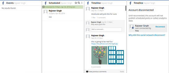
- Horizontal boxes are not aligned on the same row if the inner social widget box is collapsed/expanded. How can I ensure the height of the horizontal box is fixed irrespective of the inner social widget box height ? Refer to screenshot for same.
- There are some answers which mention the use of
display: float:left;but my issue is the variable width which actually ensures all horizontal boxes on the same row.
<div class="" style="width:2050px;">
How do I ensure the width:2050px; to increase dynamically as I will be adding inner boxes on fly. P.S.: I'm using angularjs for ui. Is there any CSS trick which is independent of the width:2050px; That way there will be no dependency on the total width calculation.
How to fix the height of inner social widget box ? The inner social widget box overflows the actual horizontol container. how can I fix this ?
Sharing an image of what actually I'm trying to accomplish.
 .
.
In short I want to accomplish point 4 with this theme's existing boxes and social widget boxes. If there is any other better way of doing this, please share the same.
In case anything is not clear, please feel free to mention it in comment. I'll update the question accordingly.
Thanks
Update 2:
I think same height columns is what making this problem more complicated. What I can do is having a scroll bar inside horizontol box which can have multiple social widgets boxes. That way we can have a fixed height for each of the horizontol column.
Update 3:
While zer00ne@ has provided one solution which is based on Flex. I have read on some forums that it doesn;t work on all browsers. Since my web-page is going to be mobile friendly, I;m more inclined towards achieving my desired results using general CSS techniques.
In path of achieving my result, I created following version http://plnkr.co/edit/awVmJWJo0AdrQvdbXG2y?p=preview using this SO thread. Following is screenshot of same:
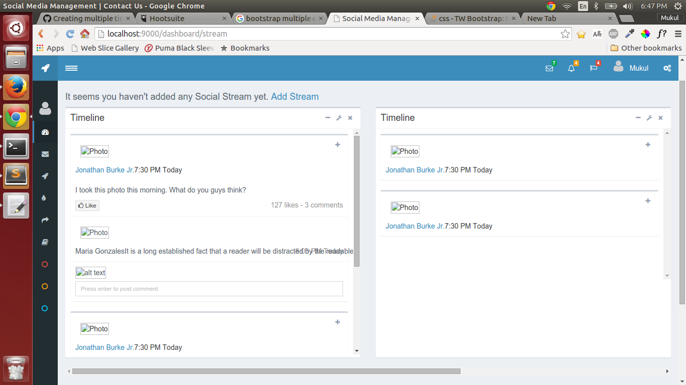
Now I'm facing one issue of text getting out of inner social widget box. I need some help on this thing.
In addition to that, can people take a review of these if this solution is any better or not ?
Thanks