I'm attempting to create a multi-project timeline that features various stages of the project in order to organize all of our current projects going forward in one easy to visualize place.
I initially found the timeline() package and was able to semi-create what I was hoping for. However, it appears that package is not very customizable, so I am hoping to complete my timeline in ggplot2() instead.
Here is my fake data:
Phase Project StartDate EndDate
SD Test1 2015-08-01 2015-08-31
DD Test1 2015-08-31 2015-09-30
CD Test1 2015-09-30 2015-11-14
PC Test1 2015-11-14 2015-12-14
CA Test1 2015-12-14 2016-08-10
SD Test2 2015-09-01 2015-10-01
DD Test2 2015-10-01 2015-10-31
CD Test2 2015-10-31 2015-12-15
PC Test2 2015-12-15 2016-01-14
CA Test2 2016-01-14 2017-01-08
SD Test3 2016-01-01 2016-01-13
DD Test3 2016-01-13 2016-01-25
CD Test3 2016-01-25 2016-02-12
PC Test3 2016-02-12 2016-03-13
CA Test3 2016-03-13 2017-01-07
SD Test4 2015-06-01 2015-06-01
DD Test4 2015-06-01 2015-06-01
CD Test4 2015-06-01 2015-06-01
PC Test4 2015-06-01 2015-07-01
CA Test4 2015-07-01 2015-07-01
SD Test5 2015-05-01 2015-05-25
DD Test5 2015-05-25 2015-06-18
CD Test5 2015-06-18 2015-07-24
PC Test5 2015-07-24 2015-08-23
CA Test5 2015-08-23 2015-08-23
As you can see, each project has 5 stages (SD, DD, CD, PC, CA) listed even though some projects (Test4) will not have a couple of stages as they currently have the same date periods listed.
When I ran my the code with timeline(), this is what I got:
    data$StartDate<- as.Date(data$StartDate)
    data$EndDate<- as.Date(data$EndDate)
    timeline(data, text.size=4)

So as you can see, the phases get overlapped in some situations and I can't adjust fonts or center the text in their respective boxes.
Because of this, I am attempting to move to a ggplot, but can't figure out how to make it similar to this timeline.
So far this is my new code:
ggplot(data,aes(x=data$StartDate, y=data$Project)) +
  geom_line()+
  geom_point()+
  geom_text(aes(label=data$Phase), hjust=0,vjust=0)
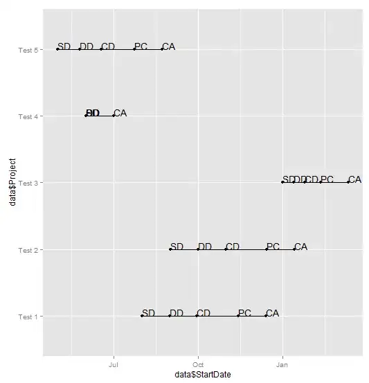
As it currently stands, the xlim is too small to show the entire CA phase of a couple of my projects. Also, I'm hoping to be able to customize the text, reorder it by nearest start date to latest, change xlab and ylab and other graphical changes that I don't believe are possible in the timleline() package.
Thanks for any and all help and please let me know if you need any clarification!
