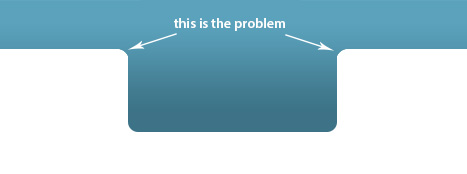
I have no idea how would i make something like inverted circle in the corners. I have attached picture for better understanding.
Is this even possible to create using CSS3 or perhaps jQuery?
I have no idea how would i make something like inverted circle in the corners. I have attached picture for better understanding.
Is this even possible to create using CSS3 or perhaps jQuery?
How i would recommend create that shape SVG.
Css solution:
Using a before and after elements that matches the background.
.shape {
  position: relative;
  width: 400px;
  height: 120px;
  background-color: cornflowerblue;
  text-align: center;
  color: white;
  line-height: 120px;
}
/*replace with "" if your going to use the code*/

.shape:before {
  content: "↙";
  font-size: 2.5em;
  text-indent: 35%;
  line-height: 0%;
  position: absolute;
  top: calc(100% - 20px);
  left: 0;
  width: 35%;
  height: 50%;
  background-color: white;
  border-top-right-radius: 15px;
}
.shape:after {
  content: "↘";
  line-height: 0%;
  text-indent: -43%;
  font-size: 2.5em;
  position: absolute;
  top: calc(100% - 20px);
  right: 0;
  width: 35%;
  height: 50%;
  background-color: white;
  border-top-left-radius: 15px;
}
.shape .extra {
  position: absolute;
  top: 100%;
  background-color: cornflowerblue;
  width: 30%;
  height: 30%;
  left: 35%;
  border-bottom-left-radius: 15px;
  border-bottom-right-radius: 15px;
}
<div class="shape">This is not a problem any more
<div class="extra"></div>
</div>SVG:
Using the path element and then using the Bezier Curves command.
MDN paths
<svg width="300px" viewbox="0 0 100 60">
  <path fill="cornflowerBlue" d="m 0,0
                                 100,0
                                 0,30
                                 -25,0
                                 c-5,0 -5,0 -5,5
                                 v20
                                 c0,5 0,5 -5,5
                                 h-30
                                 c-5,0 -5,0 -5,-5
                                 v-20
                                 c 0,-5 0,-5 -5,-5
                                 h-25z" />
</svg>
The codepen link here (http://codepen.io/techsev/pen/dtAfB/) will teach you how to useadditional divs and shape them to create inverted corners. There is no way currently to invert rounded corners without attaching additional frameworks to a style sheet.
@import "compass/css3";

body {
  background-color: #fff;
}

.wrapper {
  overflow:hidden;
  width:200px;
  height:200px;


}

div.inverted-corner {
  box-sizing:border-box;
  position: relative;
  background-color: #3e2a4f;
  height: 200px;
  width: 200px;
  border: solid grey 7px;
}

.top, .bottom {
  position: absolute;
  width: 100%;
  height: 100%;
  top:0;
  left:0;

}

.top:before, .top:after, .bottom:before, .bottom:after{
  content:" ";
  position:absolute;
  width: 40px;
  height: 40px;
  background-color: #fff;
  border: solid grey 7px;
  border-radius: 20px;
}

.top:before {
  top:-35px;
  left:-35px;


}

.top:after {
 top: -35px;
 right: -35px;
  box-shadow: inset 1px 1px 1px grey;
}

.bottom:before {
  bottom:-35px;
  left:-35px;
}

.bottom:after {
 bottom: -35px;
 right: -35px;
 box-shadow: inset 1px 1px 1px grey;
}
<div class="wrapper">
<div class="inverted-corner">
<div class="top"> </div>
<h1>Hello, use mult. divs inside a div to do this</h1>
<div class="bottom"> </div>
</div>
</div>