8

I really don't know how to put this in words.

When I have 2 divs in a row, each has different height, so the next row have unwanted space.

But stack correctly in small screen.

 <div class="row">
    <div class="col-lg-6 col-md-6 col-sm-12"> div 1 </div>
    <div class="col-lg-6 col-md-6 col-sm-12"> div 2 </div>
  </div>
  <div class="row">
    <div class="col-lg-6 col-md-6 col-sm-12"> div 3 </div>
    <div class="col-lg-6 col-md-6 col-sm-12"> div 4 </div>
  </div>

enter image description here

But when I remove the rows and put all divs on the left inside 1 div, and all on the right inside 1 div, there is no space.

But they stack in the wrong order on small screen.

  <div class="col-lg-6 col-md-6 col-sm-12">
    <div> div 1 </div>
    <div> div 3 </div>
  </div>
  <div class="col-lg-6 col-md-6 col-sm-12">
    <div> div 2 </div>
    <div> div 4 </div>
  </div>

enter image description here

Note that they are not just 4 divs, they are at least 8.

I hope this is clear. I appreciate any help.

user1118829
  • 159
  • 2
  • 13
  • 1
    Can you please show code . – Mukul Kant Sep 09 '15 at 09:14
  • As far as I'm aware, this is a drawback of Bootstrap 3. You could look into external libraries such as http://masonry.desandro.com/ to fulfill this need. Alternatively, Bootstrap 4 seems to address this issue too, though that is in early testing stage. – Hopeful Llama Sep 09 '15 at 09:14
  • thats much complicated as of now using Botostrap3, but, in another approach, you can go via **Approach 2**, then you can add an extra div for **DIV3**, (so there will be two DIV3 at a time) and using **mediaqueries**, you can hide one DIV3 instance in desktop and show needed one, viceversa in mobile. – Deepak Yadav Sep 09 '15 at 09:22
  • Its more complicated because they are not just 4 divs, they are at least 8 – user1118829 Sep 09 '15 at 09:24
  • can you add a bit of jquery to your project? – Alvaro Menéndez Sep 09 '15 at 09:28
  • 1
    @AlvaroMenéndez If OP's using Bootstrap, then jQuery is already included ;-) – Jeroen Sep 09 '15 at 09:28
  • Yes I can add Jquery – user1118829 Sep 09 '15 at 09:28
  • Your question is quite unclear. I second @Maddy you need to add (more) code, the bits you currently have do *not* visualize as in the screenshots. Much depends on the content on your page (e.g. is the contents of blocks dynamic?), and what you've tried so far. Without a representative repro we'd be *guessing* at solutions that may or may not fit your actual situation. – Jeroen Sep 09 '15 at 09:30
  • The content is dynamic, so the height of each div is unknown. – user1118829 Sep 09 '15 at 09:32
  • I was thinking about making both divs size to size same hight whatever dinamic content inside (so the smaller gets the bigger height). would that be a valid aproach? – Alvaro Menéndez Sep 09 '15 at 09:32
  • Why dont try
    div (n)
    ?
    – R Lam Sep 09 '15 at 09:35
  • 1
    I mean
    div (1)
    div (2)
    div (3)
    div (4)
    . So it will be in the correct order on both large and small size
    – R Lam Sep 09 '15 at 09:36

7 Answers7

5

For a pure css solution, if you don't use the bootstrap styles, you can use display:flex:

.flex {
  display: flex;
  flex-direction: row;
  flex-wrap: wrap;
}
.flex-div {
  border: 1px solid #000000;
  width: 50%;
  box-sizing: border-box;
}
@media (max-width: 767px) {
  .flex {
    flex-direction: column;
  }
  .flex-div {
    width: 100%;
  }
}
<div class="flex">
    <div class="flex-div"> div 1 <br> extra height</div>
    <div class="flex-div"> div 2 </div>
    <div class="flex-div"> div 3 </div>
    <div class="flex-div"> div 4 </div>
</div>

Use the full page link in the above snippet to see how the stacking changes between different screen sizes

Update

The closest I could get to what you is this:

Unfortunately it stacks the divs in columns from left first and is not supported in the older browsers:

.columns {
  -webkit-column-count: 2;
  -moz-column-count: 2;
  column-count: 2;
  -webkit-column-gap: 30px;
  -moz-column-gap: 30px;
  column-gap: 30px;
  padding: 1px;
}
.columns-div {
  border: 1px solid #000000;
}


@media (max-width: 767px) {
  .columns {
  -webkit-column-count: auto;
  -moz-column-count: auto;
  column-count: auto
  -webkit-column-gap: 0;
  -moz-column-gap: 0;
  column-gap: 0;
}
}
<div class="columns">
  <div class="columns-div">div 1
    <br>extra height</div>
  <div class="columns-div">div 2</div>
  <div class="columns-div">div 3</div>
  <div class="columns-div">div 4</div>
</div>

More information on columns

Columns support

Pete
  • 57,112
  • 28
  • 117
  • 166
  • That's really good, but this method makes the 2 adjustment divs the same height, which is not what i need unfortunately. – user1118829 Sep 10 '15 at 05:56
  • @user1118829 sorry, what are the adjustment divs? – Pete Sep 10 '15 at 13:21
  • @user1118829 I have updated my answer but unfortunately the stacking is in the wrong order, but it just gives you an extra option – Pete Sep 10 '15 at 14:15
4

If you could add jquery maybe this could help. you could add something like:

$(document).ready(function () {
            var height = Math.max($(".left").outerHeight(), $(".right").outerHeight());
            $(".left").height(height);
            $(".right").height(height);
        });  

adding class right to divs at the right and class left to divs at the left. These will make both divs same height.

The only problem may be you woudn't probably want same height when all div's in the same column. No idea if You can make a jquery code works just when window size > some px (probably) but you could force height to auto with !important at the right media queries. Just my 2 cents.

Edited: I found here that you can make this script works based on a max-width window size:

function checkPosition() {
    if (window.matchMedia('(max-width: 767px)').matches) {
        //...
    } else {
        //...
    }
}
Community
  • 1
  • 1
Alvaro Menéndez
  • 8,766
  • 3
  • 37
  • 57
  • One question: What happens, when the browser gets resized? (you know, graphic artists and designers love to resize the browsers to test your responsive layout...). oh, and executing that script on .resize() is a bad idea, because it puts some real load on your client. i like the css approaches much more, its cleaner – cari Sep 09 '15 at 15:40
  • 1
    Well, To be honest, you said it yourself the kind of people that "love" to resize the browsers. However, the only reason for a responsive webpage is to adapt to whatever platform the web is displayed for the real future users and those "resizing" for fun (or for learning) are a very low minority... and a minority that will understand the use of jquery functions. Just my point of view. – Alvaro Menéndez Sep 09 '15 at 15:49
  • ^Agreed. A past client had this same argument with me and I replied with something similar to this. – AndrewL64 Sep 16 '15 at 06:15
3

Revised answer

I have sorted out some code with the help of this answer https://stackoverflow.com/a/32565224/3956566

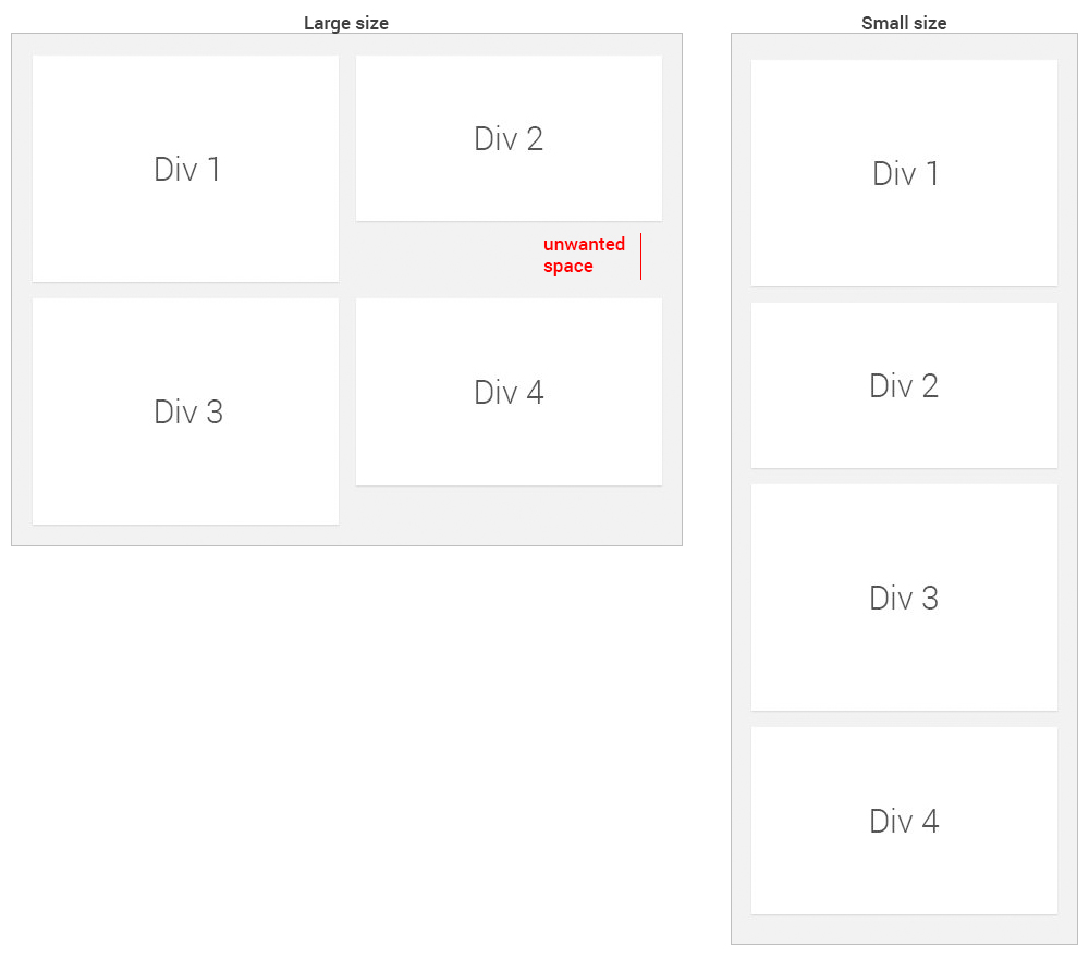
I have used a small width to demonstrate it, that is for you to customise. Also put any changes in css in a site.css file, not bootstrap and call the site.css after the bootstrap, so changes are overridden.

Css:

div {outline:solid 1px red; }

  .left {
 } 
  .right {
 }  

Html:

<div style="display:none">
<div id="1"  class="left" style="height:100px;background-color:yellow;">DIV 1</div>
<div id="2" class="right" style="height:20px;">DIV 2</div>
<div id="3" class="left" style="height:50px;background-color:yellow;">DIV 3</div>
<div id="4" class="right" style="height:170px;">DIV 4</div>
<div id="5" class="left" style="height:120px;background-color:yellow;">DIV 5</div>
<div id="6" class="right" style="height:30px;">DIV 6</div>
<div id="7" class="left" style="height:50px;background-color:yellow;">DIV 7</div>
<div id="8" class="right" style="height:90px;">DIV 8</div>
</div>
<div id="div1" style="width: 50%;float:left;background-color:grey"></div>
<div id="div2" style="width: 50%;float:right;background-color:blue"></div>
<div id="div3" style="width: 100%;float:left;background-color:white"></div>

JQuery:

if ($(window).width() > 400) {
    $('#div1').append($('.left'));
    $('#div2').append($('.right'));
}
if ($(window).width() < 400) {
    $('#div3').append($('#1'));
    $('#div3').append($('#2'));
    $('#div3').append($('#3'));
    $('#div3').append($('#4'));
    $('#div3').append($('#5'));
    $('#div3').append($('#6'));
    $('#div3').append($('#7'));
    $('#div3').append($('#8'));
}


$('#div1').append($('.left'));
$('#div2').append($('.right'));

$( window ).resize(function() {
    if($(window).width()>400){
        $('#div1').append($('.left'));
        $('#div2').append($('.right'));  
    }
    if($(window).width()<400)
    {
        // These need to be added in order, as appending them to the
        // first two divs reorders them.
        $('#div3').append($('#1'));
        $('#div3').append($('#2'));
        $('#div3').append($('#3'));
        $('#div3').append($('#4'));
        $('#div3').append($('#5'));
        $('#div3').append($('#6'));
        $('#div3').append($('#7'));
        $('#div3').append($('#8'));
    }
});

See fiddle:

https://jsfiddle.net/kermit77/vo439fte/4/

enter image description here

enter image description here


First answer

Beyond putting in calculations determining individual div height and then adjusting margins accordingly (for the larger layouts only!);
i.e.

div 1 height = a, div 2 height = b

div diff = (a-b)

if diff >0

div 4 top margin = -diff

else

div 3 top-margin = -diff;

But you would need to keep a running total of odd numbered div heights and even numbered div heights and adjust accordingly.

I've trimmed down the widths to test it. You need to clear left on every 3rd div to prevent it being placed on the right hand side.

<div class="row">
    <div class="col-lg-6  col-sm-12" style="height:100px;">DIV 1</div>
    <div  class="col-lg-6  col-sm-12" style="height:80px;">DIV 2</div>
    <div  class="col-lg-6  col-sm-12" style="height:50px;clear:left;">DIV 3</div>
    <div  class="col-lg-6  col-sm-12" style="height:40px;">DIV 4</div>
</div>

For every 3rd div clear left.

css:

div {outline:solid 1px red; }
.row {
    margin-right: 2px;
    margin-left: 2px;
}
@media (min-width: 500px) {
.container {
    max-width: 1170px;
}
.col-lg-6 {
    max-width:50%;
    width: 50%;
    float:left;
    clear:right;
}  
}
@media (min-width: 150px) {
.container {
    max-width: 500px;
}
.col-sm-12 {
    width: 100%;
}
}
Community
  • 1
  • 1
  • Im not sure i understand your solution, and when i added 4 more divs, vertical spacing appears. And please note i dont know the height of the divs, they are dynamic – user1118829 Sep 14 '15 at 08:06
  • 1
    I went poor to give this bounty ;) But i'll be glad to give it to you if you solved this :) – user1118829 Sep 14 '15 at 12:49
  • 1
    Thank you very much! I will try it and let you know :) – user1118829 Sep 15 '15 at 07:35
  • Thank you very much, i didn't have the time to understand it fully, and i don't want the bounty to expire, but i tried it and it seems to work well. Great effort :) – user1118829 Sep 17 '15 at 13:35
2

As "R Lam" Commented above, this works:

<div class="col-lg-6 col-md-6 col-sm-12">
<div>div1</div>
</div>
<div class="col-lg-6 col-md-6 col-sm-12">
<div>div2</div>
</div>
<div class="col-lg-6 col-md-6 col-sm-12">
<div>div3</div>
</div>
<div class="col-lg-6 col-md-6 col-sm-12">
<div>div4</div>
</div>

I was wondering if its ok to have them add up to more than 12, but then i found this question: question link

Actually, it did not work, some spaces still appear..

Community
  • 1
  • 1
user1118829
  • 159
  • 2
  • 13
1

We can achieve it through @media queries

And you need to add alternate float left right for divs

HTML:

    <div class="wid" style="height:80px;background-color:#ccc;float:left;"> div 1 </div>
    <div class="wid" style="height:100px;background-color:red;float:right;"> div 2 </div>
    <div class="wid" style="height:90px;background-color:yellow;float:left;"> div 3 </div>
    <div class="wid" style="height:120px;background-color:green;float:right;"> div 4 </div>
    <div class="wid" style="height:100px;background-color:#ddd;float:left;"> div 5 </div>

CSS:

.wid{
width:50%;
}

@media screen and (max-width:768px){
.wid{
width:100%;
}
}
Arun Kumar M
  • 1,633
  • 1
  • 15
  • 26
1

It seems to me that you want your div heights to be dynamic. That means, all the divs inside a row should have the height of the div with more content and therefore the height of the divs will depend on content that can vary. To accomplish that you need more than just CSS, you need some simple JQuery or JavaScript. Using JQuery:

<div class="row first-row">
  <div class="col-lg-6 col-md-6 col-sm-12 same-height"> div 1 </div>
  <div class="col-lg-6 col-md-6 col-sm-12 same-height"> div 2 </div>
</div>
<div class="row second-row">
  <div class="col-lg-6 col-md-6 col-sm-12 same-height"> div 3 </div>
  <div class="col-lg-6 col-md-6 col-sm-12 same-height" onload="FixSizeOfRows()"> div 4 </div>
</div>
<script>
  function FixSizeOfRows(){
    $('.first-row > .same-height').height($('.first-row').height());
    $('.second-row > .same-height').height($('.second-row').height());
  }
</script>

The idea here is to run the FixSizeOfRows() function when your last div has fully loaded. The function FixSizeOfRows() goes row by row injecting the height of the row to each of its child divs (note that the row height increases with the child div that has more content).

I prefer JQuery when manipulating the DOM instead of plain JavaScript. With JavaScript you could do something similar but a bit more complex. Let me know if you need more clarification on how this code works.

EliJah
  • 89
  • 6
  • Thank you for your effort, but I actually don't want the divs in 1 row to have the same height, cause some of them will have too much empty space. – user1118829 Sep 13 '15 at 05:26
0

Use this jQuery plugin to fix unwanted space issue:

http://brm.io/jquery-match-height-demo/

enter image description here