I've been searching for an easy and clean way to change my AlertDialog side margin but with no success. Just to be extra clear, what I want is to change the distance between each of sides of the dialog and the side/edge of the screen. I would like my dialogs to show up similar to those that appears in the
Material Design specification
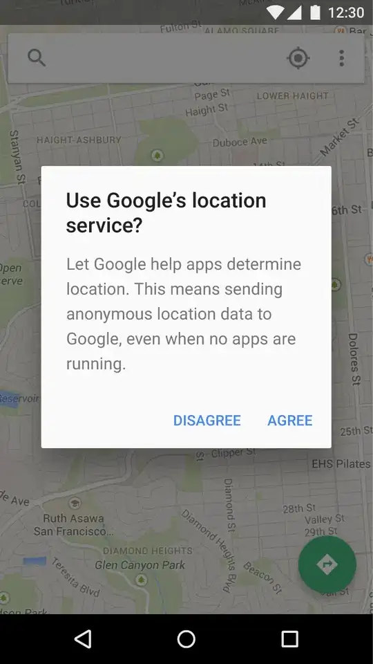
Here's an image of what I would like/expect from a simple android AlertDialog, and on the right, what I'm actually seeing with the code below.

Here's my code.
AlertDialog.Builder builder = new AlertDialog.Builder(context);
builder.setMessage(message);
builder.setTitle(title);
builder.setPositiveButton(positiveId, positiveListener);
builder.show();
Before you jump to the obvious answer of setting the LayoutParams of the dialog programmatically, let me say that I know that I can do something like this and get away with it.
final AlertDialog dialog = builder.create();
Display display = getWindowManager().getDefaultDisplay();
int width = display.getWidth();
float dialogWidth = width - TypedValue.applyDimension(TypedValue.COMPLEX_UNIT_DIP, 2 * SIDE_MARGIN_IN_DPS, r.getDisplayMetrics());

WindowManager.LayoutParams lp = new WindowManager.LayoutParams();
lp.copyFrom(dialog.getWindow().getAttributes());
lp.width = (int) dialogWidth;
lp.height = WindowManager.LayoutParams.WRAP_CONTENT;
dialog.getWindow().setAttributes(lp);
dialog.show();
But I can't believe there's no easier and cleaner way to this, and that we should do this every time we want to open an AlertDialog. I tried setting margins to styles applied to the dialog but either it didn't do anything or it changed the inner margins of the dialog (the ones between the content and the side/edge of the dialog). I'm guess that I'm looking at the wrong styles.
Has anyone came up with this same problem? Any ideas as to how to set this margins in styles and not in code?
UPDATE:
Here's my app style/theme:
<style name="Base.Theme.App" parent="Theme.AppCompat.Light.NoActionBar">
    <item name="colorPrimary">@color/primary</item>
    <item name="colorPrimaryDark">@color/primary_dark</item>
    <item name="colorAccent">@color/accent</item>
    <item name="android:windowBackground">@color/activity_background</item>
    <item name="android:textColor">@color/primary_text</item>
    <item name="android:textColorSecondary">@color/secondary_text</item>

    <item name="colorControlHighlight">@color/control_highlight</item>
    <item name="colorControlActivated">?attr/colorAccent</item>
    <!-- You can also set colorControlNormal and colorSwitchThumbNormal. -->

    <!--<item name="android:colorButtonNormal">@color/primary</item>-->

    <item name="android:spinnerStyle">@style/form_spinner</item>
    <item name="spinnerStyle">@style/form_spinner</item>
    <item name="android:spinnerItemStyle">@style/form_spinner_item</item>
    <item name="editTextStyle">@style/form_edittext</item>
    <item name="android:editTextStyle">@style/form_edittext</item>

    <item name="alertDialogTheme">@style/Theme.App.Dialog.Alert</item>
</style>
And here's my alertDialogTheme
<style name="Theme.App.Dialog.Alert" parent="Theme.AppCompat.Light.Dialog.Alert">
    <item name="colorPrimary">@color/primary</item>
    <item name="colorAccent">@color/primary</item>
    <item name="android:windowBackground">@color/activity_background</item>
    <item name="android:textColor">@color/primary_text</item>
    <item name="android:textColorSecondary">@color/secondary_text</item>
    <item name="colorControlHighlight">@color/control_highlight</item>
</style>