1

What I want to achieve is:

http://i.imgur.com/CPb8vAu.png

While so far it looks like this (bottom margins aren't the issue, I decided that they should be smaller):

http://i.imgur.com/2SKqx0P.png

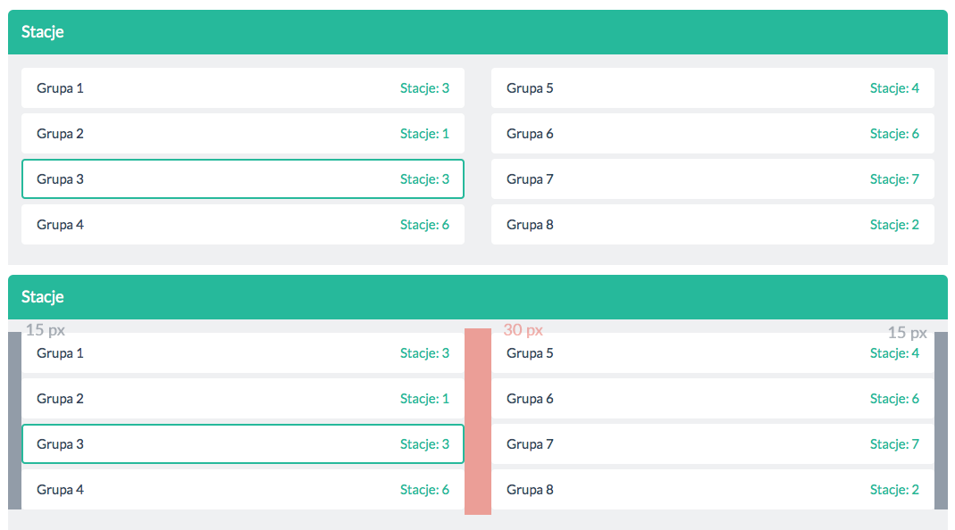
Unfortunately the gutter size is based on padding that is marked as the grey part in the image up. I would like each part to have the same size: 15 px.

The part of code I am referring to is (where groups-margin sets bottom margin for each button):

<div class="row">
                <div class="col-sm-6 groups-margin">
                    <a class="btn btn-primary btn-large btn-block outline" href="#">Grupa 1 <span class="group-stations-count">Stacje: 3</span></a>
                    <a class="btn btn-primary btn-large btn-block outline" href="#">Grupa 2 <span class="group-stations-count">Stacje: 1</span></a>
                    <a class="btn btn-primary btn-large btn-block outline" href="#">Grupa 3 <span class="group-stations-count">Stacje: 3</span></a>
                    <a class="btn btn-primary btn-large btn-block outline" href="#">Grupa 4 <span class="group-stations-count">Stacje: 6</span></a>
                </div>
                <div class="col-sm-6 groups-margin">
                    <a class="btn btn-primary btn-large btn-block outline" href="#">Grupa 5 <span class="group-stations-count">Stacje: 4</span></a>
                    <a class="btn btn-primary btn-large btn-block outline" href="#">Grupa 6 <span class="group-stations-count">Stacje: 6</span></a>
                    <a class="btn btn-primary btn-large btn-block outline" href="#">Grupa 7 <span class="group-stations-count">Stacje: 7</span></a>
                    <a class="btn btn-primary btn-large btn-block outline" href="#">Grupa 8 <span class="group-stations-count">Stacje: 2</span></a>
                </div>
            </div>
Jakub
  • 187
  • 1
  • 1
  • 9

3 Answers3

0

Wrap your col-sm-6 with a div, say .input-row like this:

<div class="row">
    <div class="input-row">
                <div class="col-sm-6 groups-margin">
                        <a class="btn btn-primary btn-large btn-block outline" href="#">Grupa 1 <span class="group-stations-count">Stacje: 3</span></a>
                        <a class="btn btn-primary btn-large btn-block outline" href="#">Grupa 2 <span class="group-stations-count">Stacje: 1</span></a>
                        <a class="btn btn-primary btn-large btn-block outline" href="#">Grupa 3 <span class="group-stations-count">Stacje: 3</span></a>
                        <a class="btn btn-primary btn-large btn-block outline" href="#">Grupa 4 <span class="group-stations-count">Stacje: 6</span></a>
                </div>
                <div class="col-sm-6 groups-margin">
                        <a class="btn btn-primary btn-large btn-block outline" href="#">Grupa 5 <span class="group-stations-count">Stacje: 4</span></a>
                        <a class="btn btn-primary btn-large btn-block outline" href="#">Grupa 6 <span class="group-stations-count">Stacje: 6</span></a>
                        <a class="btn btn-primary btn-large btn-block outline" href="#">Grupa 7 <span class="group-stations-count">Stacje: 7</span></a>
                        <a class="btn btn-primary btn-large btn-block outline" href="#">Grupa 8 <span class="group-stations-count">Stacje: 2</span></a>
                </div>
    </div>
</div>

Now since you're using col-sm-, add these properties within a media query like this:

@media (min-width: 768px){
    .input-row .col-sm-6:first-child{padding-right:7.5px;}
    .input-row .col-sm-6:last-child{padding-left:7.5px;}
}

Now all gutters (left, right and middle will be 15px)


Here's a jsfiddle with the above codes: http://jsfiddle.net/AndrewL32/65sf2f66/47/

AndrewL64
  • 15,794
  • 8
  • 47
  • 79
0

If you want increased gutter size to only that section, you can make a class for it.

.btn .gutter{
   margin-bottom: 5px;
}

and you can just add gutter in with the classes

    <a class="btn btn-primary btn-md gutter">some button</a>
Gokigooooks
  • 794
  • 10
  • 20
0

I like to create more specific row classes, leaving Bootstrap’s intact. So I may have something like this:

.row-half-gutter {
  margin-right: (@grid-gutter-width / 2) * -1;
  margin-left: (@grid-gutter-width / 2) * -1;

  > [class*="col-"] {
    padding-right: (@grid-gutter-width / 4);
    padding-left: (@grid-gutter-width / 4);
  }
}

.row-no-gutter {
  margin-right: 0;
  margin-left: 0;

  > [class*="col-"] {
    padding-right: 0;
    padding-left: 0;
  }
}
Martin Bean
  • 38,379
  • 25
  • 128
  • 201