So here's my situation
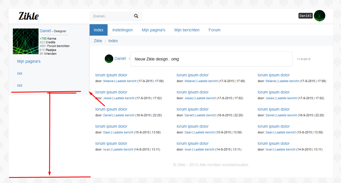
I need the sidebar to go down all the way but I can't get it to do that. I've tried searchning here as well. It is probably very simple and I can't see it because I've been working on this for a while.
My code:
<div class="container">
<div class="site-box">
<div class="container-fluid">
<div class="row">
<div class="header">
<!-- HEADER -->
<!-- Logo -->
<div class="col-xs-3 col-md-3">
<div class="header-logo">
<span class="logo">Zikle</span>
</div>
</div>
<!-- Search -->
<div class="col-md-6 hidden-xs hidden-sm">
<div class="header-search">
<div class="input-group">
<form class="header-search-form" role="search">
<input type="text" class="form-control" placeholder="Zoeken..." aria-label="Zoeken">
<span class="input-group-btn" id="basic-addon1"><button class="btn btn-default" type="button"><span class="glyphicon glyphicon-search"></span></button></span>
</form>
</div>
</div>
</div>
<!-- Control Panel -->
<div class="col-xs-9 col-md-3">
<div class="header-controlpanel"><div class="pull-right">
<span><kbd>Daniël</kbd></span> <img src="http://www.zikle.nl/userfiles/thumbs/0/2/5/4/02546700.png" width=40 height=40 style="border-radius: 50%; cursor: pointer">
</div></div>
</div>
</div>
</div>
<div class="row">
<!-- Left MENU -->
<div class="col-md-3 hidden-xs hidden-sm left-content-box">
<div class="side-menu">
<img src="http://www.zikle.nl/userfiles/thumbs/0/2/5/4/02546700.png" width=90 height=90>
<span class="user">
<span class="name"><a href="/">Daniël</a></span>
<span class="title">- Designer</span><br><hr style="margin: 5px;">
<span class="karma">+788</span> Karma<br>
<span class="gray">423</span> Credits<br>
<span class="gray">4881</span> Forum berichten<br>
<span class="gray">615</span> Plaatjes<br>
<span class="gray">96</span> Vrienden<br>
</span>
<div class="sub-menu">
<ul class="nav nav-pills nav-stacked">
<li role="presentation"><a href="#">Mijn pagina's</a></li>
<li role="presentation"><a href="#">xxx</a></li>
<li role="presentation"><a href="#">xxx</a></li>
</ul>
</div>
</div>
</div>
<!-- CONTENT -->
<div class="col-xs-12 col-md-9 right-content-box">
<div class="col-xs-12">
<ul class="nav nav-pills">
<li role="presentation" class="active"><a href="#">Index</a></li>
<li role="presentation"><a href="#">Instellingen</a></li>
<li role="presentation"><a href="#">Mijn pagina's</a></li>
<li role="presentation"><a href="#">Mijn berichten</a></li>
<li role="presentation"><a href="#">Forum</a></li>
</ul>
</div>
<!-- Crumbs -->
<div class="col-xs-12">
<ol class="breadcrumb">
<li><a href="#">Zikle</a></li>
<li><a href="#">Index</a></li>
</ol>
</div>
<!-- SHOUTS -->
<div class="col-xs-2">
<div class="shout-panel2 pull-right">
<div class="shout-user">
<a href="/"><img class="shout-avatar" src="http://www.zikle.nl/userfiles/thumbs/0/2/5/4/02546700.png" width="30" height="30">
<span class="shout-name">Daniël</span></a>
</div>
</div>
</div>
<div class="col-xs-9 col-sm-8">
<div class="panel panel-default shout-panel">
<div class="panel-body shout-body">
<span class="shout-message">Nieuw Zikle design.. omg</span>
</div>
</div>
</div>
<div class="col-sm-2 hidden-xs">
<div class="shout-panel2">
<div class="shout-date">
<span>17-9-2015</span>
</div>
</div>
</div>
<!-- forum -->
<div class="col-xs-12 col-md-12 forum-box">
<div class="forum-panel">
<span></span>
<div class="clearfix"></div>
<div class="col-xs-6 col-lg-4">
<a href="/">lorum ipsum dolor</a><br>
<span style="font-size:11px; color: #222">door: <a href="/">Melanie</a> | <a href="/">Laatste bericht</a> (17-9-2015 | 17:08)</span><br>
<br>
<a href="/">lorum ipsum dolor</a><br>
<span style="font-size:11px; color: #222">door: <a href="/">Jesse</a> | <a href="/">Laatste bericht</a> (17-9-2015 | 17:02)</span><br>
<br>
<a href="/">lorum ipsum dolor</a><br>
<span style="font-size:11px; color: #222">door: <a href="/">Daniel</a> | <a href="/">Laatste bericht</a> (16-9-2015 | 22:20)</span><br>
<br>
<a href="/">lorum ipsum dolor</a><br>
<span style="font-size:11px; color: #222">door: <a href="/">Daan</a> | <a href="/">Laatste bericht</a> (15-9-2015 | 13:58)</span><br>
<br>
<a href="/">lorum ipsum dolor</a><br>
<span style="font-size:11px; color: #222">door: <a href="/">Iwan</a> | <a href="/">Laatste bericht</a> (14-9-2015 | 13:11)</span><br>
</div>
<div class="col-lg-4 visible-lg">
<a href="/">lorum ipsum dolor</a><br>
<span style="font-size:11px; color: #222">door: <a href="/">Melanie</a> | <a href="/">Laatste bericht</a> (17-9-2015 | 17:08)</span><br>
<br>
<a href="/">lorum ipsum dolor</a><br>
<span style="font-size:11px; color: #222">door: <a href="/">Jesse</a> | <a href="/">Laatste bericht</a> (17-9-2015 | 17:02)</span><br>
<br>
<a href="/">lorum ipsum dolor</a><br>
<span style="font-size:11px; color: #222">door: <a href="/">Daniel</a> | <a href="/">Laatste bericht</a> (16-9-2015 | 22:20)</span><br>
<br>
<a href="/">lorum ipsum dolor</a><br>
<span style="font-size:11px; color: #222">door: <a href="/">Daan</a> | <a href="/">Laatste bericht</a> (15-9-2015 | 13:58)</span><br>
<br>
<a href="/">lorum ipsum dolor</a><br>
<span style="font-size:11px; color: #222">door: <a href="/">Iwan</a> | <a href="/">Laatste bericht</a> (14-9-2015 | 13:11)</span><br>
</div>
</div>
</div>
<!-- footer -->
<div class="col-xs-12 col-md-8 col-md-offset-2">
<footer>
© Zikle - 2015 Alle rechten voorbehouden.
</footer>
</div>
</div>
</div>
</div>
</div>
CSS:
html {
    color: #222;
    font-size: 1em;
    line-height: 1.4;
}

/*
 * Remove text-shadow in selection highlight:
 * https://twitter.com/miketaylr/status/12228805301
 *
 * These selection rule sets have to be separate.
 * Customize the background color to match your design.
 */

::-moz-selection {
    background: #b3d4fc;
    text-shadow: none;
}

::selection {
    background: #b3d4fc;
    text-shadow: none;
}

/*
 * A better looking default horizontal rule
 */

hr {
    display: block;
    height: 1px;
    border: 0;
    border-top: 1px solid #ccc;
    margin: 1em 0;
    padding: 0;
}

/*
 * Remove the gap between audio, canvas, iframes,
 * images, videos and the bottom of their containers:
 * https://github.com/h5bp/html5-boilerplate/issues/440
 */

audio,
canvas,
iframe,
img,
svg,
video {
    vertical-align: middle;
}

/*
 * Remove default fieldset styles.
 */

fieldset {
    border: 0;
    margin: 0;
    padding: 0;
}

/*
 * Allow only vertical resizing of textareas.
 */

textarea {
    resize: vertical;
}

/* ==========================================================================
   Browser Upgrade Prompt
   ========================================================================== */

.browserupgrade {
    margin: 0.2em 0;
    background: #ccc;
    color: #000;
    padding: 0.2em 0;
}

/* ==========================================================================
   Zikle
   ========================================================================== */

body, html {
        width: 100%;
        height: 100%;
        overflow: none;
        margin-top: 2em;
}

body {
        font-size: 14px;
        font-family: Roboto,arial,sans-serif;
        color: #111;
        background-image: url("../img/bg-pattern.gif");
}

body, div, h1, h2, h3, h4, h5, h6, p, ul, ol, li, dl, dt, dd, img, form, fieldset, input, textarea, blockquote {
        margin: 0; padding: 0; border: 0;
}

.site-box {
        background: #fff;
        border: 1px solid #eee;
        position: relative;
        margin: 0 auto;
        min-width: 0px;
        min-height: 0px;
        height: 100%;
        margin-bottom: 3em;
        margin-top: 3em;
}

.header {
        position: relative;
        display: block;
        border-bottom: 2px solid #e8e8e8;
        min-height: 55px;
}

.header-logo .logo {
        font-family: 'Lobster', cursive;
        font-size: 36px;
        padding-left: 35px;
}

.header-search {
        padding-top: 10px;
}

.header-controlpanel {
        padding-top: 5px;
        padding-right: 2em;
}

.form-control {
        height: 34px;
        padding: 6px 12px;
        font-size: 12px;
        line-height: 1.42857;
        color: #555;
        background-color: #f7f8fa;
        background-image: none;
        border: none;
        border-radius: 0px;
        box-shadow: none;
        transition: 0.25s ease-in 0s;
}

.form-control:focus {
        box-shadow: 0px 3px 3px rgba(0, 0, 0, 0.075) inset;
        outline: 0px none;
        box-shadow: none;
        width: 325px;
}

.header-search .btn-default {
        color: #222;
        background-color: #f7f8fa;
        border-color: #f7f8fa;
        transition: 0.25s ease-in 0s;
}

.header-search .btn-default:hover {
        background-color: rgba(0,0,0,0.12);
}

footer {
        text-align: center;
        padding: 35px;
        color: #ccc;
}

.left-content-box {
        height: 100%;
        float: left;
        position: relative;
}

.right-content-box {

        float: left;
        position: relative;
}

.breadcrumb {
        border-radius: 0px;
        background: #f7f8fa;
}

.nav-pills > li > a {
        border-radius: 0px;
}
.nav > li > a:focus, .nav > li > a {
        transition: 0.35s ease;
}
.nav > li > a:focus, .nav > li > a:hover {
        background-color: #F5F5F5;
}
.nav-pills > li.active > a, .nav-pills > li.active > a:focus, .nav-pills > li.active > a:hover {
        background-color: #337AB7;
}

.side-menu {
        border-right: 2px solid #e8e8e8;
        background: #f7f8fa;
        height: 100vh;
        padding: 15px;
}

.side-menu ul {
        list-style: none;
        display: inline;
        vertical-align: top
}

.side-menu span.user {
        display: inline-block;
        vertical-align: top;
        line-height: 1.2;
    font-size: 11px;
}

.side-menu span.name {
        font-size: 14px;
}

.side-menu span.title {
        color: #333;
}

.side-menu span.karma {
        color: green;
}

.side-menu span.gray {
        color: #888;
}
.shout-panel {
        margin-bottom: 20px;
        border: 1px solid #e7e7e7;
        border-radius: 4px;
}
.shout-panel:before {
        content: ''; position: absolute; top: 18px; right: 100%; height: 0; width: 0; border: 7px solid transparent; border-right: 7px solid #e7e7e7;
}
.shout-panel2 {
        display: inline-block;
}

.shout-date {
        padding-top: 15px;
        padding-left: 15px;
}
.shout-user {
        padding-right: 15px;
        padding-top: 10px;
}
.shout-user img.shout-avatar {
        border-radius: 50%;
}
.shout-date span {
        color: #888;
        font-size: 10px;
}

.forum-box {
        margin-left: 20px;
}

.extra-panel {
    background: #f7f8fa;
        border-left: 1px solid #e8e8e8;
        border-left: 1px solid #e8e8e8;
        border-bottom: 1px solid #e8e8e8;
        position: absolute;
        height: 100%;
}

.center-block {
        display: block;
        margin: 0 auto;
        text-align: center;
}
.realign-inline {
        display: inline;
        text-align: left;
}

[class*="col-"] {
        padding-right: 0;
        padding-left: 0;
}

/* ==========================================================================
   Zikle MENU
   ========================================================================== */


/* ==========================================================================
   Helper classes
   ========================================================================== */

/*
 * Hide visually and from screen readers:
 */

.hidden {
    display: none !important;
}

/*
 * Hide only visually, but have it available for screen readers:
 * http://snook.ca/archives/html_and_css/hiding-content-for-accessibility
 */

.visuallyhidden {
    border: 0;
    clip: rect(0 0 0 0);
    height: 1px;
    margin: -1px;
    overflow: hidden;
    padding: 0;
    position: absolute;
    width: 1px;
}

/*
 * Extends the .visuallyhidden class to allow the element
 * to be focusable when navigated to via the keyboard:
 * https://www.drupal.org/node/897638
 */

.visuallyhidden.focusable:active,
.visuallyhidden.focusable:focus {
    clip: auto;
    height: auto;
    margin: 0;
    overflow: visible;
    position: static;
    width: auto;
}

/*
 * Hide visually and from screen readers, but maintain layout
 */

.invisible {
    visibility: hidden;
}

/*
 * Clearfix: contain floats
 *
 * For modern browsers
 * 1. The space content is one way to avoid an Opera bug when the
 *    `contenteditable` attribute is included anywhere else in the document.
 *    Otherwise it causes space to appear at the top and bottom of elements
 *    that receive the `clearfix` class.
 * 2. The use of `table` rather than `block` is only necessary if using
 *    `:before` to contain the top-margins of child elements.
 */

.clearfix:before,
.clearfix:after {
    content: " "; /* 1 */
    display: table; /* 2 */
}

.clearfix:after {
    clear: both;
}

/* ==========================================================================
   EXAMPLE Media Queries for Responsive Design.
   These examples override the primary ('mobile first') styles.
   Modify as content requires.
   ========================================================================== */

@media only screen and (min-width: 35em) {
    /* Style adjustments for viewports that meet the condition */
}

@media print,
       (-webkit-min-device-pixel-ratio: 1.25),
       (min-resolution: 1.25dppx),
       (min-resolution: 120dpi) {
    /* Style adjustments for high resolution devices */
}

/* ==========================================================================
   Print styles.
   Inlined to avoid the additional HTTP request:
   http://www.phpied.com/delay-loading-your-print-css/
   ========================================================================== */

@media print {
    *,
    *:before,
    *:after {
        background: transparent !important;
        color: #000 !important; /* Black prints faster:
                                   http://www.sanbeiji.com/archives/953 */
        box-shadow: none !important;
        text-shadow: none !important;
    }

    a,
    a:visited {
        text-decoration: underline;
    }

    a[href]:after {
        content: " (" attr(href) ")";
    }

    abbr[title]:after {
        content: " (" attr(title) ")";
    }

    /*
     * Don't show links that are fragment identifiers,
     * or use the `javascript:` pseudo protocol
     */

    a[href^="#"]:after,
    a[href^="javascript:"]:after {
        content: "";
    }

    pre,
    blockquote {
        border: 1px solid #999;
        page-break-inside: avoid;
    }

    /*
     * Printing Tables:
     * http://css-discuss.incutio.com/wiki/Printing_Tables
     */

    thead {
        display: table-header-group;
    }

    tr,
    img {
        page-break-inside: avoid;
    }

    img {
        max-width: 100% !important;
    }

    p,
    h2,
    h3 {
        orphans: 3;
        widows: 3;
    }

    h2,
    h3 {
        page-break-after: avoid;
    }
}
Is it possible?
CSS code: http://pastebin.com/3hQ1jSsa