0

I have a number of inline-block elements in a container which is centered. The container (light blue in the picture) is also inline-block, so it should contain its content and be as small as possible.

When these inline elements start to wrap, (because I'm making the page smaller), I want the container to continue to be as small as possible, so that the container and its content centers on my page. But the container makes room for the element that is not longer present. How can I solve this?
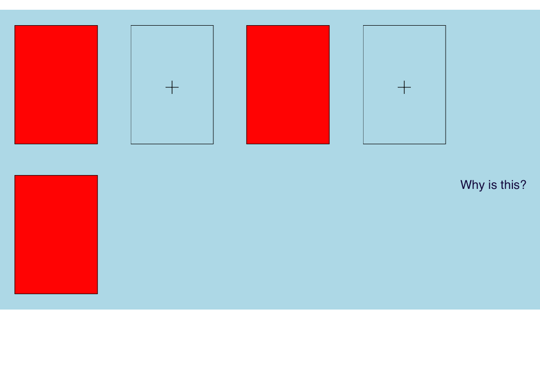
 artificial margin.

This container is centered on the page:

Centered

body,html{
 margin:0;
 width:100%;
 height:100%;
}


.card{
    background-color: red;
    border: 1px solid;
    width:100px;
    height:160px;
    display:inline-block;
    vertical-align:middle;
}

.card-container{
    background-color: lightblue;
    display: inline-block;
    position: relative;
    transform: translateX(-50%);
    left:50%;
}
<div class="card-container">
    <div class="card"></div> 
    <div class="card">+</div>
    <div class="card"></div> 
    <div class="card">+</div>
    <div class="card"></div>
 </div>
Community
  • 1
  • 1
user1506145
  • 5,176
  • 11
  • 46
  • 75
  • 1
    can you provide the full code or a jsfiddle example? also why don't you just center the container with `margin:0 auto` – Aziz Sep 20 '15 at 14:25
  • Ok, I'll create an example. I can't do that because the width of the container is undefined. – user1506145 Sep 20 '15 at 15:53
  • This is not possible due to the way *(I think)* the linebox model works. Javascript is needed. http://stackoverflow.com/questions/1371307/displayblock-inside-displayinline – Paulie_D Sep 20 '15 at 16:53

1 Answers1

1

Use inline, not inline-block for the card container.

.card-container {
  color: black;
  background-color: lightblue;
  display: inline;
  position: relative;
  padding: 5em 0;
}
.card {
  display: inline-block;
  margin: 1.5em 1em;
  color: black;
  border: 1px solid;
  width: 5em;
  line-height: 8em;
  text-align: center;
}
.card:nth-child(odd) {
  background-color: #FF0504;
}
.wrapper {
  text-align: center;
}
<div class="wrapper">
  <div class="card-container">
    <div class="card">+</div>
    <div class="card">+</div>
    <div class="card">+</div>
    <div class="card">+</div>
    <div class="card">+</div>
  </div>
</div>
Mr Lister
  • 45,515
  • 15
  • 108
  • 150
  • Thanks! But How can I center this? Also, elements are inline, so I have to put a padding on the container... – user1506145 Sep 20 '15 at 20:57
  • Yes, you're right; since the card-container is inline now, it can't be centered by itself. So you'll need another wrapper around the card-container that you can apply text-align:center to. I have updated the answer. – Mr Lister Sep 21 '15 at 06:14
  • Great, but using text-align:center the elements will be wrapped centered, I would get similar results by setting `text-align` on the `card-container` above. I would like the cards to wrap left aligned, while the card container being centered and as small as possible. – user1506145 Sep 21 '15 at 07:54
  • I don't know. As was mentioned in the comments, what you want exactly is most likely not something you can do without JavaScript. Or an awful lot of media queries. – Mr Lister Sep 21 '15 at 08:28