I have a site which works perfect with rev slider when browsing with a desktop. But when browsing to it from mobile, the slider images don't display correctly or they are cut off. Is there a way to either switch the images within the slider when mobile browsers come to site or what can i do for mobile? I tried switching with css but that didn't work. Not sure what else can be done. Any help would be very much appreciated.
Asked
Active
Viewed 5.7k times
7 Answers
16
So, in version 6 at least, you can do this by adding a shape layer with a background image and hide/show that layer depending on screen size.
- Make a new shape layer.
- Go to "Size & Pos" in the layer options.
- Set the "Size Presets" to Cover.
- Set the "Layer Align" to Scene.
- Go to "Visibility" in the layer options.
- Hide the layer on all the screen sizes you don't want it to show on.
- Make sure your shape layer is at the bottom of the layer stack.
- Go to "Style" in the layer options.
- Pick a background image.
- Make sure it's set to cover in the Position section.
And that should do it. Hope that helps someone.
You might have to fuss with the responsive settings. If you don't really understand the nuances of these settings, I found this video (Slider Revolution 6.0 Responsive Settings) super helpful.
Josh Coast
- 602
- 6
- 7
-
I've tried this, it worked perfectly! However when I switch between slides, for one second, the desktop background image appears and then comes the other slide. I currently trying to find a way to fix this – MarounG Jan 03 '21 at 11:52
-
1That's lame. I wonder if the image that's loading late is exceptionally large? That's the first place I'd look anyway. – Josh Coast Jan 04 '21 at 16:21
-
Thanks for replying. I managed to finally fix it. I had to edit the transitions of the slides to make it work – MarounG Jan 10 '21 at 08:36
11
Initially, I didn't think you could. But, it turns out that you can! You just have to make two sliders, then cleverly hide one or the other.
If it's just a matter of the picture dimensions, you can give each slider size a custom size. I have done this to accommodate not being able to read text on the slides when viewing on mobile. By stretching the height of the mobile version, I can now read the text on the images and, thus, problem solved.
You can also just disable the slider when viewing on mobile, like this.
Bhargav Rao
- 50,140
- 28
- 121
- 140
BryanOfEarth
- 715
- 11
- 26
-
thank you very much for your quick response, i was actually looking at that article, but the only problem i have is that i am using betheme and it only lets me add one slide to main portion of the site, so if there was a way to call it externally without it being on the page that would be amazing? Do you know if someting like that is possible? – Brad Hazelnut Sep 24 '15 at 16:22
-
How does it limit you to only having one slider on the main page? You can't use [slider_name] tag? – BryanOfEarth Sep 24 '15 at 16:39
-
yeah i didn't see where i can add them manuall,but now it works. Thanks for your help man,appreciate it. – Brad Hazelnut Sep 24 '15 at 17:16
0
I've searched endlessly for the answer to this, and finally figured it out. The hiding option is no good if your theme is only calling one Slider per page.
1) Install the Mobile Detect plugin.
2) Find where the Slider is being called in your theme. For me it was in THEME/inc/template-hooks.php
3) Find this code there:
echo '<div id="main-slideshow">';
putRevSlider($rev_slider);
echo '</div>';
4) Replace this with:
echo '<div id="main-slideshow">';
if ( wp_is_mobile() ) :
putRevSlider("ALIAS OF MOBILE SLIDER HERE");
else :
putRevSlider("ALIAS OF DESKTOP SLIDER HERE");
endif;
echo '</div>';
PRESTO!!!!
Jskillzz
- 1
- 1
-
Jskillzz ... you have a good solution if one is hard coding the rev slider function into a page.My problem is.. I am custom developing a theme and using the "Visual Composer" plugin for the layout of my home page and inserting the slider shortcode. I'm assuming your solution won't work then? Thanks. – Mario Jul 23 '17 at 18:37
0
In the case where several sliders are initiated in the page, if you try to optimize for performance, Revslider still will load all background pictures, despite sliders will be hidden or visible. So this hiding solution helps only for visual improvements.
Saulius Vikerta
- 61
- 1
- 2
0
If your tempalte is using visual composer :
Add Array-Variable to 2 functions in the file (plugins/js_composer/include/classes/vendors/plugins/class-vc-vendor-revslider.php) :
addShortcodeSettings & mapShortcode :
    array(
    'type' => 'dropdown',
    'heading' => __( 'Revolution Slider (Mobile)', 'js_composer' ),
    'param_name' => 'aliasmob',
    'admin_label' => true,
    'value' => $revsliders,
    'save_always' => true,
    'description' => __( 'Select your Revolution Slider Mobile-View.', 'js_composer' ),
)
Now you can set 2 different sliders in backend-editor.
At least put mobile detection from answer of "Jskillzz" to the file (plugins/js_composer/include/templates/shortcodes/rev_slider_vc.php) :
Change from :
$output .= apply_filters( 'vc_revslider_shortcode', do_shortcode( '[rev_slider ' . $alias . ']' ) );
To :
if ( wp_is_mobile() ) :
$output .= apply_filters( 'vc_revslider_shortcode', do_shortcode( '[rev_slider ' . $aliasmob . ']' ) );
else :
$output .= apply_filters( 'vc_revslider_shortcode', do_shortcode( '[rev_slider ' . $alias . ']' ) );
endif;
PASTA!
EDIT: Slides without Mobile Settings produce strange error, so we put 1 more option (checkbox) for set different mobile slide to false as default, like this :
Add 1 More Variable in the 2 functions in (plugins/js_composer/include/classes/vendors/plugins/class-vc-vendor-revslider.php) :
        array(
            'type' => 'checkbox',
            'heading' => __( 'Use a different mobile Slider?', 'js_composer' ),
            'param_name' => 'mobileslide',
            'admin_label' => true,
            'value' => false,
            'save_always' => true,
            'description' => __( 'Check if you want use Mobile Slider.', 'js_composer' ),
        ),
And in (plugins/js_composer/include/templates/shortcodes/rev_slider_vc.php) :
if ($mobileslide == true) {
    if ( wp_is_mobile() ) :
    $output .= apply_filters( 'vc_revslider_shortcode', do_shortcode( '[rev_slider ' . $aliasmob . ']' ) );
    else :
    $output .= apply_filters( 'vc_revslider_shortcode', do_shortcode( '[rev_slider ' . $alias . ']' ) );
    endif;
} else {
    $output .= apply_filters( 'vc_revslider_shortcode', do_shortcode( '[rev_slider ' . $alias . ']' ) );
}
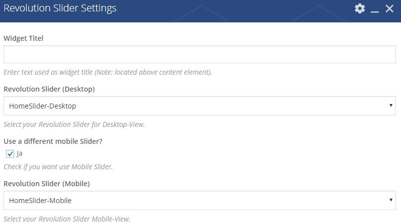
Then is look like this, we can set mobile view function to true :
SG52
- 176
- 11
0
The best way is to create two sliders one for mobile and second for desktop and than embed accordingly through elementor it will work .
-
As it’s currently written, your answer is unclear. Please [edit] to add additional details that will help others understand how this addresses the question asked. You can find more information on how to write good answers [in the help center](/help/how-to-answer). – Community Aug 31 '23 at 20:12