I'm trying to play around and learn some jQuery Mobile, but can't get the basic CSS styling to apply. I am referencing the css link from the jQuery Mobile website, and am connected to the internet (but have also tried loading the css locally into html, still wouldn't apply)
Here is my test code:
<!DOCTYPE html>
<html>
<head>
<meta charset="UTF-8">
<title>2test</title>
<meta name="viewport" content="width=device-width, initial-scale=1">
<link rel="stylesheet" href="http://code.jquery.com/mobile/1.4.5/jquery.mobile-1.4.5.min.css" />
<script src="http://code.jquery.com/jquery-1.4.5.min.js"></script>
<script src="http://code.jquery.com/mobile/1.4.5/jquery.mobile-1.4.5.min.js"></script>
</head>
<body>
<div data-role="page">
<div id="header" data-role="header">
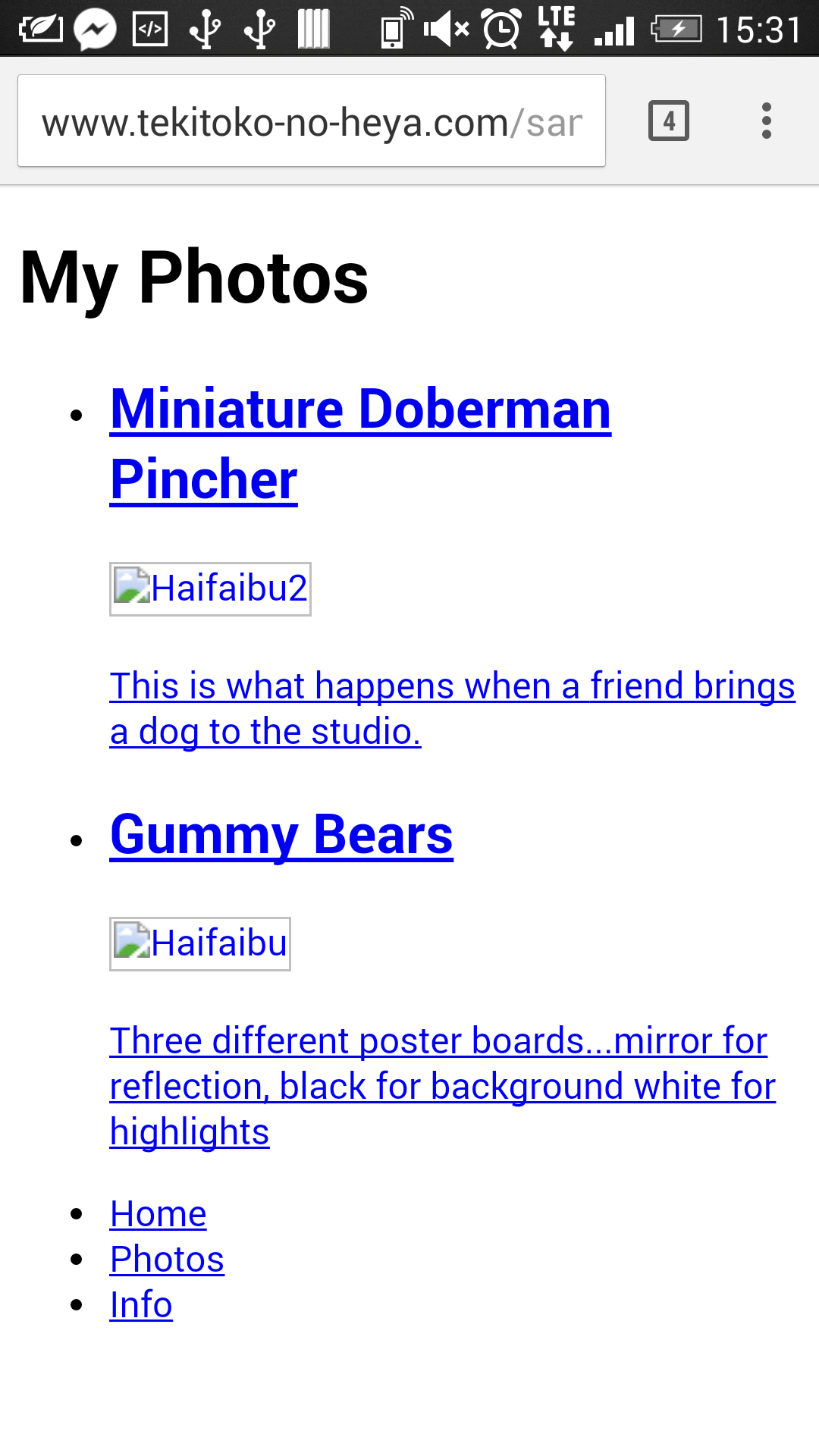
<h1>My Photos</h1>
</div>
<article data-role="content">
<ul data-role="listview" data-filter="true">
<li>
<a href="#">
<h1>Miniature Doberman Pincher</h1>
<p>This is what happens when a
friend brings a dog to the studio.</p>
</a>
</li>
<li>
<a href="#">
<h1>Gummy Bears</h1>
<p>Three different poster boards...mirror for reflection,
black for background white for highlights</p>
</a>
</li>
</ul>
</article>
<footer data-role="footer" data-position="fixed">
<nav data-role="navbar">
<ul>
<li><a href="#">Home</a></li>
<li><a href="#">Photos</a></li>
<li><a href="#">Info</a></li>
</ul>
</nav>
</footer>
</div>
</body>
</html>And here is the output on desktop Chrome 45 (EDIT: screenshot old, images since removed):

and the output on my android device Chrome 45 (access from hosted site):
neither output shows the expected "mobile-y" look of jQuery Mobile's default styling.. What am I missing?