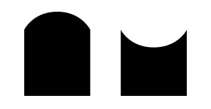
I am looking to create two shapes in CSS. The first one, the one on the left, I am close to making, but my shape goes out too far.
The second shape, I am struggling with completely.
Is there anyway to replicate these shapes? Is there anyway to do it without the use of Psuedo elements/as one div only?
The goal is to use CSS animation to make the first shape into the second, so I do not believe SVG is an option.
The div should start at shape one, and gradually transition into shape two. I'm having issues getting the bulge to not stick out so far, with my method.
HTML
<div id="one"></div>
<div id="two"></div>
CSS
div {
    width: 80px;
    height: 80px;
    background: black;
    margin: 60px;
    position: relative;
}

#one:before {
  content: "";
  display: block;
  position: absolute;
  border-radius: 55%;
  width: 80px;
  height: 80px;
  background: black;
  left: 0;
  top: -34px;
}