3

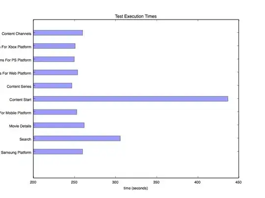
Please see attached image

enter image description here

I have the source code as follows in python

def plotBarChartH(self,data):
           LogManager.logDebug('Executing Plotter.plotBarChartH')

           if type(data) is not dict:
               LogManager.logError('Input data parameter is not in right format. Need a dict')
               return False

           testNames = []
           testTimes = []

           for val in data:
                testNames.append(val)
                testTimes.append(data[val])

           matplotlib.rcParams.update({'font.size': 8})     
           yPos = np.arange(len(testNames))
           plt.barh(yPos, testTimes, height=0.4, align='center', alpha=0.4)
           plt.yticks(yPos, testNames)
           plt.xlabel('time (seconds)')
           plt.title('Test Execution Times')
           savePath = os.path.join(ConfigurationManager.applicationConfig['robotreportspath'],'bar.jpg')
           plt.savefig(savePath)
           plt.clf()
           return True

The bar looks fine but I have two issues

  1. How can the text in y-axis can be shown in full? I mean some text are cut-off and i want to extend the space in occupies so that it can be displayed in full.

  2. Can I Increase the whole plot area on which the charts are drawn? I want to increase the width of of plot area so that image looks bit bigger

thanks
slysid
  • 5,236
  • 7
  • 36
  • 59

4 Answers4

5

You can set the figure size (in inches) explicitly when you create a Figure object with plt.figure(figsize=(width,height)), and callplt.tight_layout()` to make room for your tick labels as follows:

import matplotlib.pyplot as plt

names = ['Content Channels','Kittens for Xbox Platform','Tigers for PS Platform',
         'Content Series', 'Wombats for Mobile Platform']

values = [260, 255, 420, 300, 270]

fig = plt.figure(figsize=(10,4))
ax = fig.add_subplot(111)
yvals = range(len(names))
ax.barh(yvals, values, align='center', alpha=0.4)
plt.yticks(yvals,names)
plt.tight_layout()

plt.show()

enter image description here

xnx
  • 24,509
  • 11
  • 70
  • 109
2
  1. One option is to include newline characters \n in your string (or use something like "\n".join(wrap(longstring,60) as in this answer). You can adjust you plot area with fig.subplots_adjust(left=0.3) to ensure the whole string is shown,

Example:

import matplotlib.pyplot as plt
import numpy as np

val = 1000*np.random.rand(5)    # the bar lengths
pos = np.arange(5)+.5    # the bar centers on the y axis
name = ['name','really long name here', 
        'name 2', 
        'test', 
        'another really long \n name here too']

fig, ax = plt.subplots(1,1)
ax.barh(pos, val, align='center')
plt.yticks(pos, name)
fig.subplots_adjust(left=0.3)
plt.show()

which gives

enter image description here

  1. You can adjust the physical figure size with figsize argument to subplots or figure.

Example:

fig, ax = plt.subplots(1,1, figsize=(12,8))

the amount of space in the figure can be adjusted by setting axis based on the data,

ax.set_xlim((0,800))

or automated with ax.set_xlim((0,data.max()+200)).

Community
  • 1
  • 1
Ed Smith
  • 12,716
  • 2
  • 43
  • 55
2

As of 2020: simply calling .autoscale on plt should work:

You can do that right before plt.show()

plt.autoscale()

OR

plt.autoscale(enable=True, axis='y', tight=None)
Nour SIDAOUI
  • 164
  • 5
1
  1. How can the text in y-axis can be shown in full? I mean some text are cut-off and i want to extend the space in occupies so that it can be displayed in full.

You could use plt.axes to control where the axes are plotted so you can leave more space in the left area. An example could be plt.axes([0.2,0.1,0.9,0.9]).

  1. Can I Increase the whole plot area on which the charts are drawn? I want to increase the width of of plot area so that image looks bit bigger

I do not understand what you mean.

  • You can control the size of the figure using plt.figure (e.g., plt.figure(figsize = (6,12)))
  • You can control the space between the information and the axis using plt.[xy]lim. For example, if you want more blank space in the right area you could use plt.xlim(200, 600).
  • You can save some margin space using plt.axes (See question 1 above).
kikocorreoso
  • 3,999
  • 1
  • 17
  • 26
  • Hi, what does the array represent [0.2,0.1,0.9,0.9]? I am playing around with the values but not able understand what they actually represents. – slysid Oct 06 '15 at 14:13
  • It indicates normalized values for xmin, ymin, xmax and ymax. So if you use 0,0,1,1 there is no margin, if you use 0.1,0.1,0.9,0.9 you left 10% on each side between the axis and the figure border,... – kikocorreoso Oct 06 '15 at 16:36