I have added some @media print queries to a stylesheet to try to make the content more attractive and useful if printed out (typical stuff: remove navbar, interactive features, print links). It is working how I want on Chrome, but not on Firefox and Safari. (I'm taking about pages like this).
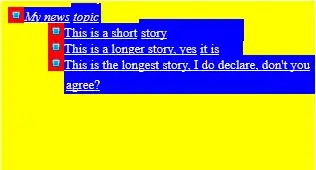
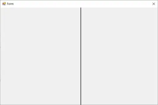
The rules I've written to not display certain material, but the grid layout behaves differently:
Firefox
Chrome
The additional @print styles are being applied to both, but Chrome reproduces the layout without any of the other media rules being applied (so it appears in one column---which is what I would like); Firefox does not.
I suspect my question is as much about Bootstrap as it is about @print queries per se. But before I start writing @print rules to try to reset Bootstrap's layout, is there something else I should understand about how browsers construct a page for print? Is there a simple solution to ensure other browsers produce something that looks like Chrome?

