-1

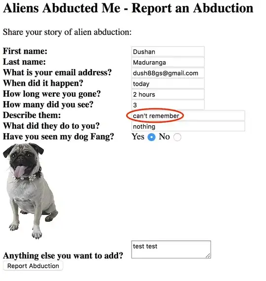
We're making a website responsive and on the client's iPad, the development website is only occupying half the screen and browser cache has been cleared - see screenshot below:-

enter image description here

This is happening on an iPad in portrait orientation using Chrome.

I am unable to replicate my end and the website is displaying as we intend it in every user-agent / browser.

Any ideas what could be causing this to happen on the clients iPad?
zigojacko
  • 1,983
  • 9
  • 45
  • 77
  • Some code which goes with this would be nice – Miroslav Saracevic Oct 14 '15 at 10:32
  • Like what? You want all the styles and markup do you (no, I didn't think so)? – zigojacko Oct 14 '15 at 10:40
  • I have actually just fixed it with a viewport by the looks of it... – zigojacko Oct 14 '15 at 10:41
  • http://stackoverflow.com/questions/11165460/responsive-site-is-zoomed-in-when-flipping-between-portrait-and-landscape-on-ipa?rq=1 shows pretty much exact same question, but there is code displayed – Miroslav Saracevic Oct 14 '15 at 10:43
  • There was no viewport specified and only about 20 lines of media queries in use (removal of these did not resolve the problem). In this instance, I actually don't think there was any relevant code snippets I could have provided. – zigojacko Oct 14 '15 at 10:44

1 Answers1

4

I actually got this from another answer but seeing as I was relying on the client to confirm whether any change fixed the problem because we could not replicate the issue ourselves, we had since posted our own question...

<meta name = "viewport" content = "width=device-width; initial-scale = 1; maximum-scale=1; user-scalable = no;" />

I shall leave this question with answer up though in the hope that it benefits anyone else that comes across a similar problem.

Community
  • 1
  • 1
zigojacko
  • 1,983
  • 9
  • 45
  • 77