Is there a way to create a layout without blank spaces where most items are the same dimensions, but some are 2x the height? I can make something similar to what I want with the following CSS:
Parent:
display: flex;
flex-direction: column;
justify-content: flex-start;
align-content: flex-start;
flex-wrap: wrap;
Children:
width: 22%
height: 100px;
The tall one has height: 200px. It looks like this:
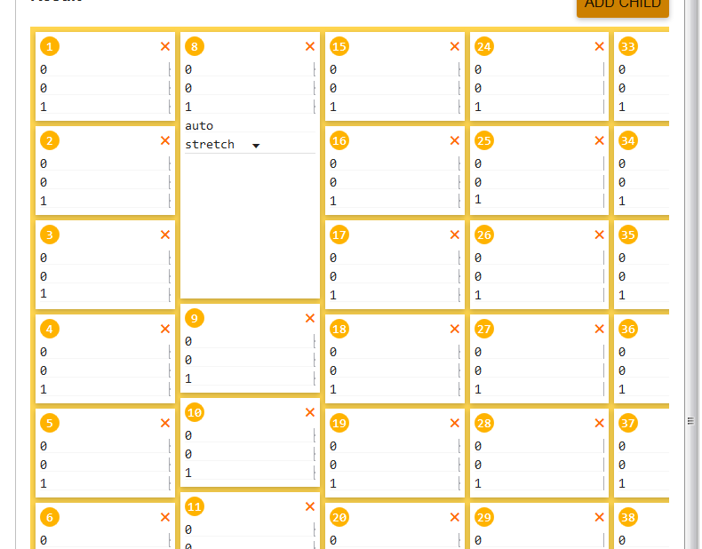
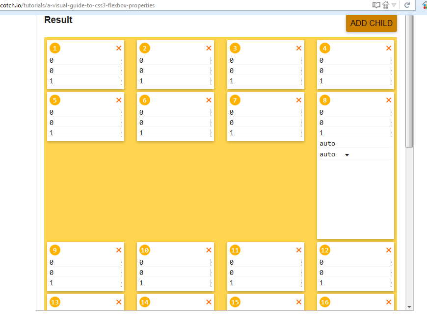
It's pretty close, but the problem is that I need a left-to-right order, not top-to-bottom, so I can't use flex-direction: column. If I do the same with flex-direction: row, it doesn't work:
Any ideas?