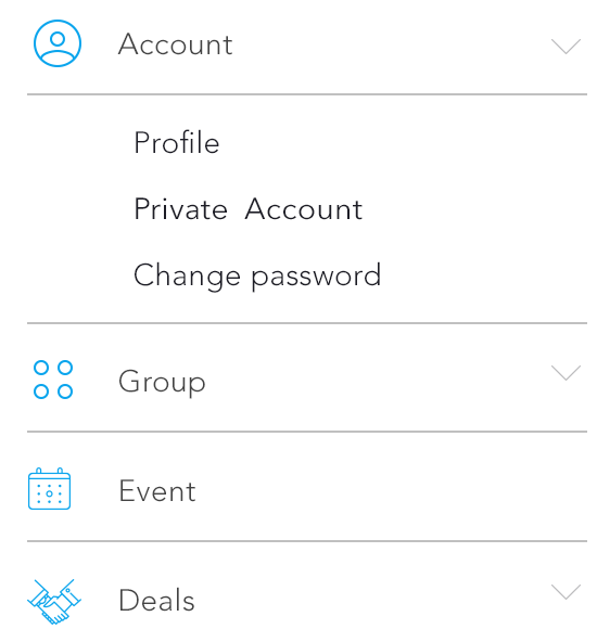
How to Create this type of tableview in iOS??
Here, If we tap on 1st row 'Account', then automatically it scrolled with some more rows which is showing in Image. And if again we tap on Account, then that view will be hidden.
How to Create this type of tableview in iOS??
Here, If we tap on 1st row 'Account', then automatically it scrolled with some more rows which is showing in Image. And if again we tap on Account, then that view will be hidden.
You could easily set up a cell to LOOK like a header, and setup the tableView: didSelectRowAtIndexPath to expand or collapse the section it is within manually. If I'd store an array of booleans corresponding the the "expended" value of each of your sections. You could then have the tableView:didSelectRowAtIndexPath on each of your custom header rows toggle this value and then reload that specific section.
- (void)tableView:(UITableView *)tableView didSelectRowAtIndexPath:(NSIndexPath *)indexPath {
    if (indexPath.row == 0) {
        ///it's the first row of any section so it would be your custom section header

        ///put in your code to toggle your boolean value here
        mybooleans[indexPath.section] = !mybooleans[indexPath.section];

        ///reload this section
        [self.tableView reloadSections:[NSIndexSet indexSetWithIndex:indexPath.section] withRowAnimation:UITableViewRowAnimationFade];
    }
}
You'd then setup your number numberOfRowsInSection to check the mybooleans value and return either 1 if the section isn't expanded, or 1+ the number of items in the section, if it is expanded.
- (NSInteger)tableView:(UITableView *)tableView numberOfRowsInSection:(NSInteger)section {

    if (mybooleans[section]) {
        ///we want the number of people plus the header cell
        return [self numberOfPeopleInGroup:section] + 1;
    } else {
        ///we just want the header cell
        return 1;
    }
}
You would also have to update your cellForRowAtIndexPath to return a custom header cell for the first row in any section.
- (UIView *)tableView:(UITableView *)tableView viewForHeaderInSection:(NSInteger)section is the better way to provide your "own custom header", as that's exactly what it's designed to do.
For more details, Refer this Answer or this PKCollapsingTableViewSections.
Also, You can get this type of tableviews using setIndentationLevel. Please refer this DemoCode for this example. I think this the best solution for Drop-Down tableviews.
If you want to make a simple header and cell drop down, then please refer STCollapseTableView.
Hope, this is what you're looking for. Any concern get back to me. :)
The easier and most natural way to implement this if via table view cells. No expanding cell views, no section headers, plain and simply cells (we're in a table view after all).
The design is as following:
CollapsableViewModel class that holds the information needed to configure the cell: label, imagechildren, which is an array of CollapsableViewModel objects, and isCollapsed, which holds the state of the drop downCollapsableViewModel, as well as a flat list containing the view models that will be rendered on the screen (the displayedRows property)displayedRows and in the table view, via the insertRowsAtIndexPaths() and deleteRowsAtIndexPaths() functions.The Swift code is as following (note that the code makes use only of the label property of the view model, to keep it clean):
import UIKit

class CollapsableViewModel {
    let label: String
    let image: UIImage?
    let children: [CollapsableViewModel]
    var isCollapsed: Bool

    init(label: String, image: UIImage? = nil, children: [CollapsableViewModel] = [], isCollapsed: Bool = true) {
        self.label = label
        self.image = image
        self.children = children
        self.isCollapsed = isCollapsed
    }
}

class CollapsableTableViewController: UITableViewController {
    let data = [
        CollapsableViewModel(label: "Account", image: nil, children: [
            CollapsableViewModel(label: "Profile"),
            CollapsableViewModel(label: "Activate account"),
            CollapsableViewModel(label: "Change password")]),
        CollapsableViewModel(label: "Group"),
        CollapsableViewModel(label: "Events", image: nil, children: [
            CollapsableViewModel(label: "Nearby"),
            CollapsableViewModel(label: "Global"),
            ]),
        CollapsableViewModel(label: "Deals"),
    ]

    var displayedRows: [CollapsableViewModel] = []

    override func viewDidLoad() {
        super.viewDidLoad()
        displayedRows = data
    }

    override func numberOfSections(in tableView: UITableView) -> Int {
        return 1
    }

    override func tableView(_ tableView: UITableView, numberOfRowsInSection section: Int) -> Int {
        return displayedRows.count
    }

    override func tableView(_ tableView: UITableView, cellForRowAt indexPath: IndexPath) -> UITableViewCell {
        let cell = tableView.dequeueReusableCell(withIdentifier: "CellIdentifier") ?? UITableViewCell()
        let viewModel = displayedRows[indexPath.row]
        cell.textLabel!.text = viewModel.label
        return cell
    }

    override func tableView(_ tableView: UITableView, didSelectRowAt indexPath: IndexPath) {
        tableView.deselectRow(at: indexPath, animated: false)
        let viewModel = displayedRows[indexPath.row]
        if viewModel.children.count > 0 {
            let range = indexPath.row+1...indexPath.row+viewModel.children.count
            let indexPaths = range.map { IndexPath(row: $0, section: indexPath.section) }
            tableView.beginUpdates()
            if viewModel.isCollapsed {
                displayedRows.insert(contentsOf: viewModel.children, at: indexPath.row + 1)
                tableView.insertRows(at: indexPaths, with: .automatic)
            } else {
                displayedRows.removeSubrange(range)
                tableView.deleteRows(at: indexPaths, with: .automatic)
            }
            tableView.endUpdates()
        }
        viewModel.isCollapsed = !viewModel.isCollapsed
    }
}
The Objective-C counterpart is easy to translate, I added the Swift version only as it's shorter and more readable.
With a couple of small changes, the code can be used to generate drop down lists of multiple levels.
People asked me about the separators, this can be achieved by adding a custom class CollapsibleTableViewCell which get's configured with a view model (finally, move the cell configuration logic from the controller to where it belongs - the cell). Credits for the separator logic only for some of the cells go to people answering this SO question.
Firstly, update the model, add a needsSeparator property that tells the table view cell to render or not the separator:
class CollapsableViewModel {
    let label: String
    let image: UIImage?
    let children: [CollapsableViewModel]
    var isCollapsed: Bool
    var needsSeparator: Bool = true

    init(label: String, image: UIImage? = nil, children: [CollapsableViewModel] = [], isCollapsed: Bool = true) {
        self.label = label
        self.image = image
        self.children = children
        self.isCollapsed = isCollapsed

        for child in self.children {
            child.needsSeparator = false
        }
        self.children.last?.needsSeparator = true
    }
}
Then, add the cell class:
class CollapsibleTableViewCell: UITableViewCell {
    let separator = UIView(frame: .zero)

    func configure(withViewModel viewModel: CollapsableViewModel) {
        self.textLabel?.text = viewModel.label
        if(viewModel.needsSeparator) {
            separator.backgroundColor = .gray
            contentView.addSubview(separator)
        } else {
            separator.removeFromSuperview()
        }
    }

    override func layoutSubviews() {
        super.layoutSubviews()
        let separatorHeight = 1 / UIScreen.main.scale
        separator.frame = CGRect(x: separatorInset.left,
                                 y: contentView.bounds.height - separatorHeight,
                                 width: contentView.bounds.width-separatorInset.left-separatorInset.right,
                                 height: separatorHeight)
    }
}
cellForRowAtIndexPath would then need to be modified to return this kind of cells:
override func tableView(_ tableView: UITableView, cellForRowAt indexPath: IndexPath) -> UITableViewCell {
        let cell = (tableView.dequeueReusableCell(withIdentifier: "CollapsibleTableViewCell") as? CollapsibleTableViewCell) ?? CollapsibleTableViewCell(style: .default, reuseIdentifier: "CollapsibleTableViewCell")
        cell.configure(withViewModel: displayedRows[indexPath.row])
        return cell
    }
One last step, remove the default table view cell separators - either from xib or from code (tableView.separatorStyle = .none).
Here is an MVC based solution.
Create a Model class ClsMenuGroup for your Sections
class ClsMenuGroup: NSObject {

    // We can also add Menu group's name and other details here.
    var isSelected:Bool = false
    var arrMenus:[ClsMenu]!
}
Create a Model class ClsMenu for your Rows
class ClsMenu: NSObject {

    var strMenuTitle:String!
    var strImageNameSuffix:String!
    var objSelector:Selector!   // This is the selector method which will be called when this menu is selected.
    var isSelected:Bool = false

    init(pstrTitle:String, pstrImageName:String, pactionMehod:Selector) {

        strMenuTitle = pstrTitle
        strImageNameSuffix = pstrImageName
        objSelector = pactionMehod
    }
}
Create groups array in your ViewController
 class YourViewController: UIViewController, UITableViewDelegate {

    @IBOutlet var tblMenu: UITableView!
    var objTableDataSource:HDTableDataSource!
    var arrMenuGroups:[AnyObject]!

    // MARK: - View Lifecycle

    override func viewDidLoad() {
        super.viewDidLoad()
        if arrMenuGroups == nil {
            arrMenuGroups = Array()
        }

        let objMenuGroup = ClsMenuGroup()
        objMenuGroup.arrMenus = Array()

        var objMenu = ClsMenu(pstrTitle: "Manu1", pstrImageName: "Manu1.png", pactionMehod: "menuAction1")
        objMenuGroup.arrMenus.append(objMenu)

        objMenu = ClsMenu(pstrTitle: "Menu2", pstrImageName: "Menu2.png", pactionMehod: "menuAction2")
        objMenuGroup.arrMenus.append(objMenu)

        arrMenuGroups.append(objMenuGroup)
        configureTable()
    }


    func configureTable(){

        objTableDataSource = HDTableDataSource(items: nil, cellIdentifier: "SideMenuCell", configureCellBlock: { (cell, item, indexPath) -> Void in

            let objTmpGroup = self.arrMenuGroups[indexPath.section] as! ClsMenuGroup
            let objTmpMenu = objTmpGroup.arrMenus[indexPath.row]
            let objCell:YourCell = cell as! YourCell

            objCell.configureCell(objTmpMenu)  // This method sets the IBOutlets of cell in YourCell.m file.
        })

        objTableDataSource.sectionItemBlock = {(objSection:AnyObject!) -> [AnyObject]! in

            let objMenuGroup = objSection as! ClsMenuGroup
            return (objMenuGroup.isSelected == true) ? objMenuGroup.arrMenus : 0
        }

        objTableDataSource.arrSections = self.arrMenuGroups
        tblMenu.dataSource = objTableDataSource
        tblMenu.reloadData()
    }

    // MARK: - Tableview Delegate

    func tableView(tableView: UITableView, didSelectRowAtIndexPath indexPath: NSIndexPath) {

        let objTmpGroup = self.arrMenuGroups[indexPath.section] as! ClsMenuGroup
        let objTmpMenu = objTmpGroup.arrMenus[indexPath.row]

        if objTmpMenu.objSelector != nil && self.respondsToSelector(objTmpMenu.objSelector) == true {
            self.performSelector(objTmpMenu.objSelector)  // Call the method for the selected menu.
        }

        tableView.reloadData()
    }

    func tableView(tableView: UITableView, viewForHeaderInSection section: Int) -> UIView? {

        let arrViews:[AnyObject] = NSBundle.mainBundle().loadNibNamed("YourCustomSectionView", owner: self, options: nil)
        let objHeaderView = arrViews[0] as! UIView
        objHeaderView.sectionToggleBlock = {(objSection:AnyObject!) -> Void in

            let objMenuGroup = objSection as! ClsMenuGroup
            objMenuGroup.isSelected = !objMenuGroup.isSelected
            tableView.reloadData()
        }
        return objHeaderView
    }

    // MARK: - Menu methods

    func menuAction1(){

    }

    func menuAction2(){

    }
}
I have used HDTableDataSource in place of Tableview's data source methods. You may find example of HDTableDataSource from Github.
Advantages of above code is
- You can anytime change the order of any menu or section or interchange menu and section, without changing other functions.
- You will not need to add long code of else if ladder in your tableview's delegate methods
- You can specify icon, title or other attribute for your menu item separately like adding badge count, changing selected menu's color etc.
- You may also use multiple cells or sections by applying minor changes to existing code
Usually I do it by setting the row height. For example, you have two menu items with drop-down lists:
So you have to create a table view with 2 sections. The first section contains 4 rows (Menu 1 and it's items) and the seconds section contains 3 rows (Menu 2 and it's items).
You always set height only for first row in section. And if user clicks on the first row, you expand this section rows by settings the height and reload this section.
the easy way to do this is use UITableView section header as cell-> and set number of row is 0 and section.count for collapse and expand state.
.This is TableViewSection Header, isExpand -> section.count else return 0.
-Normal cell
-Normal cell
-Normal cell
.This is TableViewSection Header, isExpand -> section.count else return 0.
-Normal cell
-Normal cell
-Normal cell
There is no built in control for tree-view like views in iOS framework - UIKit. As it was pointed out by other users, probably the simplest solution (without using any external libraries) is to add some custom logic to the UITableView's delegate and data source to mimic desired behaviour.
Fortunately, there are some open source libraries which allow you to implemented desired tree view like view without worrying about the details of expand/collapse operations. There are a couple of them available for iOS platform. In most cases these libraries just wrap UITableView and provide you with programmer-friendly interface which allow you to focus on your problem and not on implementation details of the tree view.
Personally, I'm the author of RATreeView library which purpose it to minimalize the cost needed to create tree view like views on iOS. You can check out example projects (available in Objective-c and Swift) to check how this control works and behaves. Using my control, it is really simple to create the view you want:
DataObject struct will be used to keep information about the tree view node - it will be responsible for keeping information about the title of the cell, its image (if cell has image) and its children (if cell has children).class DataObject
{
let name : String
let imageURL : NSURL?
private(set) var children : [DataObject]
init(name : String, imageURL : NSURL?, children: [DataObject]) {
self.name = name
self.imageURL = imageURL
self.children = children
}
convenience init(name : String) {
self.init(name: name, imageURL: nil, children: [DataObject]())
}
}
TreeTableViewCell and implement two cells which conforms to that protocol. One of these cells will be used to display root items and another one will be used to display children of the root items.protocol TreeTableViewCell {
func setup(withTitle title: String, imageURL: NSURL?, isExpanded: Bool)
}
class ChildTreeTableViewCell : UITableViewCell, TreeTableViewCell {
func setup(withTitle title: String, imageURL: NSURL?, isExpanded: Bool) {
//implementation goes here
}
}
class RootTreeTableViewCell : UITableViewCell, TreeTableViewCell {
func setup(withTitle title: String, imageURL: NSURL?, isExpanded: Bool) {
//implementation goes here
}
}
let profileDataObject = DataObject(name: "Profile")
let privateAccountDataObject = DataObject(name: "Private Account")
let changePasswordDataObject = DataObject(name: "Change Password")
let accountDataObject = DataObject(name: "Account", imageURL: NSURL(string: "AccountImage"), children: [profileDataObject, privateAccountDataObject, changePasswordDataObject])

let groupDataObject = DataObject(name: "Group", imageURL: NSURL(string: "GroupImage"), children: [])
let eventDataObject = DataObject(name: "Event", imageURL: NSURL(string: "EventImage"), children: [])
let dealsDataObject = DataObject(name: "Deals", imageURL: NSURL(string: "DealsImage"), children: [])

data = [accountDataObject, groupDataObject, eventDataObject, dealsDataObject]
RATreeView.func treeView(treeView: RATreeView, numberOfChildrenOfItem item: AnyObject?) -> Int {
if let item = item as? DataObject {
return item.children.count //return number of children of specified item
} else {
return self.data.count //return number of top level items here
}
}
func treeView(treeView: RATreeView, child index: Int, ofItem item: AnyObject?) -> AnyObject {
if let item = item as? DataObject {
return item.children[index] //we return child of specified item here (using provided `index` variable)
} else {
return data[index] as AnyObject //we return root item here (using provided `index` variable)
}
}
func treeView(treeView: RATreeView, cellForItem item: AnyObject?) -> UITableViewCell {
let cellIdentifier = item ? “TreeTableViewChildCell” : “TreeTableViewCellRootCell”
let cell = treeView.dequeueReusableCellWithIdentifier(cellIdentifier) as! TreeTableViewCell
//TreeTableViewCell is a protocol which is implemented by two kinds of
//cells - the one responsible for root items in the tree view and another
//one responsible for children. As we use protocol we don't care
//which one is truly being used here. Both of them can be
//configured using data from `DataItem` object.
let item = item as! DataObject
let isExpanded = treeView.isCellForItemExpanded(item) //this variable can be used to adjust look of the cell by determining whether cell is expanded or not
cell.setup(withTitle: item.name, imageURL: item.imageURL, expanded: isExpanded)
return cell
}
Notice that using my library you don't have to care about expanding and collapsing of the cell - it is handled by the RATreeView. You are responsible only for the data which is used to configure cells - the rest is handled by the control itself.
@interface TestTableViewController ()
{
    BOOL showMenu;
}

@implementation TestTableViewController

- (void)viewDidLoad {
    [super viewDidLoad];

    // Uncomment the following line to preserve selection between presentations.
    // self.clearsSelectionOnViewWillAppear = NO;

    // Uncomment the following line to display an Edit button in the navigation bar for this view controller.
    // self.navigationItem.rightBarButtonItem = self.editButtonItem;
    [self.tableView registerClass:[UITableViewCell class] forCellReuseIdentifier:@"accountMenu"];
    [self.tableView registerClass:[UITableViewCell class] forCellReuseIdentifier:@"accountSubMenu"];
}

#pragma mark - Table view data source

- (NSInteger)numberOfSectionsInTableView:(UITableView *)tableView {
    return 2;
}

- (NSInteger)tableView:(UITableView *)tableView numberOfRowsInSection:(NSInteger)section {
    if (section == 0) {
        // Account Menu
        return 1;
    }
    if (showMenu) {
        // Profile/Private Account/Change Password
        return 3;
    }
    // Hidden Account Menu
    return 0;
}

- (UITableViewCell *)tableView:(UITableView *)tableView cellForRowAtIndexPath:(NSIndexPath *)indexPath {
    UITableViewCell *cell;

    if (indexPath.section == 0) {
        cell = [tableView dequeueReusableCellWithIdentifier:@"accountMenu" forIndexPath:indexPath];
        cell.textLabel.text = @"Account";
    }
    else
    {
        cell = [tableView dequeueReusableCellWithIdentifier:@"accountSubMenu" forIndexPath:indexPath];
        switch (indexPath.row) {
            case 0:
                cell.textLabel.text = @"Profile";
                break;
            case 1:
                cell.textLabel.text = @"Private Account";
                break;
            case 2:
                cell.textLabel.text = @"Change Password";
                break;

            default:
                break;
        }
    }


    return cell;
}

-(void)tableView:(UITableView *)tableView didSelectRowAtIndexPath:(NSIndexPath *)indexPath
{
    if (indexPath.section == 0) {
        // Click on Account Menu
        showMenu = !showMenu;
        [tableView reloadSections:[NSIndexSet indexSetWithIndex:1] withRowAnimation:UITableViewRowAnimationAutomatic];
    }
}
Hope it help :)
If you don't like to use any external library, then you can make 2 custom cells. One that shows before expanding and the other one after expanding (with different identifiers). And when you click the cell, check if the cell is expanded or not. If not, use the expanded cell identifier otherwise the non expanded cell identifier.
It's the best and clean way to make an expanded table view cell.
You need a Collapsable TableView. In order to achieve that, in your TableView you must keep track of which sections are collapsed (contracted) and which of them are expanded. For this you need to maintain a set of indices of sections that are expanded, or a boolean array where the value of each index indicates if the corresponding section is expanded or not. Check for the values at the specific index while assigning height to a certain row. Check this link for more help.
You can learn about Sectional TableViews here.
There are third party libraries available on Github that can save you from the hustel. Have a look at CollapsableTableView or CollapsableTable-Swift
You could have Account as a cell that expands on tap to reveal three buttons ("Profile", "Activate Account", "Change Password"), but that creates a problem: tapping around each of the three buttons will count as "user selected the Account cell" and trigger -tableView:didSelectRowAtIndexPath: with the resulting expand/collapse of the cell.
Or you could make each of the hidden options ("Profile", "Activate Account", "Change Password") a separate table view cell. But I don't know how you could animate the three cells as a whole expanding and contracting (instead of each expanding separately from zero height to fully expanded).
So, perhaps the best solution is to:
It is not the most elegant use of UITableView, but will get the job done.
As per @sticker answer, you can bind runtime
objc_setAssociatedObject
for section index, and use his logic. And while using tapgesture on header view, you can get section index as
objc_getAssociatedObject.

UITapGestureRecognizer *singleTapRecogniser = [[[UITapGestureRecognizer alloc] initWithTarget:self action:@selector(gestureHandler:)] autorelease];
[singleTapRecogniser setDelegate:self];
singleTapRecogniser.numberOfTouchesRequired = 1;
singleTapRecogniser.numberOfTapsRequired = 1;
[sectionHeaderView addGestureRecognizer:singleTapRecogniser];
If you want any third party library, then you can try this solution.
I like @Cristik solution, some time ago I had the same problem and my solution follows kind of the same principles; so this is what I propose based on the requirements I had:
To make it more general, the items of the table shouldn't inherit from a class specialised for the expanding functionality, instead there should be a protocol that defines the necessary properties
There shouldn't be a restriction on the number of levels that we can expand. So the table can have option, sub option, sub sub option, etc.
The table view should show or hide the cells using any of the usual animations (no reloadData)
The expand action shouldn't be necessarily attached to the user selecting the cell, the cell could have a UISwitch for example
The simplified version of the implementation (https://github.com/JuanjoArreola/ExpandableCells) is as follows:
First the protocol:
protocol CellDescriptor: class {
    var count: Int { get }
    var identifier: String! { get }
}
A non expandable cell always have a count of 1:
extension CellDescriptor {
    var count: Int { return 1 }
}
Then the expandable cell protocol:
protocol ExpandableCellDescriptor: CellDescriptor {
    var active: Bool { get set }
    var children: [CellDescriptor] { get set }

    subscript(index: Int) -> CellDescriptor? { get }
    func indexOf(cellDescriptor: CellDescriptor) -> Int?
}
A cool thing about swift is that we can write some of the implementation in a protocol extension and all conforming classes can use the default implementation, so we can write the count subscript and indexOf implementation and additionally a couple of other useful functions like this:
extension ExpandableCellDescriptor {
    var count: Int {
        var total = 1
        if active {
            children.forEach({ total += $0.count })
        }
        return total
    }

    var countIfActive: Int {
        ...
    }

    subscript(index: Int) -> CellDescriptor? {
        ...
    }

    func indexOf(cellDescriptor: CellDescriptor) -> Int? {
        ...
    }

    func append(cellDescriptor: CellDescriptor) {
        children.append(cellDescriptor)
    }
}
The complete implementation is in the file CellDescriptor.swift
Additionally, in the same file, there is a class named CellDescriptionArray that implements ExpandableCellDescriptor and doesn't show a cell by itself
Now, any class can conform to the previous protocols without the necessity to inherit from a specific class, for the example code in github I created a couple of classes: Option and ExpandableOption, this is how ExpandableOption looks like:
class ExpandableOption: ExpandableCellDescriptor {

    var delegate: ExpandableCellDelegate?

    var identifier: String!
    var active: Bool = false {
        didSet {
            delegate?.expandableCell(self, didChangeActive: active)
        }
    }

    var children: [CellDescriptor] = []
    var title: String?
}
And this is one of the UITableViewCell subclasses:
class SwitchTableViewCell: UITableViewCell, CellDescrptionConfigurable {

    @IBOutlet weak var titleLabel: UILabel!
    @IBOutlet weak var switchControl: UISwitch!

    var cellDescription: CellDescriptor! {
        didSet {
            if let option = cellDescription as? ExpandableOption {
                titleLabel.text = option.title
                switchControl.on = option.active
            }
        }
    }

    @IBAction func activeChanged(sender: UISwitch) {
       let expandableCellDescriptor = cellDescription as! ExpandableCellDescriptor
       expandableCellDescriptor.active = sender.on
    }
}
Notice that you can configure the cell and it's class the way you like, you can add images, labels, switches, etc; no restrictions and no change to the protocols needed.
Finally in the TableViewController we create the options tree:
var options = CellDescriptionArray()

override func viewDidLoad() {
   super.viewDidLoad()

   let account = ExpandableOption(identifier: "ExpandableCell", title: "Account")
   let profile = Option(identifier: "SimpleCell", title: "Profile")
   let isPublic = ExpandableOption(identifier: "SwitchCell", title: "Public")
   let caption = Option(identifier: "SimpleCell", title: "Anyone can see this account")
   isPublic.append(caption)
   account.append(profile)
   account.append(isPublic)
   options.append(account)

   let group = ExpandableOption(identifier: "ExpandableCell", title: "Group")
   group.append(Option(identifier: "SimpleCell", title: "Group Settings"))
   options.append(group)
   ...
}
The rest of the implementation is now very simple:
func tableView(tableView: UITableView, numberOfRowsInSection section: Int) -> Int {
   return options.count
}

func tableView(tableView: UITableView, cellForRowAtIndexPath indexPath: NSIndexPath) -> UITableViewCell {
   let option = options[indexPath.row]!
   let cell = tableView.dequeueReusableCellWithIdentifier(option.identifier, forIndexPath: indexPath)

   (cell as! CellDescrptionConfigurable).cellDescription = option
   (option as? ExpandCellInformer)?.delegate = self
   return cell
}

func tableView(tableView: UITableView, didSelectRowAtIndexPath indexPath: NSIndexPath) {
    guard let option = options[indexPath.row] else { return }
    guard let expandableOption = option as? ExpandableOption else { return }
    if expandableOption.identifier == "ExpandableCell" {
        expandableOption.active = !expandableOption.active
    }
}

func expandableCell(expandableCell: ExpandableCellDescriptor, didChangeActive active: Bool) {
    guard let index = options.indexOf(expandableCell) else { return }
    var indexPaths = [NSIndexPath]()
    for row in 1..<expandableCell.countIfActive {
        indexPaths.append(NSIndexPath(forRow: index + row, inSection: 0))
    }
    if active {
        tableView.insertRowsAtIndexPaths(indexPaths, withRowAnimation: UITableViewRowAnimation.Fade)
    } else {
        tableView.deleteRowsAtIndexPaths(indexPaths, withRowAnimation: UITableViewRowAnimation.Fade)
    }
}
It might look like a lot of code, but most of it is written only once, most of the information needed to draw the table view correctly exists in the CellDescriptor.swift file, the cell configuration code exists inside the UITableViewCell subclasses and there is relatively few code in the TableViewController itself.
Hope it helps.