32

I've got X number of images (all the same height and width), and I want to display them on a web page. But I want to make the page automatically display the maximum number of images on a row (without resizing the images) when the browser is resized, and to show the images a fixed distance apart.

Also the images should be grouped together in the centre of the page, and displayed one after the other.

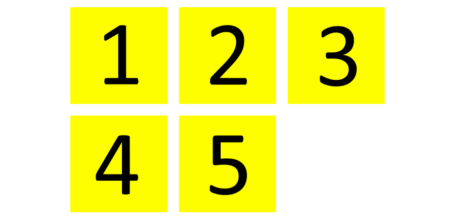
e.g. When the browser window is only wide enough to display 3 images on a row, they should be displayed as follows.

3 images per row grouped together a fixed distance apart, in the centre of the page, one after the other. enter image description here

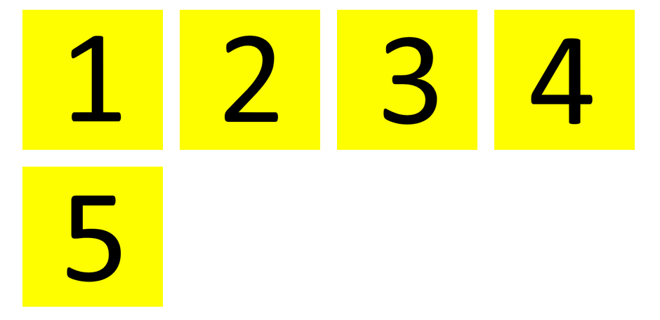
And if the browser is made wider so 4 images can be displayed on a row they should be displayed like so.

4 images per row (without resizing the images), grouped together a fixed distance apart, in the centre of the page, one after the other. enter image description here

So far I've written the following code:

HTML

<div class="outer-div">
    <div class="inner-div">
        <div class="image-div"><img src="images/1.png"></div>
        <div class="image-div"><img src="images/2.png"></div>
        <div class="image-div"><img src="images/3.png"></div>
        <div class="image-div"><img src="images/4.png"></div>
        <div class="image-div"><img src="images/5.png"></div>
    </div>
</div>

CSS

img {
    height: 200px;
    width: 200px;
    padding: 10px;
}

.image-div {
    display: inline;
}

.outer-div {
    text-align: center;
    width: 100%;
}

.inner-div {
    text-align: left;
    display: inline;
}

So the images are displayed inline with a 10px padding inside a div (inner-div) which is then centred inside the outer-div. And the images are text-aligned to the left inside the inner-div.

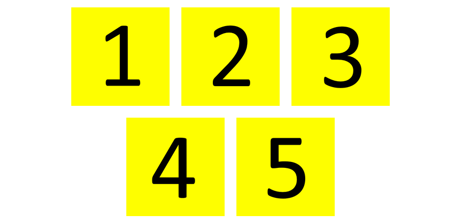
But the problem is they are displayed as follows:

enter image description here

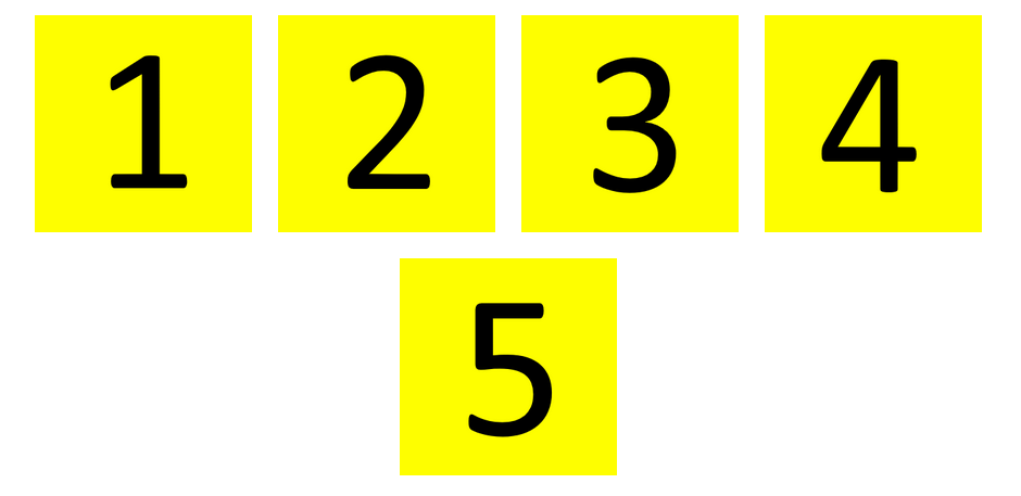
And like follows when the browser is made wider enter image description here

Can someone please show me how to display the images like the first set of images?

i.e. Maximum number of images per row (without resizing the images), one after another, grouped together in the centre of the page, fixed distance apart (wrapped).

Community
  • 1
  • 1
m_collard
  • 2,008
  • 4
  • 29
  • 51

9 Answers9

10

There isn't an easy way to achieve the layout with plain CSS as far as I know. The following approach uses media queries to set the width of inner divs for different viewport sizes.

Consider to use Javascript if you have a rather large number of items, CSS preprocessors might be helpful too.

See code snippet and comments inline, also check out the jsfiddle example for easy testing.

body {
    margin: 10px 0;
}
.outer {
    text-align: center;
}
.inner {
    font-size: 0; /* fix for inline gaps */
    display: inline-block;
    text-align: left;
}
.item {
    font-size: 16px; /* reset font size */
    display: inline-block;
    margin: 5px; /* gutter */
}
.item img {
    vertical-align: top;
}
@media (max-width: 551px) { /* ((100+5+5)x5)+1 */
    .inner {
        width: 440px; /* (100+5+5)x4 */
    }
}
@media (max-width: 441px) {
    .inner {
        width: 330px;
    }
}
@media (max-width: 331px) {
    .inner {
        width: 220px;
    }
}
@media (max-width: 221px) {
    .inner {
        width: 110px;
    }
}
<div class="outer">
    <div class="inner">
        <div class="item"><img src="//dummyimage.com/100"></div>
        <div class="item"><img src="//dummyimage.com/100"></div>
        <div class="item"><img src="//dummyimage.com/100"></div>
        <div class="item"><img src="//dummyimage.com/100"></div>
        <div class="item"><img src="//dummyimage.com/100"></div>
    </div>
</div>
Stickers
  • 75,527
  • 23
  • 147
  • 186
  • Thank you. Just what I was looking for. Your code positions the images responsively exactly the way I need them positioned. Perfect. – m_collard Oct 18 '15 at 22:08
8

Maximum number of images per row (without resizing the images), one after another, grouped together in the centre of the page, fixed distance apart (wrapped).

That was a really good question. It seems very simple at first, but the optimum result is hard to achieve.

I don't really believe there's an way to achieve the expected behavior without using media queries.

However, making use of some media queries and knowing exactly the width of the images and the maximum possible number of images per row we can solve the issue using display: inline-* based properties.


display: inline-block

Should support old browsers, since it's around since CSS2. We have to use a little trick to prevent the rendering of an undesired blank space between the items.

The trick is setting the CSS property font-size: 0.


display: inline-flex

This solution makes use of the CSS flexbox and its a good option for modern browers.


display: inline-table

Supported since CSS2 also and no tricks needed in order to make it work.


display: inline

The final result is not the one expected by the author, since the elements in the second row will be center aligned and not left aligned. The good part about this solution is that it will work without previous knowledge of the image width and media queries.


.wrapper {
  text-align: center;
}
.inline {
  font-size: 0;
  display: inline;
}
.inline-block {
  display: inline-block;
  font-size: 0;
  text-align: left;
}
.inline-flex {
  display: inline-flex;
  flex-wrap: wrap;
}
.inline-table {
  display: inline-table;
  text-align: left;
}
.item {
  margin: 10px;
}
@media (max-width: 240px) {
  .inline-block,
  .inline-flex,
  .inline-table {
    width: 120px;
  }
}
@media (min-width: 241px) and (max-width: 360px) {
  .inline-block,
  .inline-flex,
  .inline-table {
    width: 240px;
  }
}
@media (min-width: 361px) and (max-width: 480px) {
  .inline-block,
  .inline-flex,
  .inline-table {
    width: 360px;
  }
}
@media (min-width: 481px) and (max-width: 600px) {
  .inline-block,
  .inline-flex,
  .inline-table {
    width: 480px;
  }
}
@media (min-width: 601px) and (max-width: 720px) {
  .inline-block,
  .inline-flex,
  .inline-table {
    width: 600px;
  }
}
@media (min-width: 721px) and (max-width: 840px) {
  .inline-block,
  .inline-flex,
  .inline-table {
    width: 720px;
  }
}
<h1>display: inline-block</h1>

<div class="wrapper">

  <div class="inline-block">

    <img class="item" src="http://dummyimage.com/100">

    <img class="item" src="http://dummyimage.com/100">

    <img class="item" src="http://dummyimage.com/100">

    <img class="item" src="http://dummyimage.com/100">

    <img class="item" src="http://dummyimage.com/100">

    <img class="item" src="http://dummyimage.com/100">

  </div>

</div>

<h1>display: inline-flex</h1>

<div class="wrapper">

  <div class="inline-flex">

    <img class="item" src="http://dummyimage.com/100">

    <img class="item" src="http://dummyimage.com/100">

    <img class="item" src="http://dummyimage.com/100">

    <img class="item" src="http://dummyimage.com/100">

    <img class="item" src="http://dummyimage.com/100">

    <img class="item" src="http://dummyimage.com/100">

  </div>

</div>

<h1>display: inline-table</h1>

<div class="wrapper">

  <div class="inline-table">

    <img class="item" src="http://dummyimage.com/100">

    <img class="item" src="http://dummyimage.com/100">

    <img class="item" src="http://dummyimage.com/100">

    <img class="item" src="http://dummyimage.com/100">

    <img class="item" src="http://dummyimage.com/100">

    <img class="item" src="http://dummyimage.com/100">

  </div>

</div>

<h1>display: inline</h1>

<div class="wrapper">

  <div class="inline">

    <img class="item" src="http://dummyimage.com/100">

    <img class="item" src="http://dummyimage.com/100">

    <img class="item" src="http://dummyimage.com/100">

    <img class="item" src="http://dummyimage.com/100">

    <img class="item" src="http://dummyimage.com/100">

    <img class="item" src="http://dummyimage.com/100">

  </div>

</div>
Romulo
  • 4,896
  • 2
  • 19
  • 28
  • This seems to work assuming [old browser compatibility](http://caniuse.com/#feat=flexbox) is not an issue – asm Oct 27 '15 at 22:26
5

Here's a generic solution that may work for you and others.

HTML

<ul>
    <li>1</li>
    <li>2</li>
    <li>3</li>
    <li>4</li>
    <li>5</li>
</ul>

CSS

ul {
    margin: 0 auto;              /* center container */
    width: 1000px;
    padding-left: 0;             /* remove list padding */
    list-style-type: none;
    font-size: 0;                /* remove inline-block white space;
                                    see https://stackoverflow.com/a/32801275/3597276 */
}

li {
    display: inline-block;
    font-size: 60px;             /* restore font size removed in container */
    width: 150px;
    height: 150px;
    padding: 5px;
    margin: 15px 25px;
    box-sizing: border-box;
    text-align: center;
    line-height: 150px;
}

@media screen and (max-width: 430px) { ul { width: 200px; } }
@media screen and (min-width: 431px) and (max-width: 630px) { ul { width: 400px; } }
@media screen and (min-width: 631px) and (max-width: 830px) { ul { width: 600px;  } }
@media screen and (min-width: 831px) and (max-width: 1030px) { ul { width: 800px; } }

DEMO

Re: Flexbox: Although flexbox is an awesome tool, it's not the best solution for this particular problem. I explain my reasoning here: How to center a flex container but left-align flex items

Community
  • 1
  • 1
Michael Benjamin
  • 346,931
  • 104
  • 581
  • 701
1

I think, given the multitude of CSS possibilities, that this is a fairly elegant and multi-purpose solution with minimal code.

The snippet below contains all the necessary CSS, and comes with extensive comment. It is best run in 'full page' mode. Initially resize your browser until 'rcb 1' has 6 columns. Then start scrolling and resizing to see the various effects.

At first glance you may not be aware, but this simple code has very much potential as gallery, filmstrip, scrollbox (both vertical and horizontal), etc.

While maybe not a 100% solution to the question, I am pretty pleased with the result!

Please DO have a good look at it and give your appreciated comment!

-Addendum-: this solution has been tested to work with:

  • Android 5+: default browser
  • Windows7-x32: Google Chrome (46+), Firefox (41+), Firefox DE (43+) and IE11+

UPDATE 11/20/15 A few code modifications, see comments.

/* A few initial globals I always use */
html, body           { box-sizing: border-box; height: 100%; width: 100%; 
                       margin: 0; padding: 0; border: 0; cursor: default }
*, *:before, *:after { box-sizing: inherit }
body                 { max-width: 100%; margin: 0 auto }


/*******************************/
/*     The important code      */
/*******************************/
.rcb { /* [MANDATORY] Main Responsive Component Box container */ 
    overflow-x: hidden; /* Content wraps vertically, no horizontal scollbar needed */
    overflow-y: auto;   /* Vertical scrollbar when needed */
    width: 100%;        /* Maximum width within parent element */
    height: auto;       /* Adjust height to child element needs */
    padding: 15px       /* Needed to get from under autohide IE scrollbar, check difference with FF/Ch */
}
.rcb-cmp-list { /* [MANDATORY] Component list, direct child of RCB, controls the flexbox behaviour */
    display: flex;      /* make element a flexible layout container */
    flex-wrap: wrap;    /* a row of N columns, wrapping within frame*/
}
.rcb-cmp-item { /* [RECOMMENDED] RCB component list item, default RCB influences flexbox behaviour of parent list */
    flex: 1 1;          /* add auto or 0, or add some min required width (fiddle away!) */
    min-width:  165px;  /* best value is a multiple or division of 330px for all types of devices */
    max-width:  100%;   /* don't make this too small, leave as is or make it a multiple of min-width */
    max-height: 100%;   /* ditto */
    min-height: auto;   /* override if you want to set minimum; interacts with flex-basis! */
    overflow: hidden;   /* Chop off outside content */
    margin: 8px         /* some space between the boxes */
}
.rcb-cmp-item img {
    display: block }    /*  -Add 11/20/15 - remove the gap below image elements 
                           (by default, IMG is an inline element and causes bottom space) */

.rcb-cmp-item-cnt > * { /* [OPTIONAL] RCB component list content container, fully occupies parent  */
    min-width: 100%;    /* min/max 100% makes sizes fixed to parent */    
    max-width: 100%
}

/* [OPTIONAL] Media Queries to keep box sizes within reasonable limits (corrected for 8px margin) */
@media all and (min-width:  721px)  { .rcb-cmp-item { max-width: calc(33% - 16px) } }
@media all and (min-width:  991px)  { .rcb-cmp-item { max-width: calc(25% - 16px) } }
@media all and (min-width: 1321px)  { .rcb-cmp-item { max-width: calc(20% - 16px) } }

/*******************************/
/* That's it, the rest is demo */
/*******************************/

/* which you can replace with your own */
body                    { font-family: Lato; background-color: rgba(96,125,139,1); /* bluegrey 500*/
                          color: rgba(255,255,255,.87); font-size: 1vmax; line-height: 1.3vmax; }
h3,        
.rcb-cmp-list h4        { text-align: center }

.rcb-cmp-item           { background-color: #ffc107;
                          color: rgba(0,0,0,.87)  /* amber 500 */;
                          padding: 4px; /* -update 11/20/15 - see add of ".rcb-cmp-item img" */
                          border-radius: 2px }
.rcb-cmp-item,
.rcb-cmp-item p img     { box-shadow: 0px 2px 2px  0px rgba(0, 0, 0, 0.14), 
                                      0px 3px 1px -2px rgba(0, 0, 0, 0.20),
                                      0px 1px 5px  0px rgba(0, 0, 0, 0.12) }

.rcb-cmp-item p img     { vertical-align: middle }
.rcb-cmp-item p         { font-weight: 400; letter-spacing: 0 }

.rcb-cmp-item iframe    { border: none }
<h3>rcb 1</h3>
    <div id="rcb-control-1" class="rcb">
        <div class="rcb-cmp-list">
            <h4 class="rcb-cmp-item">200x200 rectangles</h4>
            <div class="rcb-cmp-item"><div class="rcb-cmp-item-cnt"><img src="http://dummyimage.com/200"></div></div>
            <div class="rcb-cmp-item"><div class="rcb-cmp-item-cnt"><img src="http://dummyimage.com/200"></div></div>
            <div class="rcb-cmp-item"><div class="rcb-cmp-item-cnt"><img src="http://dummyimage.com/200"></div></div>
            <div class="rcb-cmp-item"><div class="rcb-cmp-item-cnt"><img src="http://dummyimage.com/200"></div></div>
            <div class="rcb-cmp-item"><div class="rcb-cmp-item-cnt"><img src="http://dummyimage.com/200"></div></div>
            <div class="rcb-cmp-item"><div class="rcb-cmp-item-cnt"><img src="http://dummyimage.com/200"></div></div>
            <div class="rcb-cmp-item"><div class="rcb-cmp-item-cnt"><img src="http://dummyimage.com/200"></div></div>
            <div class="rcb-cmp-item"><div class="rcb-cmp-item-cnt"><img src="http://dummyimage.com/200"></div></div>
            <div class="rcb-cmp-item"><div class="rcb-cmp-item-cnt"><img src="http://dummyimage.com/200"></div></div>
            <div class="rcb-cmp-item"><div class="rcb-cmp-item-cnt"><img src="http://dummyimage.com/200"></div></div>
            <div class="rcb-cmp-item"><div class="rcb-cmp-item-cnt"><img src="http://dummyimage.com/200"></div></div>
    
            <h4 class="rcb-cmp-item">odd sized rectangles</h4>
            <div class="rcb-cmp-item"><div class="rcb-cmp-item-cnt"><img src="http://dummyimage.com/100"></div></div>
            <div class="rcb-cmp-item"><div class="rcb-cmp-item-cnt"><img src="http://dummyimage.com/200"></div></div>
            <div class="rcb-cmp-item"><div class="rcb-cmp-item-cnt"><img src="http://dummyimage.com/300"></div></div>
            <div class="rcb-cmp-item"><div class="rcb-cmp-item-cnt"><img src="http://dummyimage.com/400"></div></div>
            <div class="rcb-cmp-item"><div class="rcb-cmp-item-cnt"><img src="http://dummyimage.com/500"></div></div>
            <div class="rcb-cmp-item"><div class="rcb-cmp-item-cnt"><img src="http://dummyimage.com/100"></div></div>
        </div>
    </div>

    <h3>rcb 2</h3>
    <div id="rcb-control-2" class="rcb">
        <div class="rcb-cmp-list">
            <h4 class="rcb-cmp-item">300x150 oblongs</h4>
            <div class="rcb-cmp-item"><div class="rcb-cmp-item-cnt"><img src="http://dummyimage.com/300x150"></div></div>
            <div class="rcb-cmp-item"><div class="rcb-cmp-item-cnt"><img src="http://dummyimage.com/300x150"></div></div>
            <div class="rcb-cmp-item"><div class="rcb-cmp-item-cnt"><img src="http://dummyimage.com/300x150"></div></div>
            <div class="rcb-cmp-item"><div class="rcb-cmp-item-cnt"><img src="http://dummyimage.com/300x150"></div></div>
            <div class="rcb-cmp-item"><div class="rcb-cmp-item-cnt"><img src="http://dummyimage.com/300x150"></div></div>
    
            <h4 class="rcb-cmp-item">odd sized  oblongs</h4>
            <div class="rcb-cmp-item"><div class="rcb-cmp-item-cnt"><img src="http://dummyimage.com/100x50"></div></div>
            <div class="rcb-cmp-item"><div class="rcb-cmp-item-cnt"><img src="http://dummyimage.com/200x100"></div></div>
            <div class="rcb-cmp-item"><div class="rcb-cmp-item-cnt"><img src="http://dummyimage.com/300x150"></div></div>
            <div class="rcb-cmp-item"><div class="rcb-cmp-item-cnt"><img src="http://dummyimage.com/400x200"></div></div>
            <div class="rcb-cmp-item"><div class="rcb-cmp-item-cnt"><img src="http://dummyimage.com/500x250"></div></div>
        </div>
    </div>
    
    <h3>rcb 3</h3>
    <div id="rcb-control-3" class="rcb">
        <div class="rcb-cmp-list">
            <h4 class="rcb-cmp-item">portrait 9:16</h4>
            <div class="rcb-cmp-item"><div class="rcb-cmp-item-cnt"><img src="http://dummyimage.com/180x320"></div></div>
            <div class="rcb-cmp-item"><div class="rcb-cmp-item-cnt"><img src="http://dummyimage.com/180x320"></div></div>
            <div class="rcb-cmp-item"><div class="rcb-cmp-item-cnt"><img src="http://dummyimage.com/180x320"></div></div>
            <div class="rcb-cmp-item"><div class="rcb-cmp-item-cnt"><img src="http://dummyimage.com/180x320"></div></div>
            <div class="rcb-cmp-item"><div class="rcb-cmp-item-cnt"><img src="http://dummyimage.com/180x320"></div></div>
    
            <h4 class="rcb-cmp-item">landscape 16:9</h4>
            <div class="rcb-cmp-item"><div class="rcb-cmp-item-cnt"><img src="http://dummyimage.com/320x180"></div></div>
            <div class="rcb-cmp-item"><div class="rcb-cmp-item-cnt"><img src="http://dummyimage.com/320x180"></div></div>
            <div class="rcb-cmp-item"><div class="rcb-cmp-item-cnt"><img src="http://dummyimage.com/320x180"></div></div>
            <div class="rcb-cmp-item"><div class="rcb-cmp-item-cnt"><img src="http://dummyimage.com/320x180"></div></div>
            <div class="rcb-cmp-item"><div class="rcb-cmp-item-cnt"><img src="http://dummyimage.com/320x180"></div></div>
    
            <h4 class="rcb-cmp-item">mixed 16:9 - 9:16</h4>
            <div class="rcb-cmp-item"><div class="rcb-cmp-item-cnt"><img src="http://dummyimage.com/180x320"></div></div>
            <div class="rcb-cmp-item"><div class="rcb-cmp-item-cnt"><img src="http://dummyimage.com/320x180"></div></div>
            <div class="rcb-cmp-item"><div class="rcb-cmp-item-cnt"><img src="http://dummyimage.com/180x320"></div></div>
            <div class="rcb-cmp-item"><div class="rcb-cmp-item-cnt"><img src="http://dummyimage.com/180x320"></div></div>
            <div class="rcb-cmp-item"><div class="rcb-cmp-item-cnt"><img src="http://dummyimage.com/320x180"></div></div>
        </div>
    </div>
    
    <h3>rcb 4</h3>
    <div id="rcb-control-4" class="rcb">
        <div class="rcb-cmp-list">
            <h4 class="rcb-cmp-item">odd ones out</h4>
            <div class="rcb-cmp-item">empty rcb-cmp</div>
            <div class="rcb-cmp-item"><div class="rcb-cmp-item-cnt">empty rcb-cmp-item-cnt</div></div>
            <div class="rcb-cmp-item"><div class="rcb-cmp-item-cnt"><p>While I used a few oddly shaped images in this demo, on average most images will have ratio 3:2, 4:3 or 16:9</p></div></div>
            <div class="rcb-cmp-item"><div class="rcb-cmp-item-cnt"><img src="http://dummyimage.com/100x200"></div></div>
            <div class="rcb-cmp-item"><div class="rcb-cmp-item-cnt"><iframe src="http://www.youtube.com/embed/XGSy3_Czz8k?autoplay=0"></iframe><h4>live media</h4></div></div>
            <div class="rcb-cmp-item"><div class="rcb-cmp-item-cnt"><img src="http://dummyimage.com/200x300"></div></div>
            <div class="rcb-cmp-item"><div class="rcb-cmp-item-cnt">this is some text div with a <a href="javascript:void(0)">clickable anchor</a></div></div>
            <div class="rcb-cmp-item"><div class="rcb-cmp-item-cnt"><img src="http://dummyimage.com/320x200"></div></div>
            <div class="rcb-cmp-item"><div class="rcb-cmp-item-cnt"><img src="http://dummyimage.com/400x300"></div></div>
            <div class="rcb-cmp-item"><div class="rcb-cmp-item-cnt"><p>this is some paragraph with a <a href="javascript:void(0)">clickable anchor</a> and a tiny image <img src="http://dummyimage.com/35"> somewhere inside</p></div></div>
            <div class="rcb-cmp-item"><div class="rcb-cmp-item-cnt"><img src="http://dummyimage.com/100x150"></div></div>
            <div class="rcb-cmp-item"><div class="rcb-cmp-item-cnt"><img src="http://dummyimage.com/200x100"></div></div>
            <div class="rcb-cmp-item"><div class="rcb-cmp-item-cnt"><img src="http://dummyimage.com/300x320"></div></div>
            <div class="rcb-cmp-item"><div class="rcb-cmp-item-cnt"><img src="http://dummyimage.com/200"></div></div>
            <div class="rcb-cmp-item"><div class="rcb-cmp-item-cnt"><img src="http://dummyimage.com/200"></div></div>
            <div class="rcb-cmp-item"><div class="rcb-cmp-item-cnt"><img src="http://dummyimage.com/400x100"></div></div>
            <div class="rcb-cmp-item"><div class="rcb-cmp-item-cnt"><img src="http://dummyimage.com/257x133"></div></div>
        </div>
    </div>
Rene van der Lende
  • 4,992
  • 2
  • 14
  • 25
0

I think I've got a solution.

Treating .inner as an inline-block, you can use text-align: center to keep the group of items in the middle of a 100% width div. Which scales down nicely.

.outer {
    width: 100%;
    text-align: center;
}

.inner {
    display: inline-block;
}

.item {
    display: inline-block;
    float: left;
    margin: 5px;
    width: 100px;
    height: 100px;
}

Get'fiddle wit it: http://jsfiddle.net/sLz2ok92/2/

Will Thresher
  • 109
  • 1
  • 9
0

You don't need to do any complex work here, just put !important

.outer-div {
    text-align: center;
    width: 100%;
}

.inner-div {
    text-align: left !important;
    display: inline;
}

" !important" will work in this situation

0

I don't have time to improve what following, but, hope that can help you in some way! Many cases are covered! Use Flexbox if you're looking for a PureCSS solution!

.flex-container {
    display: -ms-inline-flexbox;
    display: -webkit-inline-flex;
    display: inline-flex;
    -webkit-flex-direction: row;
    -ms-flex-direction: row;
    flex-direction: row;
    -webkit-flex-wrap: wrap;
    -ms-flex-wrap: wrap;
    flex-wrap: wrap;
    -webkit-justify-content: center;
    -ms-flex-pack: center;
    justify-content: center;
    -webkit-align-content: flex-start;
    -ms-flex-line-pack: start;
    align-content: flex-start;
    -webkit-align-items: flex-start;
    -ms-flex-align: start;
    align-items: flex-start;
}

.flex-item {
    -webkit-flex: 0 1 auto;
    -ms-flex: 0 1 auto;
    flex: 0 1 auto;
    -webkit-align-self: auto;
    -ms-flex-item-align: auto;
    align-self: auto;
}
.flex-item:last-child { margin-right: auto }


/** IGNORE FOLLOWING **/
.flex-container {
  padding: 1em;
  border: 1px solid black;
  margin: 0 0 1em 0;
}
.box {
  width: 100px;
  height: 100px;
  visibility: visible;
  margin: 15px;
}

.size-lg { width: 90% }
.size-sm { width: 60% }
.size-xs { width: 40% }

.size-lg .box { background-color: yellow; }
.size-sm .box { background-color: yellow; }
.size-xs .box { background-color: yellow; }
<div class="flex-container size-lg">
  
  <div class="flex-item box"></div>
  <div class="flex-item box"></div>
  <div class="flex-item box"></div>
  <div class="flex-item box"></div>
  <div class="flex-item box"></div>
  <div class="flex-item box"></div>
  <div class="flex-item box"></div>
  <div class="flex-item box"></div>
  <div class="flex-item box"></div>
  <div class="flex-item box"></div>
  <div class="flex-item box"></div>
  
</div>

<div class="flex-container size-sm">
  
  <div class="flex-item box"></div>
  <div class="flex-item box"></div>
  <div class="flex-item box"></div>
  <div class="flex-item box"></div>
  <div class="flex-item box"></div>
  <div class="flex-item box"></div>
  <div class="flex-item box"></div>
  <div class="flex-item box"></div>
  <div class="flex-item box"></div>
  <div class="flex-item box"></div>
  <div class="flex-item box"></div>
  
</div>

<div class="flex-container size-xs">
  
  <div class="flex-item box"></div>
  <div class="flex-item box"></div>
  <div class="flex-item box"></div>
  <div class="flex-item box"></div>
  <div class="flex-item box"></div>
  <div class="flex-item box"></div>
  <div class="flex-item box"></div>
  <div class="flex-item box"></div>
  <div class="flex-item box"></div>
  <div class="flex-item box"></div>
  <div class="flex-item box"></div>
  
</div>
Hitmands
  • 13,491
  • 4
  • 34
  • 69
-1

You can just add float: left; to .image-div class

.image-div {
    display: inline;
    float:left;
}

Example: https://jsfiddle.net/czdwkxq7/

Yuriy Yakym
  • 3,616
  • 17
  • 30
-2

body {
    margin: 10px 0;
}

.outer {
    text-align: left;
    width:90%;
    margin:auto;
    
}
.inner {
    font-size: 0; /* fix for gaps */
    display: inline-block;
    text-align: left;
}
.item {
    font-size: 16px; /* reset size */
    display: inline-block;
    margin: 5px; /* gutter */
    height:100px;
    width:100px;
    background:yellow;
}
<div class="outer">
    <div class="inner">
        <div class="item"></div>
        <div class="item"></div>
        <div class="item"></div>
        <div class="item"></div>
        <div class="item"></div>
        
    </div>
</div>
Mitul
  • 3,431
  • 2
  • 22
  • 35