I've been looking at this previously asked question:
Consolidate Multiple Bootstrap 3 navbar menus on collapse
And it provides a good solution to this issue as you can see in this fiddle
The problem is that for my current layout this solution isn't perfect. Here is how it displays:
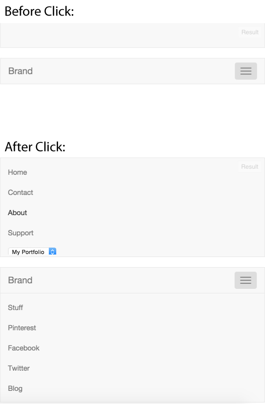
It works for the other scenario I suppose but in my case the top navbar will be display:none on mobile so there will only be a single navbar on the page and once a user clicks the toggle it isn't ideal to have the logo in the middle of the new menu and the toggle halfway down the page.
Is it possible to do have the final display like:
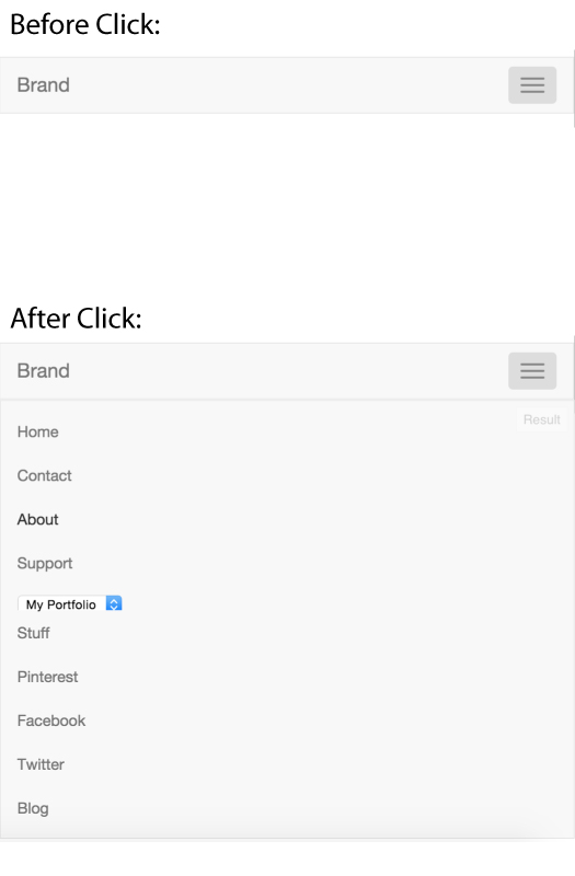
I have full access to change the structure of the HTML or add any additional javascript, but I cannot change the design of the logo on the second navbar.
Current HTML:
<nav class="navbar navbar-default" role="navigation">
  <div class="container-fluid">
    <!-- Collect the nav links, forms, and other content for toggling -->
    <div class="collapse navbar-collapse">
      <ul class="nav navbar-nav">
        <li><a href="#">Home</a></li>
        <li><a href="#">Contact</a></li>
        <li><a href="#">About</a></li>
        <li><a href="#">Support</a> </li>
      </ul>
      <div class="navbar-right">
        <select><option>My Portfolio</option></select>
      </div>
    </div><!-- /.navbar-collapse -->
  </div><!-- /.container-fluid -->
</nav>

<nav class="navbar navbar-default" role="navigation">
  <div class="container-fluid">
    <!-- Brand and toggle get grouped for better mobile display -->
    <div class="navbar-header">
      <button type="button" class="navbar-toggle collapsed" data-toggle="collapse" data-target=".navbar-collapse">
        <span class="sr-only">Toggle navigation</span>
        <span class="icon-bar"></span>
        <span class="icon-bar"></span>
        <span class="icon-bar"></span>
      </button>
      <a class="navbar-brand" href="#">Brand</a>
    </div>
    <!-- Collect the nav links, forms, and other content for toggling -->
    <div class="collapse navbar-collapse">
      <div class="navbar-right" role="search">
        <ul class="nav navbar-nav">
          <li><a href="#">Stuff</a></li>
          <li><a href="#">Pinterest</a></li>
          <li><a href="#">Facebook</a></li>
          <li><a href="#">Twitter</a></li>
          <li><a href="#">Blog</a></li>
        </ul>
      </div>
    </div><!-- /.navbar-collapse -->
  </div><!-- /.container-fluid -->
</nav>